Crafting Tradition: Unveiling the Natural Tobacco Eliquid Logo
Explore the remarkable design journey behind the Natural Tobacco Eliquid logo. A story of tradition meeting modernity in the world of eliquid branding.
In a world where the eliquid industry continually searches for dynamic representation, the Natural Tobacco Eliquid brand has embarked on an elegant branding journey. By creating a visual identity that captures the essence of its core product, this venture into rebranding fosters both nostalgia and innovation.
The Vision Behind the Brand
Natural Tobacco Eliquid sets itself apart in the bustling eliquid marketplace by prioritizing genuine tobacco flavors sourced directly from nature. As the industry grows, particularly with increasing demand for authentic taste experiences, the need for a distinctive logo became paramount. Based on the insights provided, the design team faced the challenge of condensing the purity and richness of real tobacco into an emblem that resonated with both the old and new generations of eliquid enthusiasts.
Initial Inspirations and Client Aspirations
The project thread reveals an actively involved client, one eager to see the brand's potential unfold through the design. Early exchanges centered around crafting a logo that wasn't just visually appealing but also substantial in meaning. Given the industry's demands, there was a pressing need for a logo that could reflect quality and tradition while remaining contemporary.
Presented initially with a series of logo sheets, including
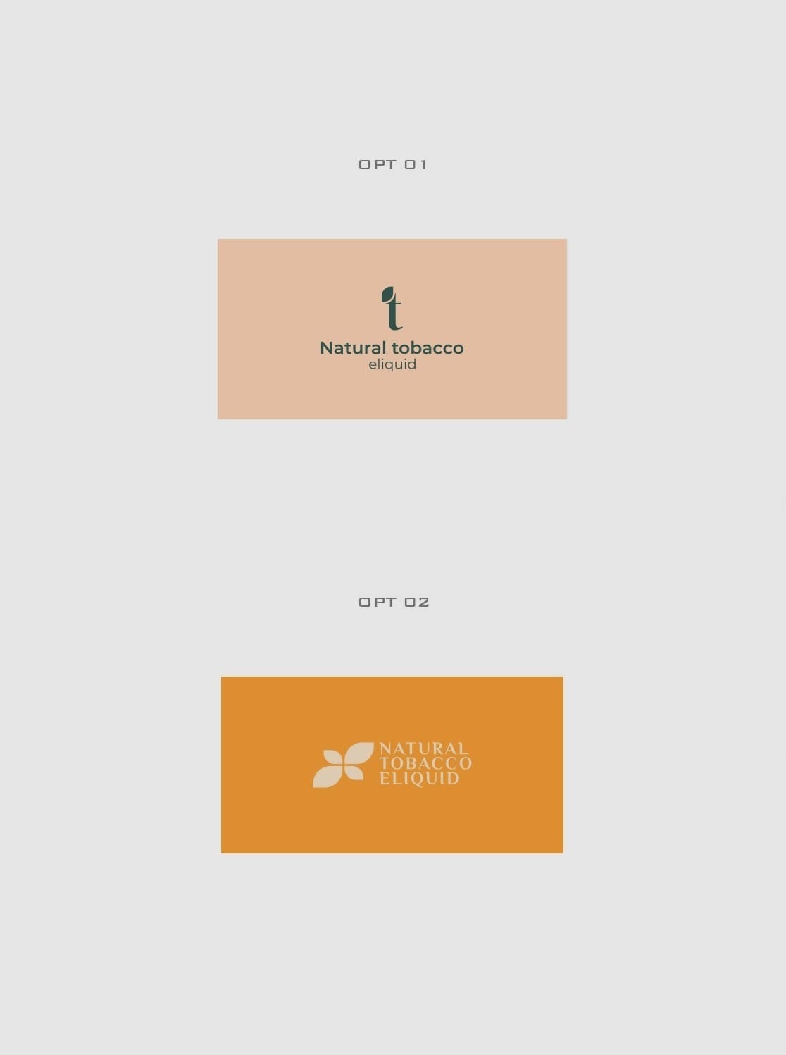
and
, the client was keen on a design that offered more than a visual cue, pushing the boundaries for something that could become emblematic of a lifestyle choice.
The Iterative Design Journey
What transpired was an iterative process, driven by both feedback and the designers’ quest for excellence. Faced with an earnest request for further exploration, the design team delved into creating
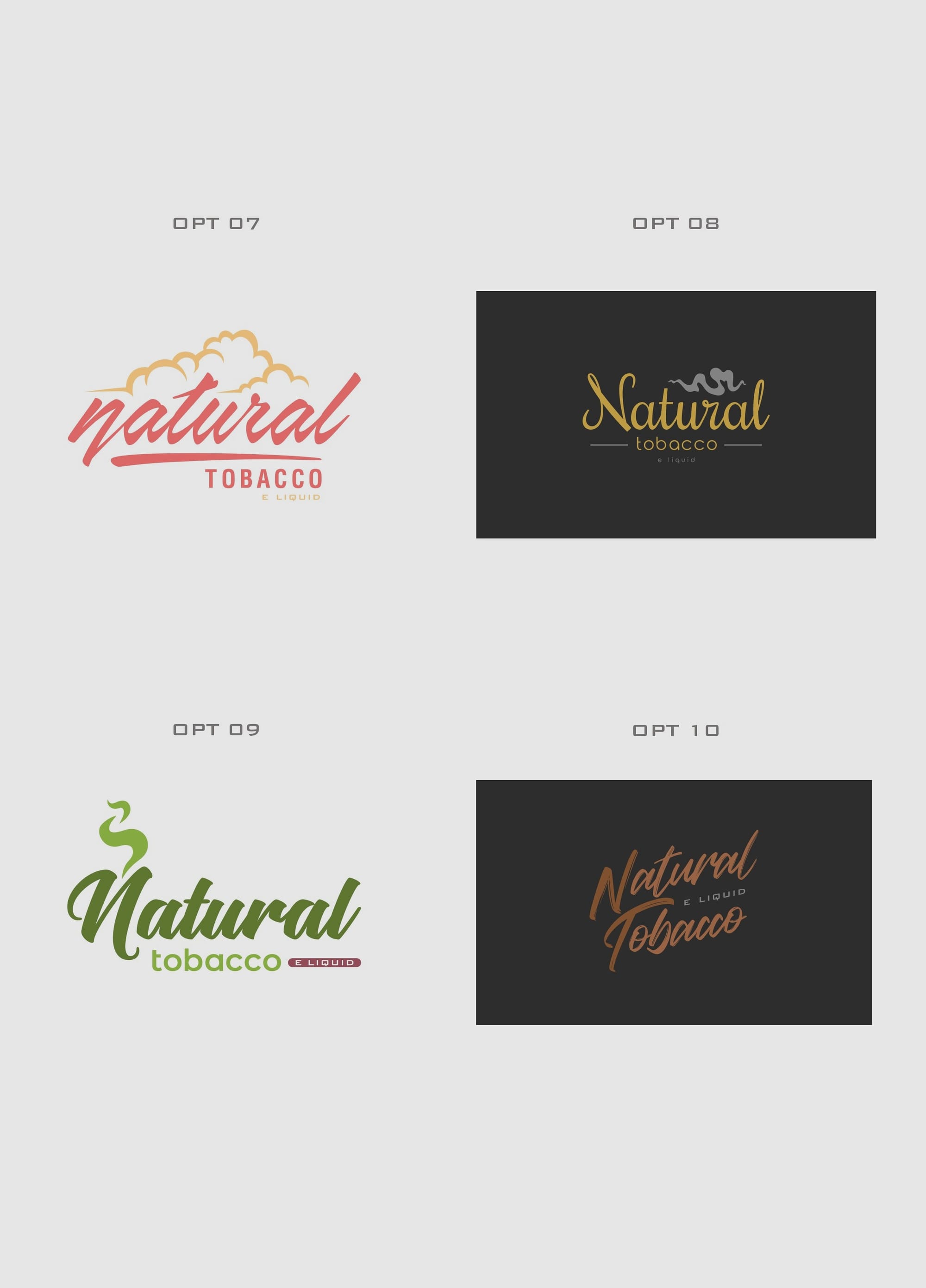
, a set of refined options that highlighted improved aesthetic elements and an adherence to the core brand values.
The process wasn't just about honing aesthetics, it was about finding a balance between simplicity and depth. Thanks to this conscientious approach, the emblem that emerged combined classical typography with a modern twist, resonating deeply with the brand's commitment to quality.
Font and Design Elements
A pivotal factor in the final logo's success was the choice of typography. Employing the 'Flaming' font, known for its elegant and organic strokes, perfectly captured the brand's essence. See the representation of the chosen typeface:
Final Presentation: Rough Elegance in Real-World Application
The unveiling of the chosen logo, Option#09, marked a significant milestone. Not only did it capture the client’s heart, but it also set a precedent for what the brand could achieve visually. The logo was showcased in various forms and textures, each demonstrating its adaptability and strength in real-world applications. From tote bags to billboards and candles, each scenario emphasized the logo's capability to maintain its integrity across diverse media.
Take a glimpse at the final deliverables:
A Step Forward in Tobacco Eliquid Identity
Natural Tobacco Eliquid now rides the wave of branding success, building a visual narrative that mirrors its commitment to natural essence and quality. The thoughtful collaboration between the client and the design team shines through, setting a standard for captivating and meaningful identities in the eliquid domain.
Start your brand journey today.
