Crafting the Identity of Martin Orthopedic and Wellness: A Journey Towards Holistic Branding
Explore the branding case study of Martin Orthopedic and Wellness, showcasing their journey from client briefs to final design, reflecting orthopedic excellence and holistic wellness.
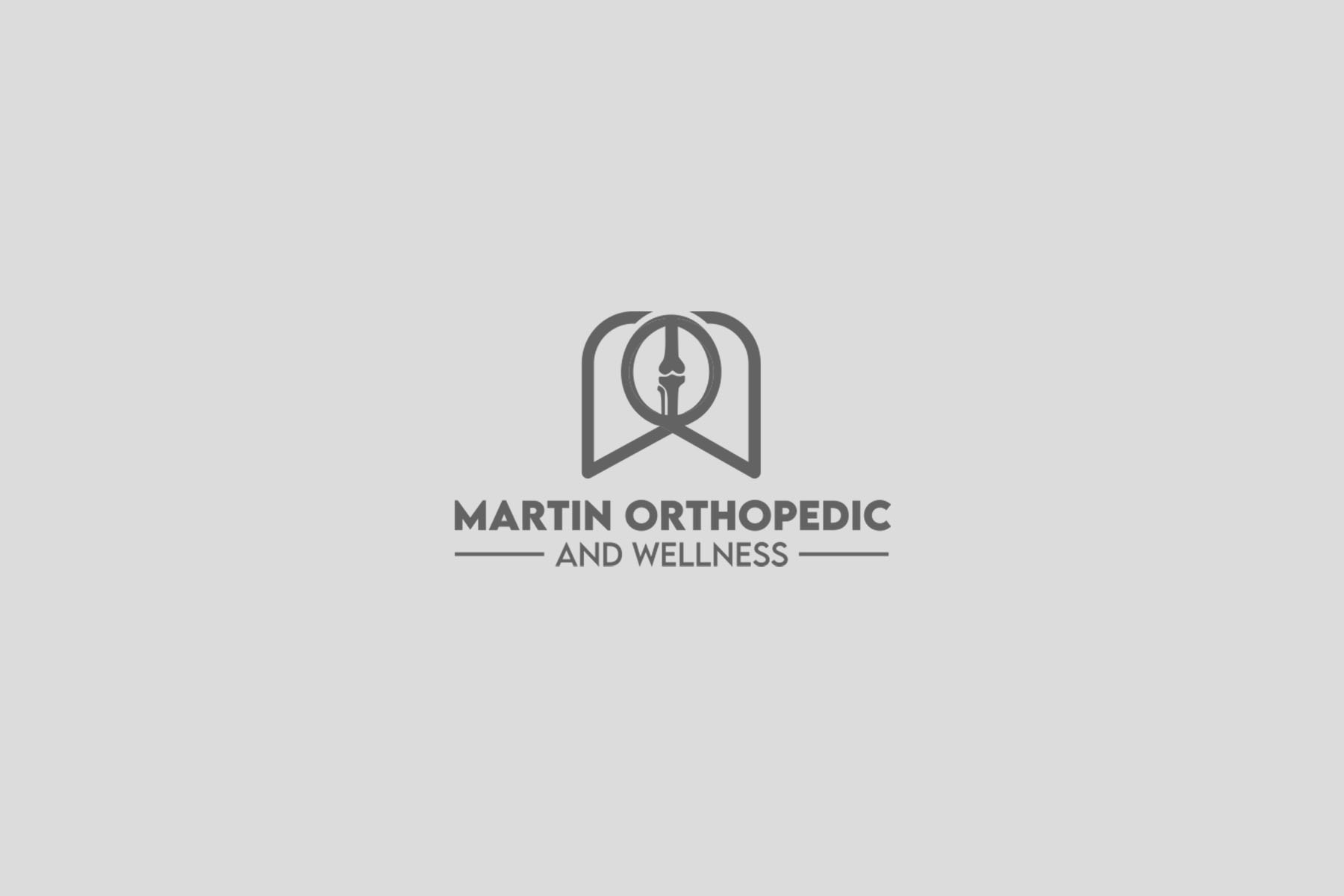
In the sphere of holistic health and orthopedic care, the visual identity of a brand serves as the cornerstone that communicates the essence of its ethos. Martin Orthopedic and Wellness, an emerging name in the field of orthopedic surgery and wellness treatments, recently embarked on a transformative branding journey to establish a cohesive and impactful identity.
Understanding Martin Orthopedic and Wellness
Located in the bustling domain of integrated health solutions, Martin Orthopedic and Wellness stands as a beacon of both traditional orthopedic surgery and alternative wellness treatments. From Botox to homeopathic healing, the facility aims to provide a comprehensive array of services that cater to both physical rehabilitation and wellness enhancement.
The requirement was clear; a logo that encapsulates both orthopedic excellence and the soothing essence of wellness. Colors like blues and greens were proposed to establish a calming and professional aura. A tentative slogan, "Feel good again," was suggested, reflecting the brand's dedication to patient rejuvenation.
The Design Process
The design team wasted no time in channeling their creativity into conceptualizing logos that would perfectly encapsulate the Martin ethos. The team initially presented three options as potential faces of the brand.

First iterations prominently featured blues and greens, employing various styles, from symbols of precise practices to more abstract representations of wellness and personal growth.


Fonts and Color Themes
The fonts selected for the project were Poppins and Lemon Milk, which offer a blend of modernity and readability, fitting for a brand that bridges traditional and innovative health solutions. A palette of blues and greens was chosen to symbolize tranquility and trust, designed to evoke a sense of calm and reliability.
The Reveal
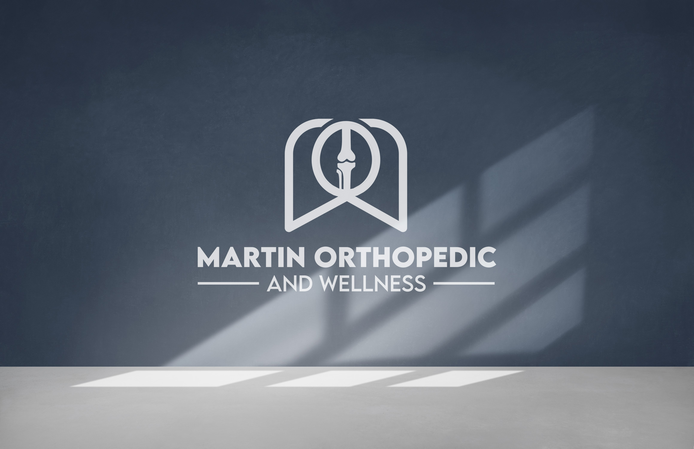
With client feedback in hand, the second concept from the initial logo options immediately stood out. It captured the essence of the brand so effectively that no adjustments were needed. The client approved it in one go, confident in how it conveyed both the sleek professionalism and holistic appeal that define Martin Orthopedic and Wellness.
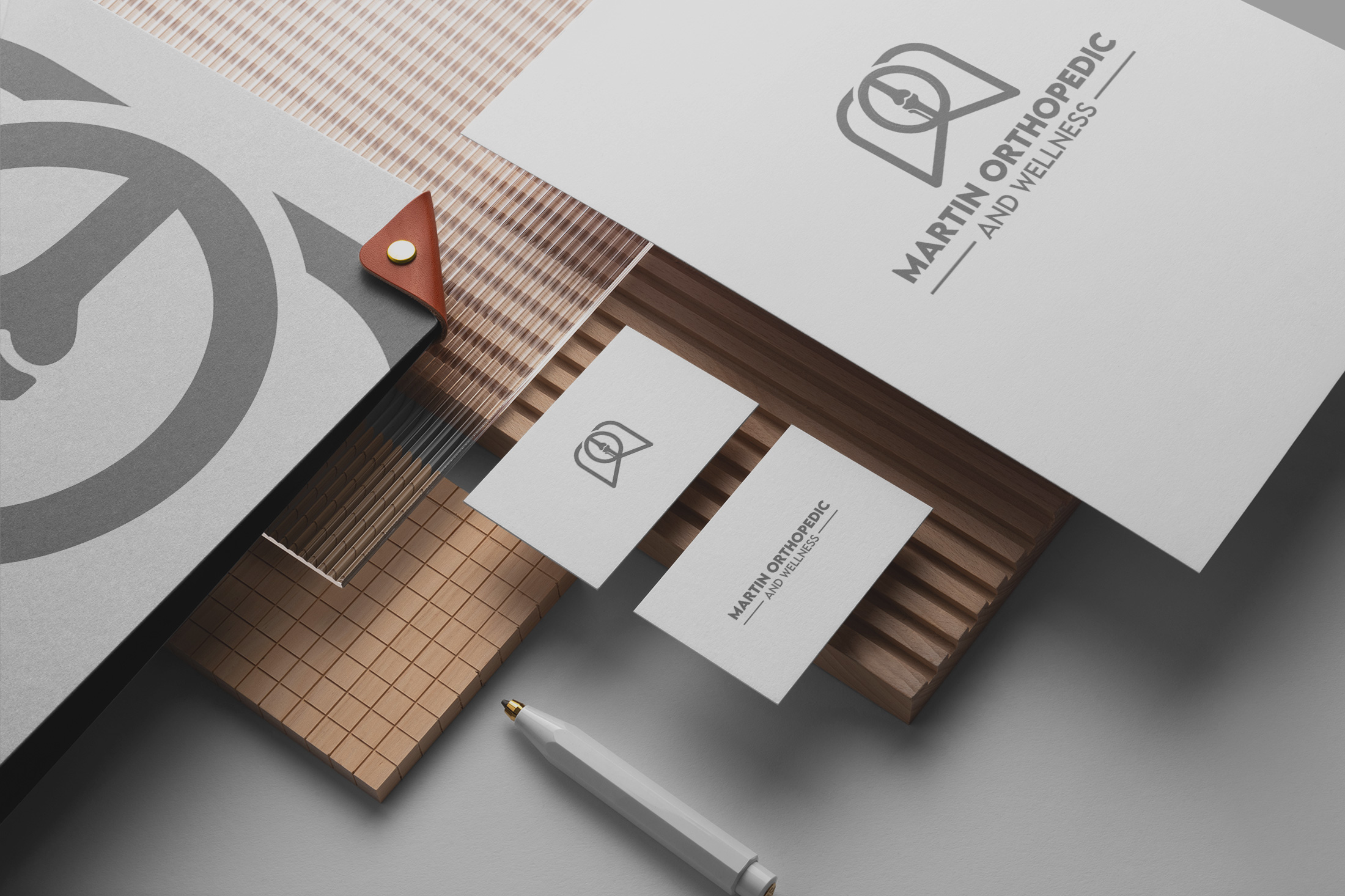
Final deliverables included versatile applications of the logo, ensuring that it felt at home across different platforms and materials—from business cards to office decor.
A Future Defined by Holistic Care
Martin Orthopedic and Wellness is more than a brand, it is a narrative. It tells a story of commitment to health and the power of holistic practices working alongside modern medicine. The logo, now firmly integrated into all aspects of the brand, stands as a testament to thoughtful design that aligns perfectly with brand ethos. As they continue to grow, this visual identity will serve as a touchstone for all future endeavors, reinforcing their mission to help patients "feel good again."
Start your brand journey today.


