Crafting Minimalist Excellence: The Visual Odyssey of Optimal's Logo Design
Explore Optimal's path to an elegantly minimal logo, echoing their career-accelerating services. Discover our creative design process and challenges faced.
In the fast-paced world of career services, Optimal stands as a beacon of simplicity and excellence in their offerings. Known for providing high-caliber CV and career services under the slogan "Accelerate Your Career," Optimal approached our creative design agency with a clear vision for their brand's identity. The challenge was to encapsulate the company's core values of elegance, minimalism, and corporate professionalism into a single logo design.
Understanding Optimal's Vision
Optimal serves a dynamic clientele eager to enhance their professional journey, and their brand needed a visual symbol that echoed this aspiration. The directive from Optimal was precise: a minimalist and elegant design, using the entirety of the word "Optimal" in lowercase. They envisioned a color palette that included grey (#8c92ac), light blue (#99ccff), medium blue (#2a577d), and terracotta (#FF6666), reflecting a modern and approachable aesthetic.
Initial Design Concepts
The design team embarked on crafting a variety of concepts that aligned with these instructions. Early iterations presented to Optimal included:
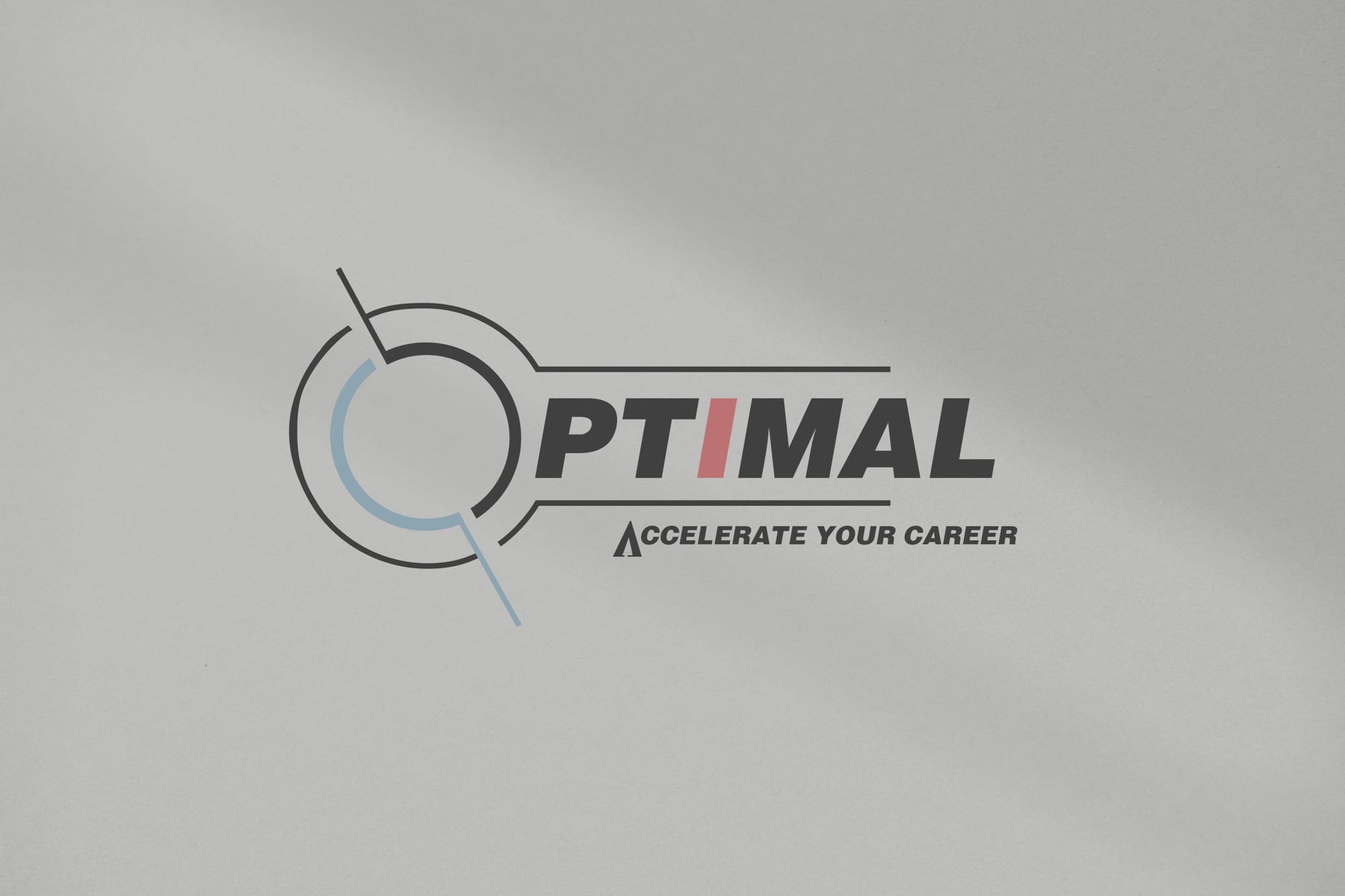
While the designs were well-received, Optimal felt they did not perfectly capture the minimalist essence they desired. Feedback highlighted a preference for cleaner lines and simpler elements, particularly emphasizing the use of lower case letters and two complementary colors, dismissing any use of black.
Refining the Design
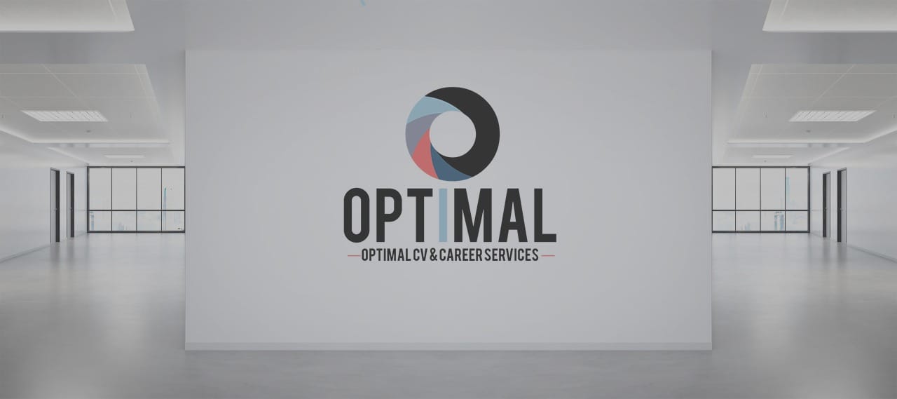
Taking this feedback into account, our team refined the concepts. A significant aspect of the updated designs included a "forward spinning circle" integrated into the letter "o." This element symbolized forward momentum—a nod to Optimal's mission of accelerating careers. The revised concepts presented to Optimal were significantly more aligned with their vision:
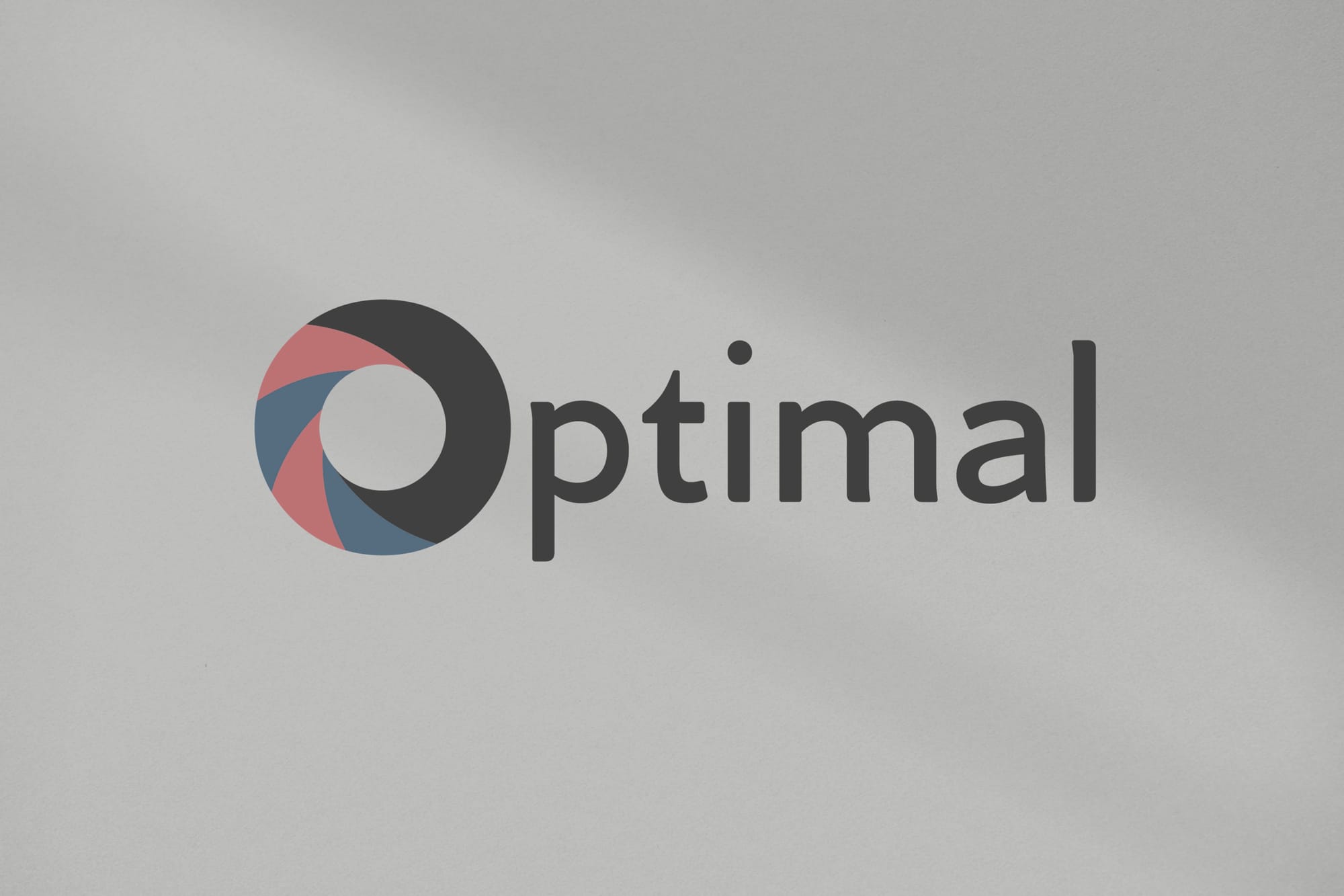
Yet, another refinement was needed. The client requested adjustments ensuring the uniformity of the typeface, maintaining all characters in medium blue (#2a577d), with the circle in the "o" retaining only two colors— medium blue and terracotta.
The Final Outcome
The focus on simplicity and brand consistency paid off beautifully. The final designs demonstrated an exemplary balance between minimalist design and brand representation:
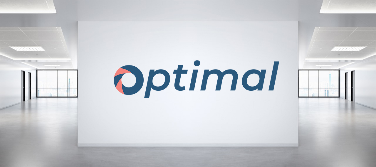
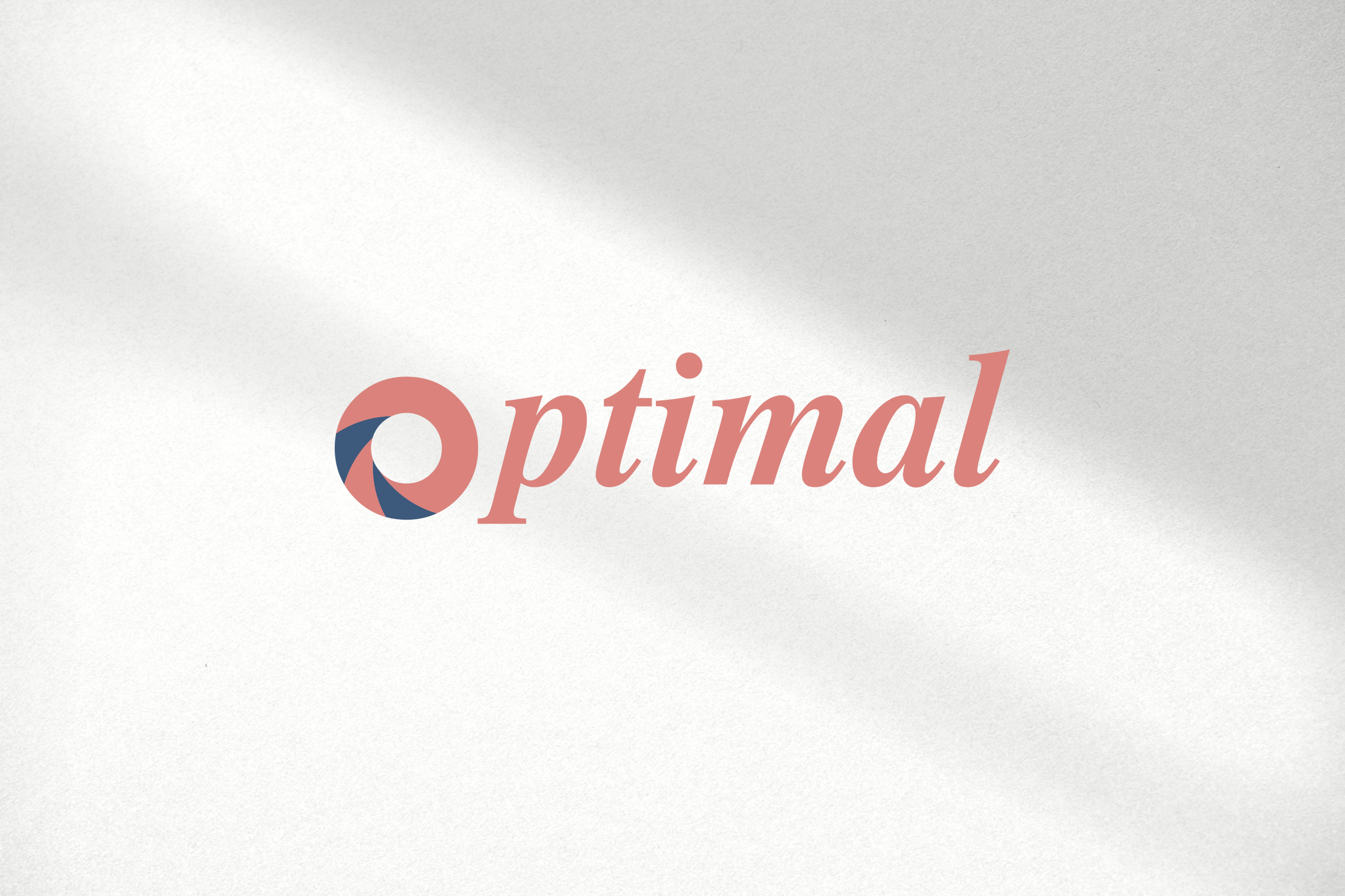
To see the logo in practical settings, various mockups were developed:
These placements help convey the brand's identity in real-world applications, supporting its role as a trusted partner in career enhancement. Each touchpoint speaks to the core values Optimal holds dear - simplicity, elegance, and professionalism.
Concluding Thoughts
The collaborative journey with Optimal underscores the importance of iterative design in meeting client needs. Through careful attention to detail and a steadfast commitment to aesthetic goals, we've crafted a logo that's not only visually appealing but resonates deeply with Optimal's mission and market presence.
Start your brand journey today.
