Crafting Identity: The Visual Journey of 'Tree' by Creative Titans
Explore the creative journey behind the 'Tree' logo, from initial concepts to final approval, harmonizing brand identity with visual storytelling.
In the world of branding, a logo serves as the emblematic fingerprint of an organization. It encapsulates core values, identity, and aspirations within a singular visual manifestation. When the creators behind the 'Tree' logo embarked on their journey, their mission was clear: create not just a logo but a visual narrative that encompassed the essence of a brand eager to flourish.
Understanding the Brand Essence
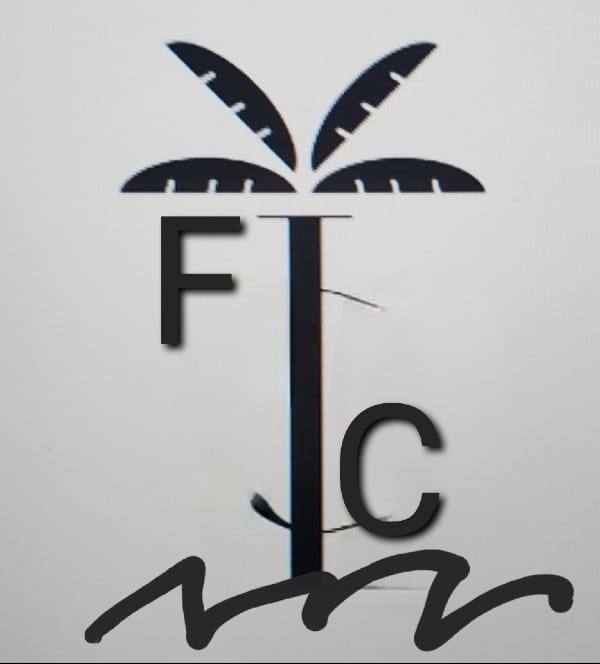
The client approached the creative team with a succinct yet imaginative brief. The focus was a ‘Palm tree’ integrated with the letters 'F' and 'C,' accompanied by waves at the bottom. Black was chosen as the primary color, embodying sophistication and timelessness. This concise palette offered a blank canvas on which meaning could be layered, drawing from nature while maintaining a modern appeal.
Initial Conceptual Exploration
Starting with a sketch provided by the client, the creative team ventured into producing multiple iterations to embody the specified elements. Each concept was molded to reflect the fluidity of waves and the resilience of a tree, while the letters 'F' and 'C' sought integration without compromising legibility.
Refining the Visual Narrative
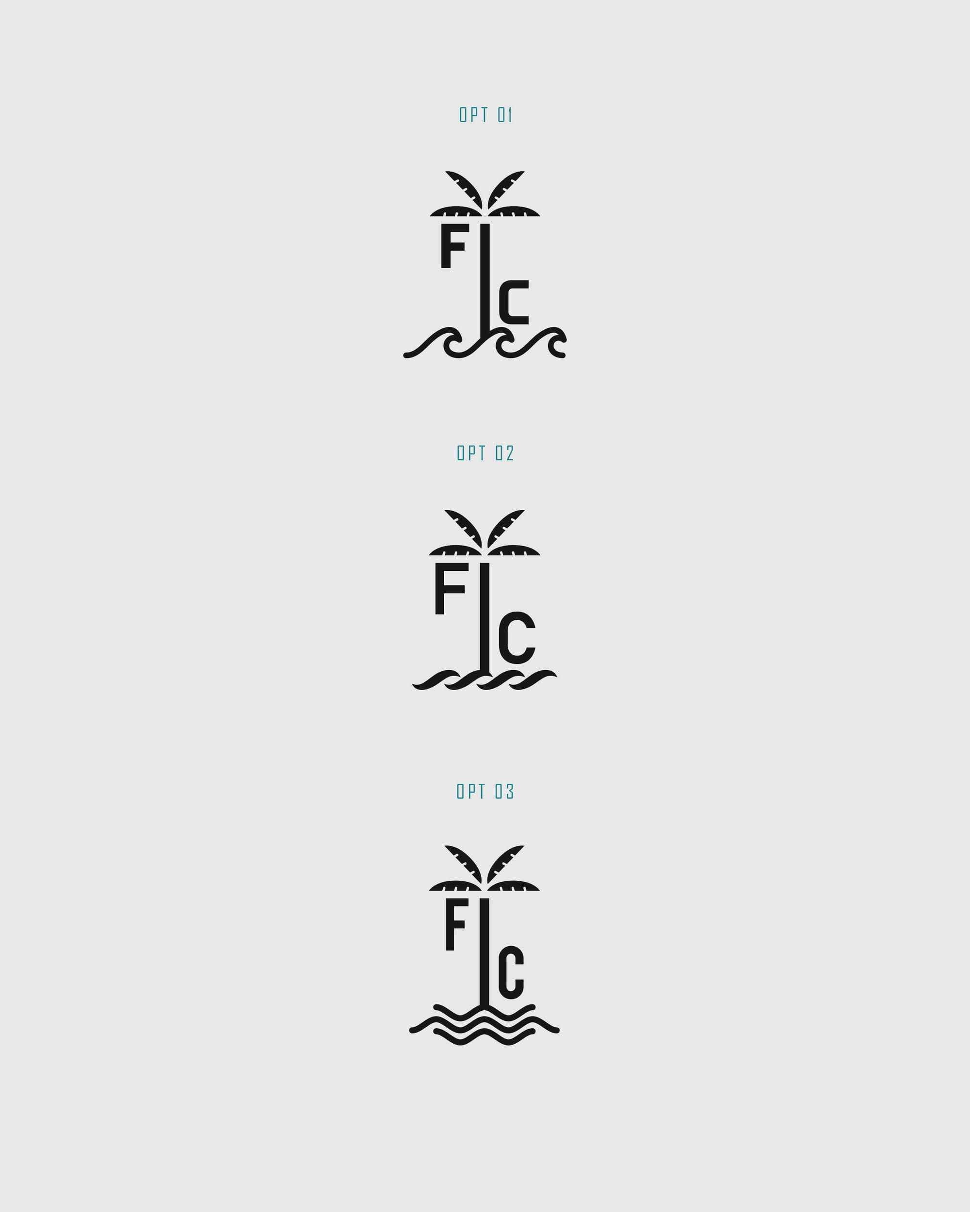
The first wave of design options was met with enthusiasm, particularly Options 1 and 2, but led to requests for further refinement. The client desired a font variation and an evaluation of how the letters interact with the tree. Inspired by their feedback, the design team added dynamic interactions in the form of diagonal line cuts and touched letters, resonating with the client's vision for integration.
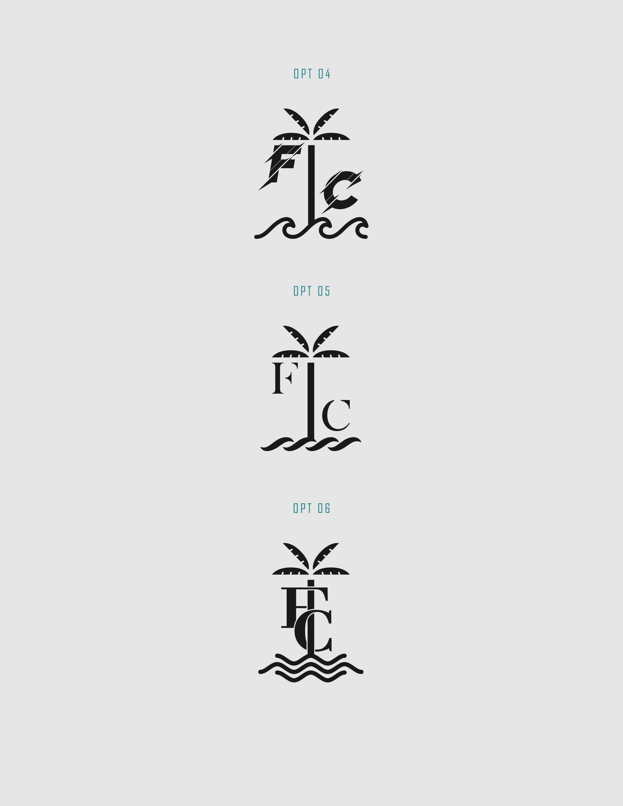
After carefully considering each visual effort, Option 6 emerged as the winning logo. Its refined balance between visual complexity and straightforward symbolism resonated deeply, becoming the approved emblem for the brand.
Font Choice: Abhaya Libre Extra Bold
Font choice in any visual identity can elevate narrative subtly yet significantly. The selection of Abhaya Libre Extra Bold provided gravitas, enhancing the expressive potential of the 'Tree' logo. This typeface achieved harmony between tradition and modernity, acting as a vessel for storytelling through its bold natural presence.
Real World Application
The finalized logo brings the ethos of the brand into public spaces, adorning everything from shop boards and T-shirts to caps and cars. Each application transcends functionality, reinforcing the identity established by the emblematic tree.
The creative journey undertaken in crafting the 'Tree' logo reflects the intricacies of visual storytelling. It highlights not just the collaboration between client and design team but also the influence of strategic choices in shaping a brand's perception. In the dance between palm trees and ocean waves, the logo conjures imagery of enduring elegance and unity.
Start your brand journey today.
