Crafting Identity: The Story Behind Watershed Outdoor Living's Logo Transformation
Explore the journey of creating Watershed Outdoor Living's logo, encapsulating their unique identity in the outdoor living industry.
The logo is the face of a brand, offering the first glimpse into its essence and identity. For Watershed Outdoor Living, renowned for its specialization in natural ecosystem water features and outdoor spaces, the logo journey was both experiential and evocative.
Navigating through myriad possibilities, from hand-drawn sketches to polished mockups, the design narrative for Watershed Outdoor Living encapsulates more than creative exploration.
Design Genesis
The embarkation for the Watershed Outdoor Living's logo commenced with a simple yet clear vision. The client aimed for a minimalist, modern logo reflecting their industry and global ethos.
The challenge was to encapsulate the balance between nature and creativity. From the outset, the emphasis was laid on amplifying the "WATERSHED" element, propelling the essence of water's life‑giving properties into the spotlight.
Guiding Inspiration
Initial inspirations drew from drawings, provided by the client, which captured the essence they wanted. These weren't to be replicated, but rather served as a directional impetus for the creative team.
Seeking originality, the design team immersed itself in crafting hand‑drawn sketches. These laid a groundwork for refining an emblem that captures the authenticity of Watershed Outdoor Living’s services.
The ensuing renderings further honed the visual vocabulary, offering initial versions for client feedback.
Iterative Refinement
While the inaugural designs set the stage, the client sought refinements to evoke a deeper resonance.
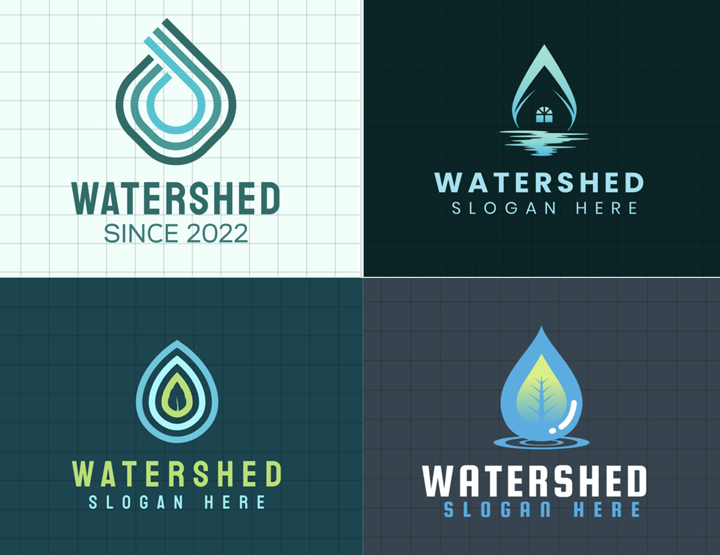
Feedback highlighted a preference for designs to embody a water drop shape, enhancing the visual representation of watershed elements.
Simultaneously, the exploration of modern fonts was essential to match the logo's contemporary aesthetic. The design team promptly rose to the challenge, showcasing multiple renditions that catered to these specifications.
Final Evolution
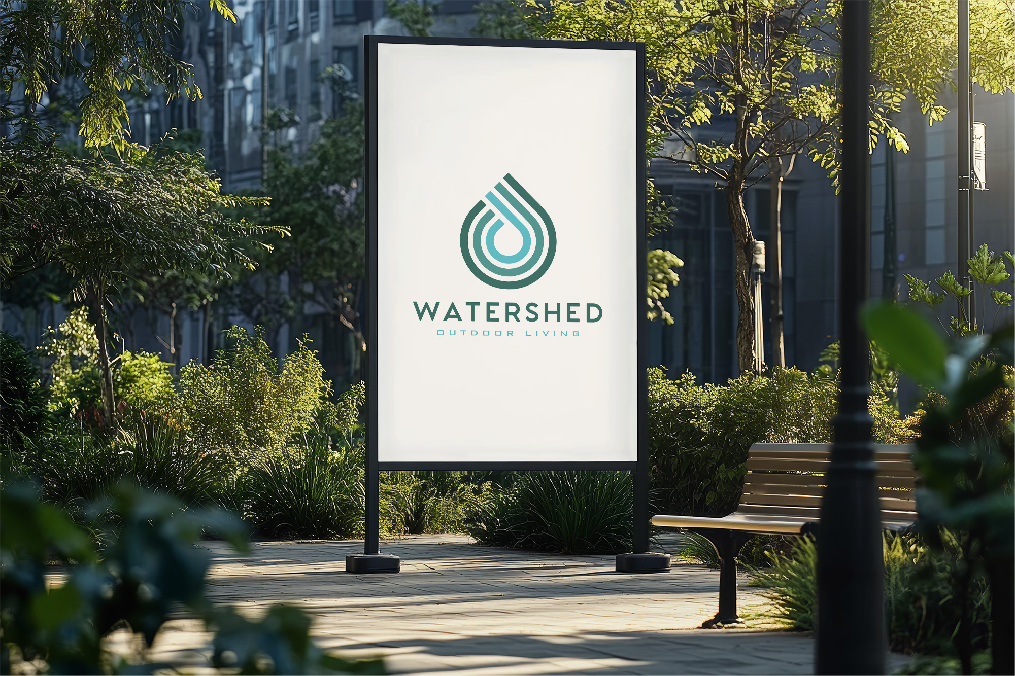
The culmination of this creative voyage of Watershed Outdoor Living resulted in a logo option resonating with the client’s vision.
Choosing the modern font Futura, the design captured the spirit of outdoor sanctuaries. As modern design cue points define the logo, such as the water drop shape, it embodies their nature‑centric approach.

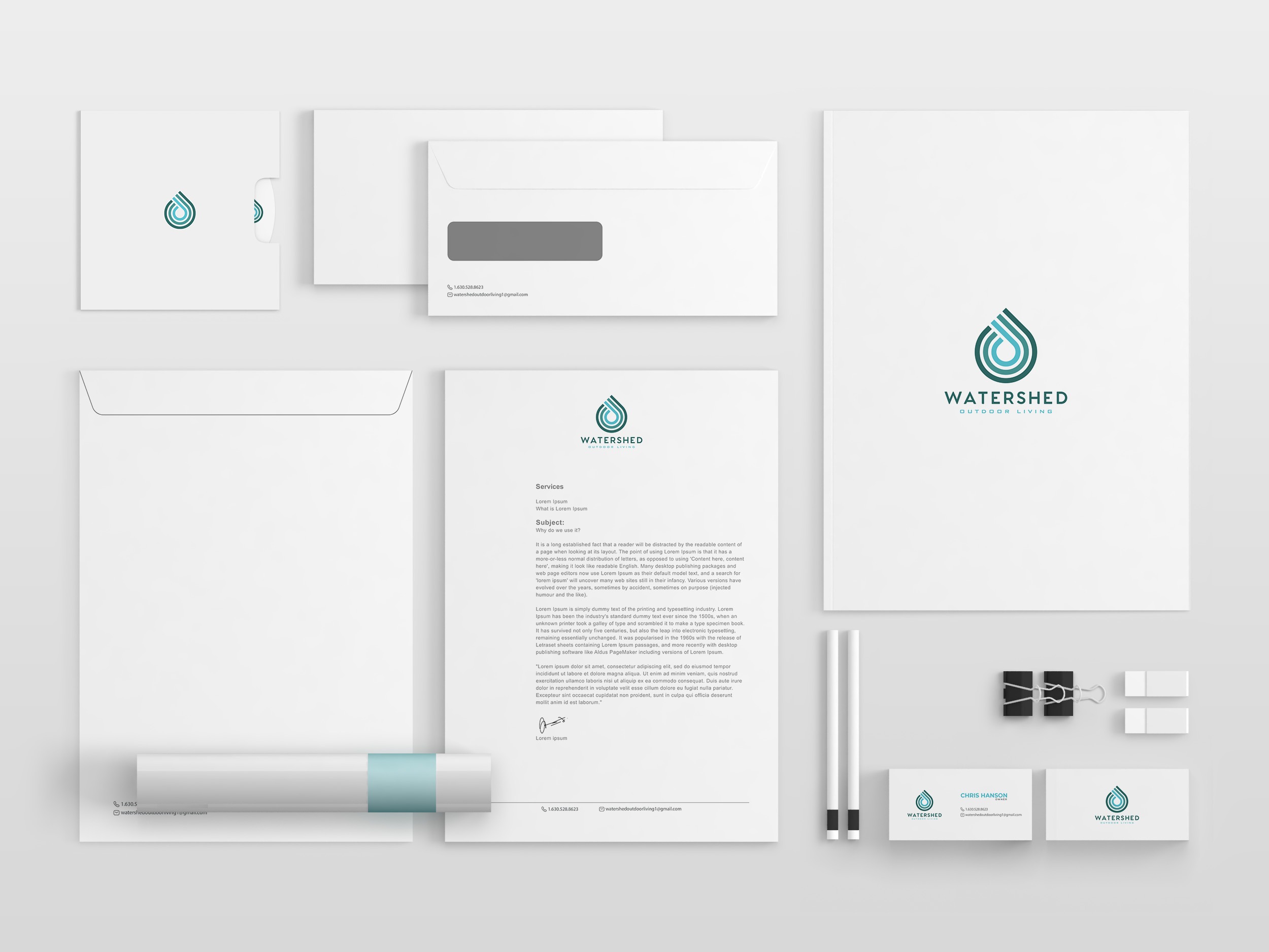
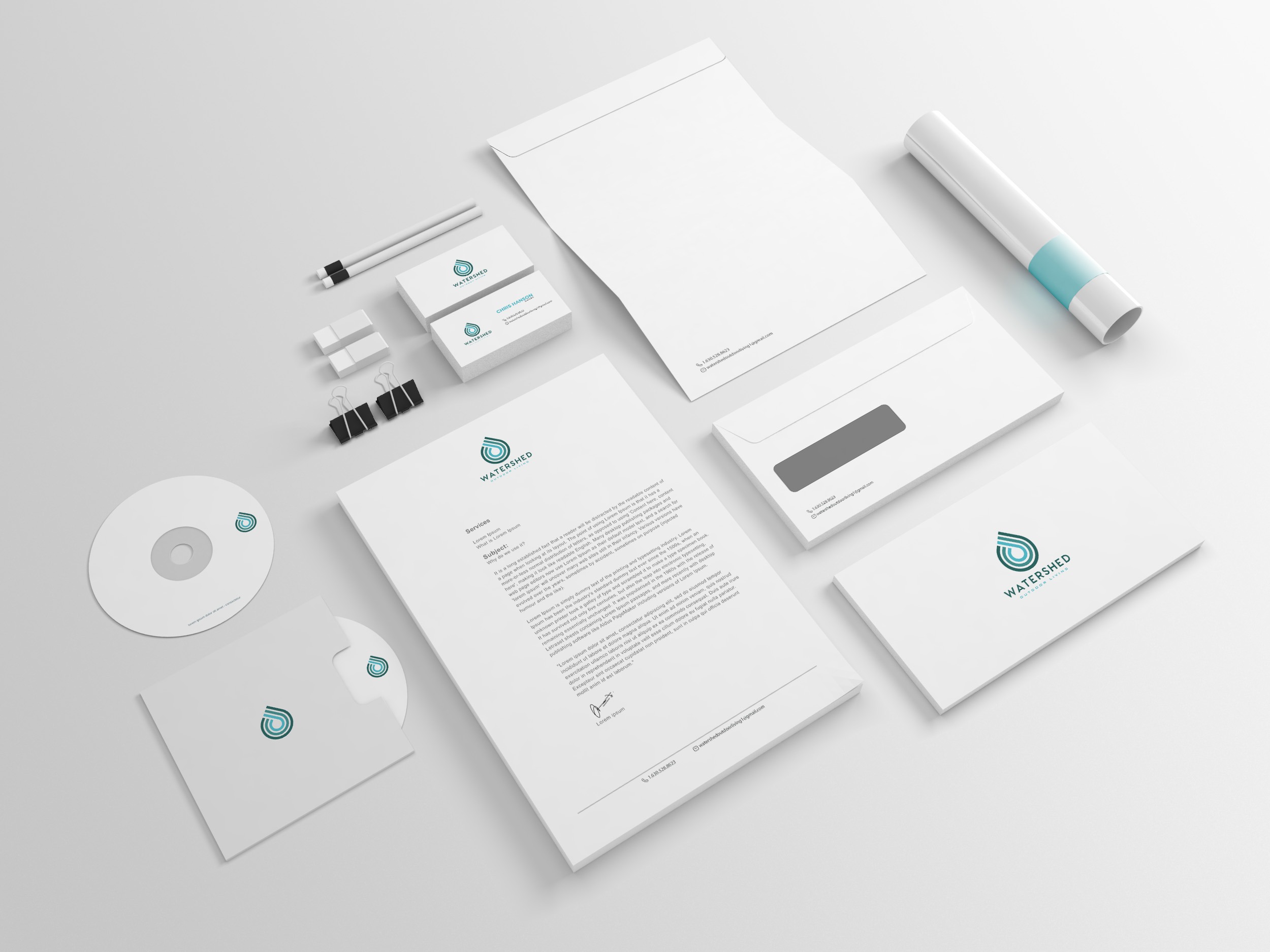
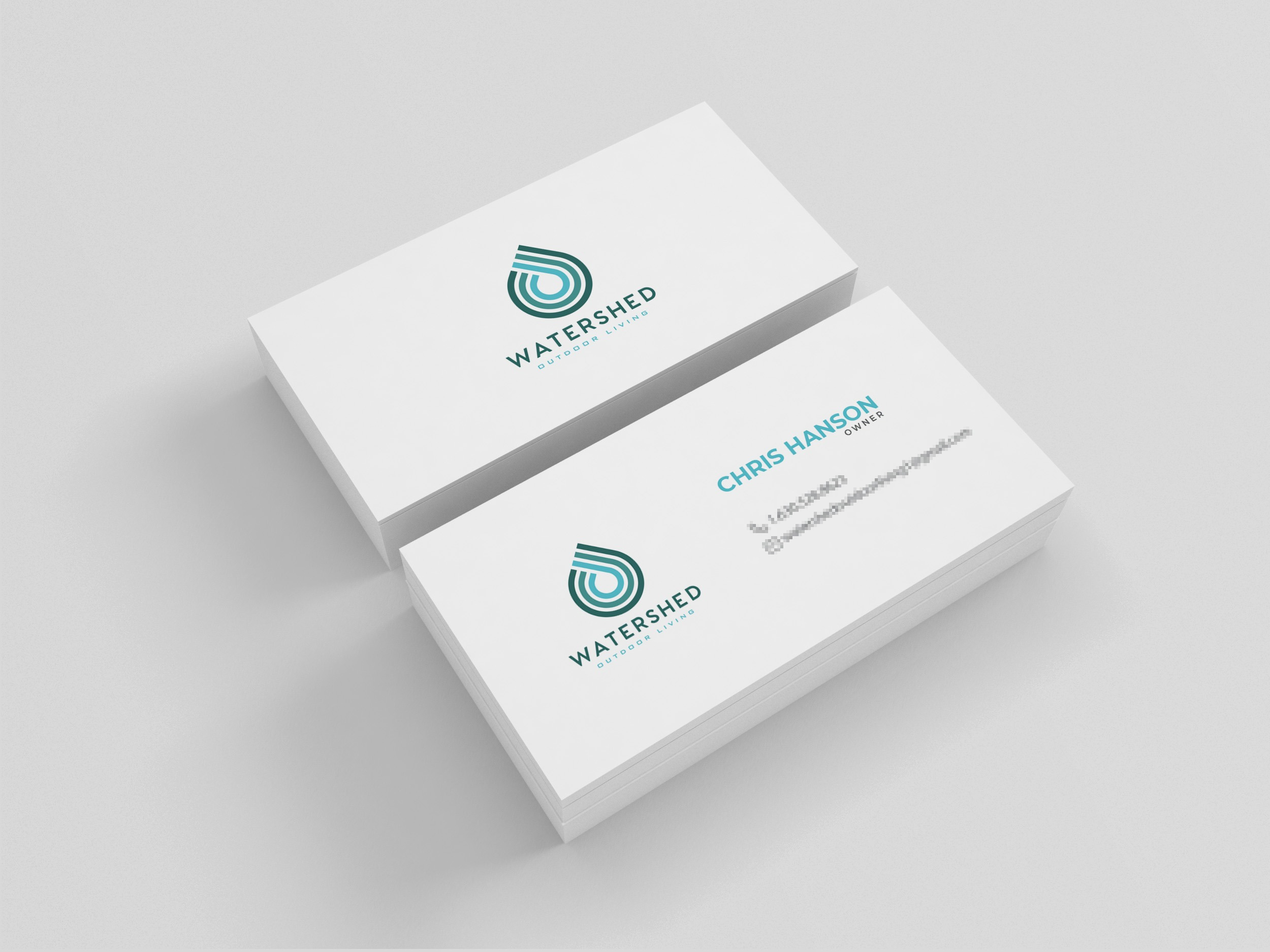
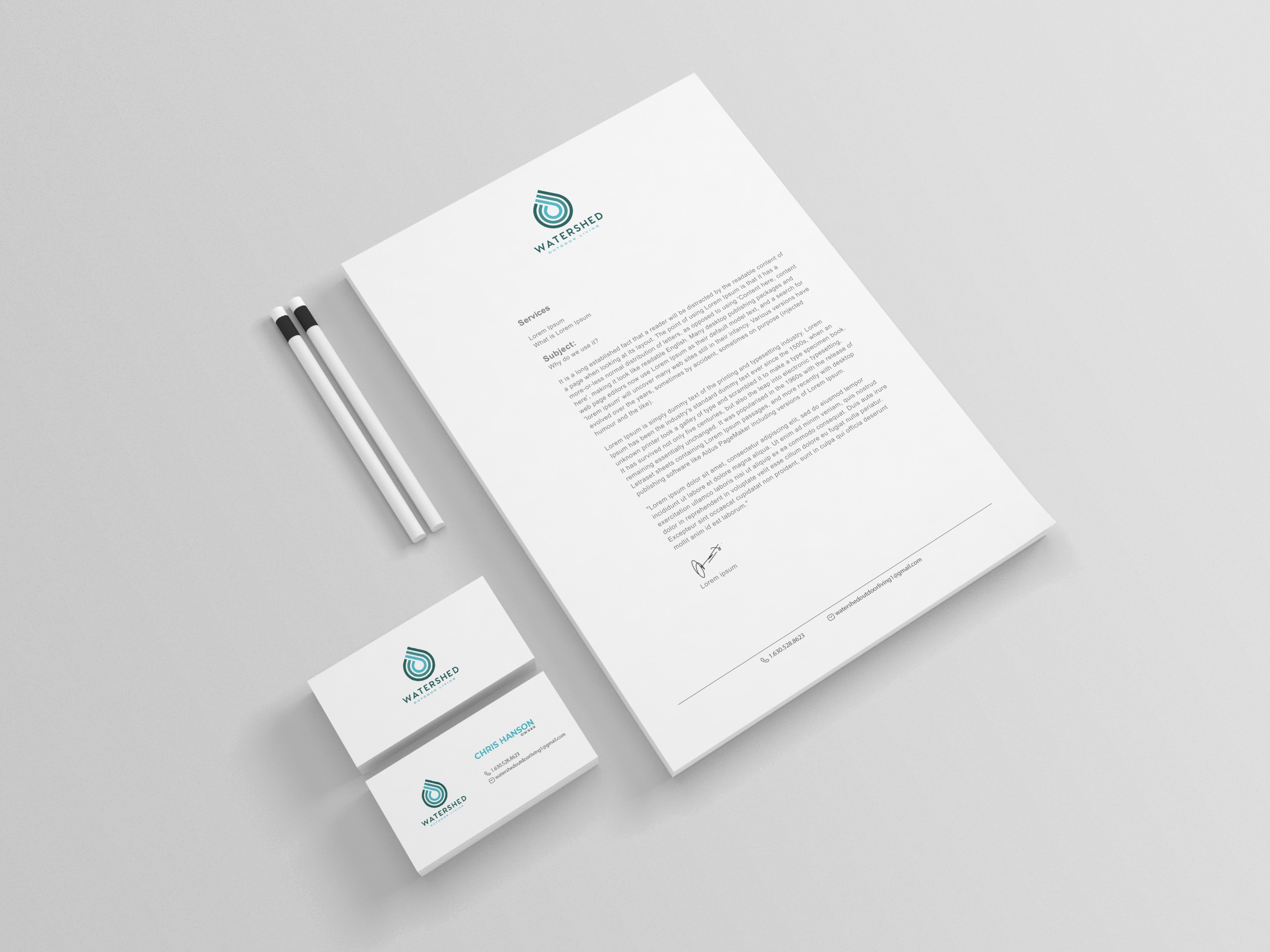
As branding ensued, the philosophy of “Mother Nature reimagined” echoed through business cards and branding sheets, mapping a unified identity across touchpoints. With branding now cemented, the logo emerged as a visual cornerstone for the company, serving as a badge of trust and innovation.

Conclusion
The Watershed Outdoor Living logo exemplifies the synthesis of client's vision with design ingenuity.
Drawing from the essence of water and nature, it brilliantly reflects the craftsmanship at the heart of Watershed Outdoor Living. Reimagining Mother Nature in the vivid strokes of logo design, this identity speaks boldly, inviting audiences to experience outdoor living spaces that resonate deeply with the natural world.
Start your brand journey today.
