Crafting Identity: The Story Behind Melt for Health Branding
Explore how Melt for Health, a handmade candle charity organization, crafted their bold and minimalist logo through collaboration and creativity.
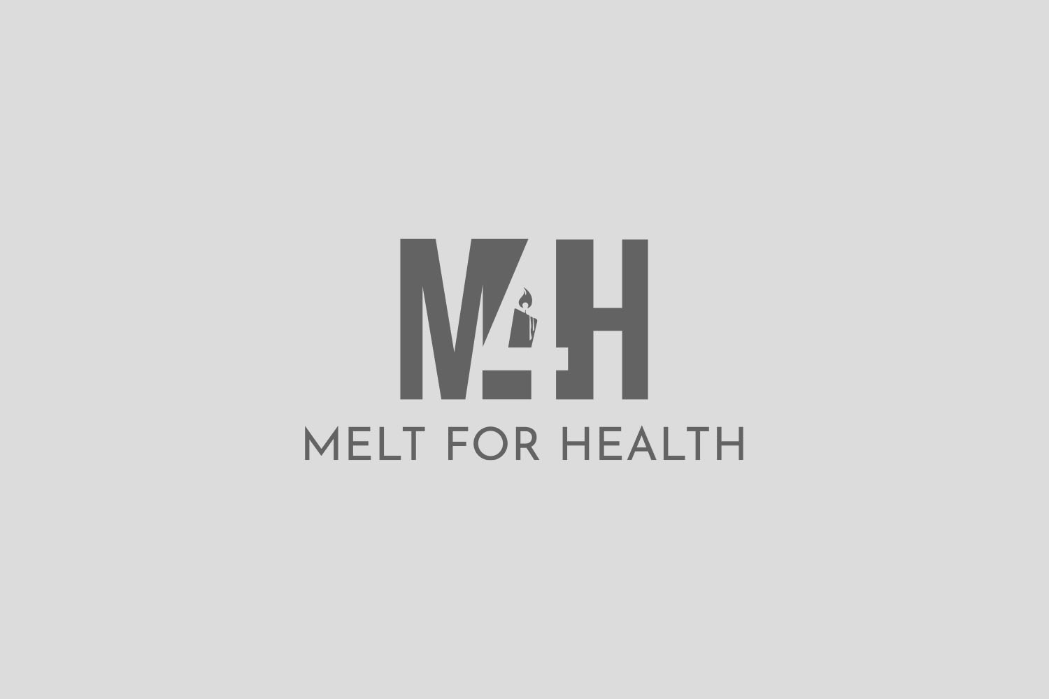
Branding, especially in the charity sector, demands a balance of clarity and emotional connection. This is the journey of crafting a logo for Melt for Health, a handmade candle charity organization with a distinct vision. Their mandate was clear: a minimal yet bold logo that encapsulated the compassion and warmth of their mission.
Understanding the Brief
The client’s initial communication hinted at a strong desire to incorporate simple yet significant elements. They specified colors like black and beige, indicating an aesthetic grounded in understated elegance. The name 'Melt for Health' was to serve as the main design feature while creatively integrating 'M4H' and a candle symbol into the logo.
The fonts mentioned, Archivo Narrow and Assistant, were indicative of a preference for modern, humanist typefaces, bringing in the right blend of professionalism and approachability. Additionally, the client shared a reference image to guide the design team, showcasing their inclination towards abstract designs.
Design Team’s Initial Concepts
The design team promptly responded with three logo variations. Each option was a reflection of the requested minimal yet bold style. Option 1 predominantly featured the desired fonts with a classic composition. Option 2 was more adventurous, giving life to the idea of incorporating a candle within the logo. Option 3 offered a different perspective, merging various elements harmoniously. All designs were presented on a black background, echoing the preference for a dark canvas.


Client Feedback and Adjustments
The initial feedback was enthusiastic and precise. The client expressed admiration for options 1 and 2, appreciating the font choice of option 1 and the candle incorporation of option 2. A blend of both options seemed the way forward.
The conversation turned towards refining the concept, adjusting the thickness of specific line elements, experimenting with the placement of '4,' and repositioning the flame on the letter 'M.' These changes demonstrated the client’s meticulous attention to detail, ensuring that each component of the logo harmonized perfectly.

Achieving the Final Look
Progressing through the feedback loop, the design team diligently addressed each modification. They successfully combined the design approaches to form a cohesive logo. The final layout encapsulated the preferred typefaces with an artfully integrated candle. It resonated simplicity yet carried significant weight emotionally—perfectly aligned with the brand’s ethos.
The final design was submitted for approval, showcasing a narrower candle administered within the structure, gracefully aligned with the letter '4.' This creative iteration satisfied the client’s vision, melding the organization’s purpose into visual identity effortlessly.

Application and Impact
The true testament to a successful logo is found in its application, where theory meets reality. The tangible manifestation of Melt for Health’s logo, elegantly printed on candle packaging, attracts patrons, contributing to the non-profit cause effortlessly. The application embodies both aesthetic appeal and functional clarity, elevating the brand in the social enterprise sector.
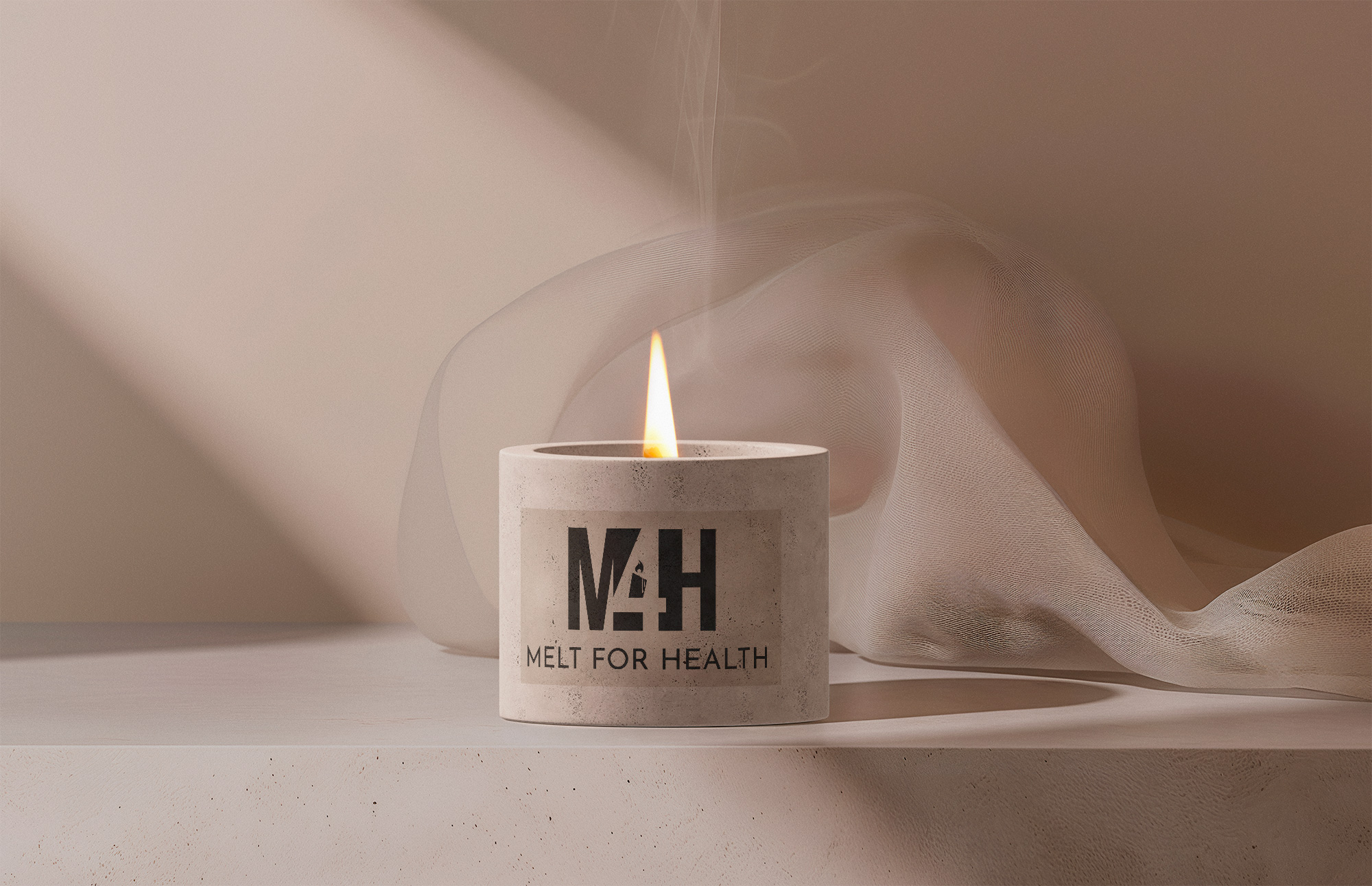

This logo journey illuminates the essence of design thinking, where a logo becomes a narrative of shared values and identity. Melt for Health now stands as a beacon in the charitable landscape, serving not only as a brand mark but as a symbol of hope and warmth.
Start your brand journey today.


