Crafting Elegance: The Visual Identity of D&S Strachan
Explore the story behind the quick and effective creation of D&S Strachan's brand identity, a testament to the power of simplicity and design alignment.

In the realm of branding, few stories capture the elegance and immediacy of success like the creation of the visual identity for D&S Strachan. Without the labyrinth of iterations or extensive revisions, the design process was both brief and exceptional, facilitated by a nuanced understanding of the client's vision and preferences.
The Client's Vision
D&S Strachan approached the design team with aspirations to create a logo that embodied simplicity and elegance in its purest form. While the client opted for a succinct communication style, defined parameters were set: the logo should include royal blue and white with an additional all-black version to ensure versatility across different applications. No slogan was required, allowing the focus to remain solely on the logo's visual impact.
Initial Designs and Immediate Resonance
Upon presenting two initial variations, the logo resonated with the client in a nearly unprecedented way. The initial designs captured the brand’s ethos perfectly, leaving the client with no further revisions. The alignment of expectations and outcomes stands as a testament to an understanding deeply rooted in the core values of D&S Strachan.

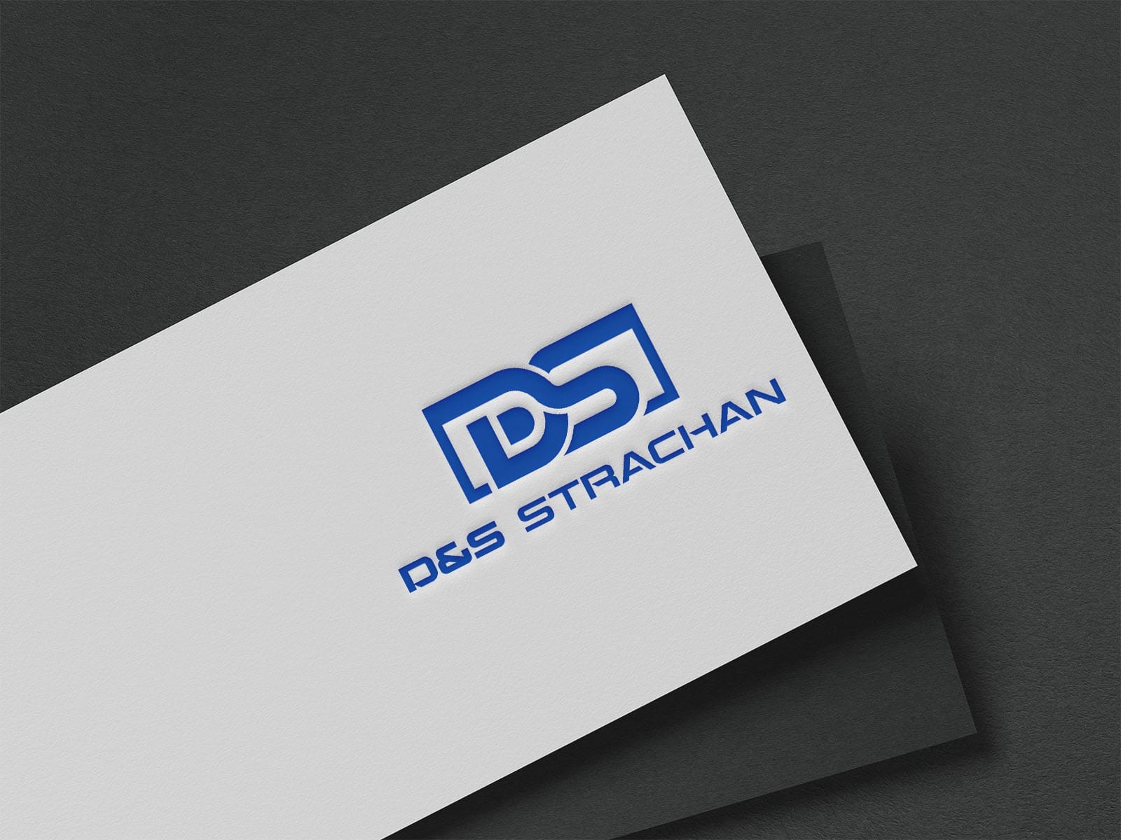
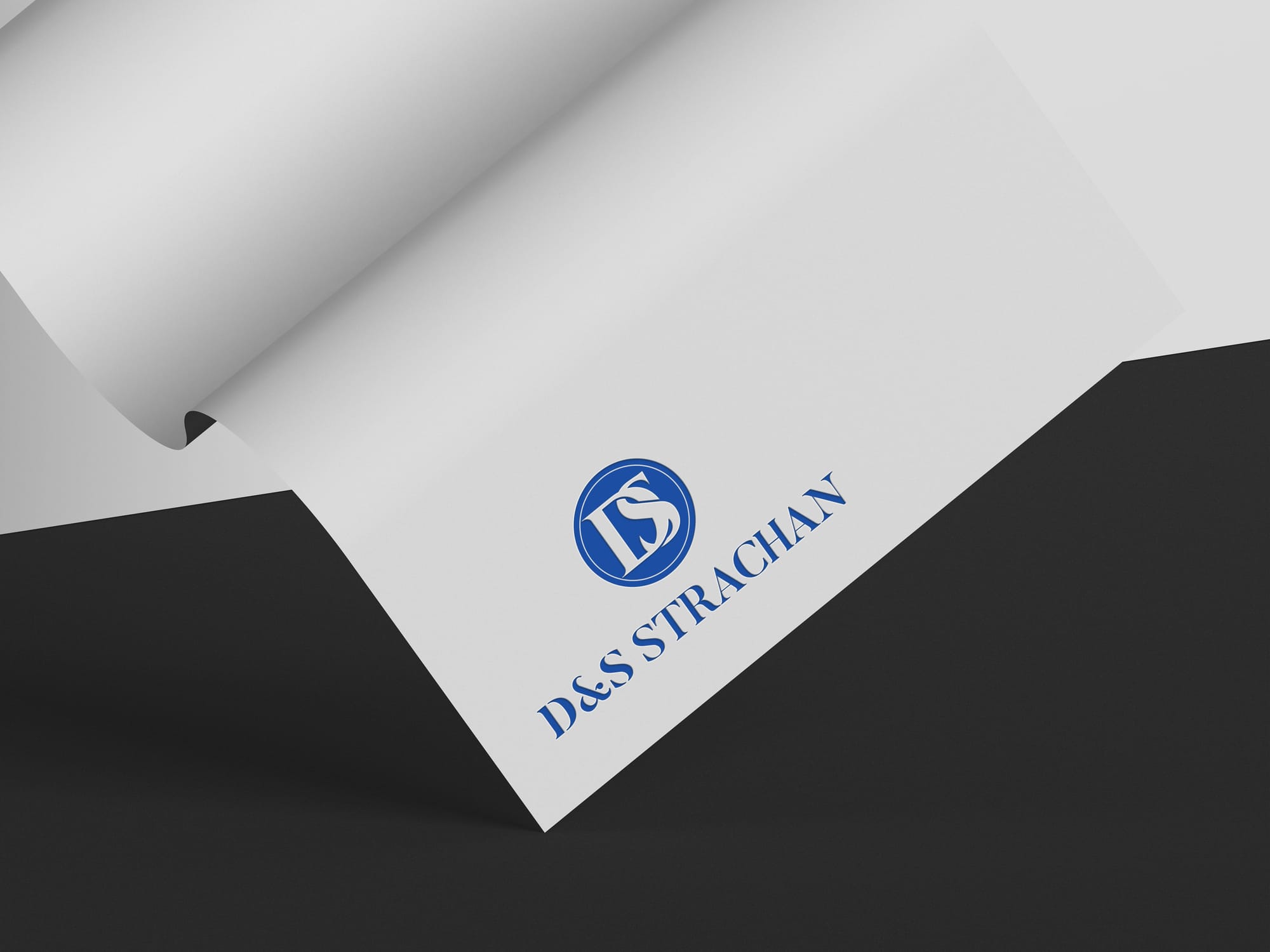
The logos’ minimal aesthetic with thoughtfully curated aspects like color and type reflect the qualities of trust and excellence qualities that are presumably at the core of D&S Strachan’s business model and client service promise.
Narrative Style: When Vision Meets Execution
The logo resonated with the client instantly a rare and rewarding moment in the design process. Upon the very first presentation, the client expressed complete satisfaction, noting that the logo captured their vision perfectly without the need for any revisions. Its balance of simplicity, symbolism, and brand relevance struck exactly the right chord. The seamless approval not only reflected the strength of the creative alignment but also underscored how effectively the design translated the client’s goals into a timeless and impactful visual identity.
Design Elements: Font and Color
The final logo utilizes the Aspire font, enhancing its sleek, contemporary character. This choice of typography instills a sense of refined modernity that seamlessly translates the brand's idiosyncratic story into visual form.
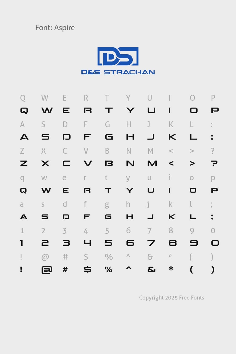
Royal Blue serves as the primary hue within the logo design, invoking a sense of regal stability and professionalism. Paired with its monochrome counterpart, the design maintains its elegance across various mediums, ensuring that the reputation of D&S Strachan is upheld regardless of its application.
Final Deliverables and Brand Applications
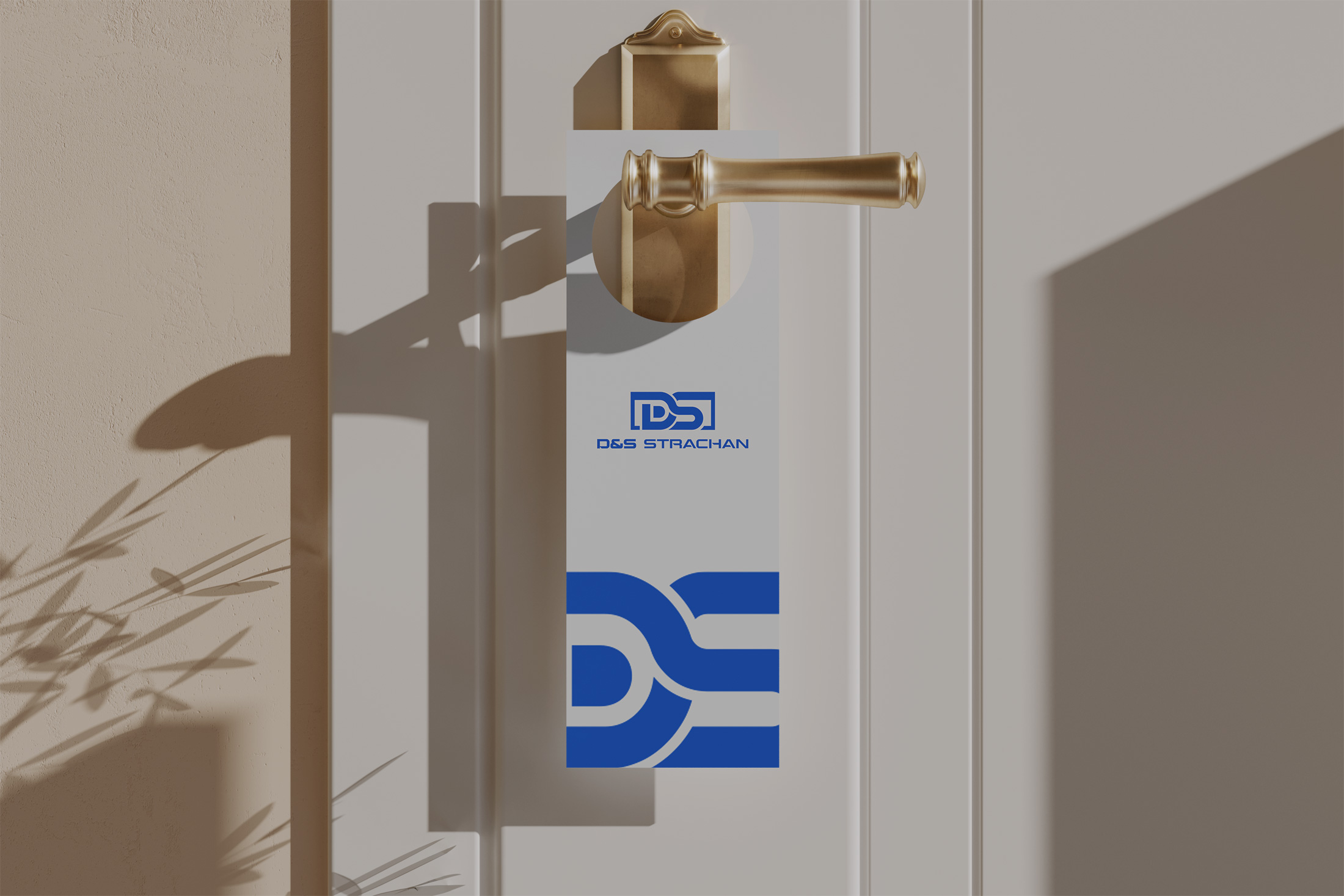
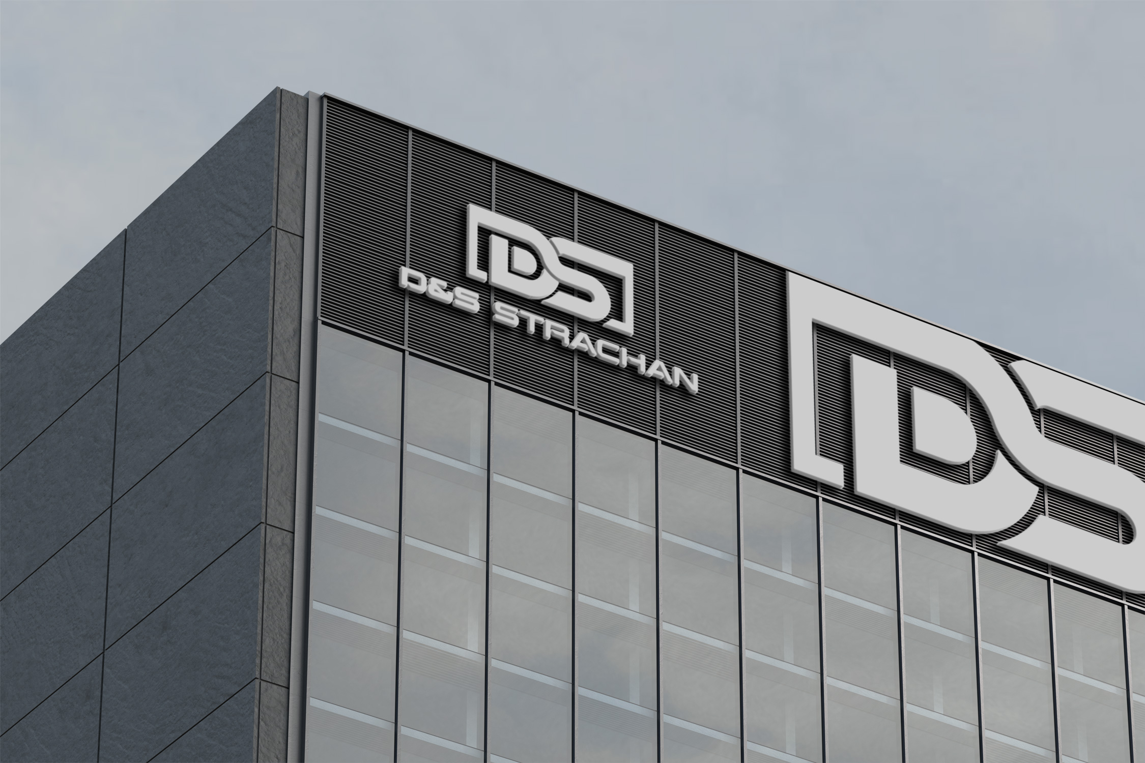
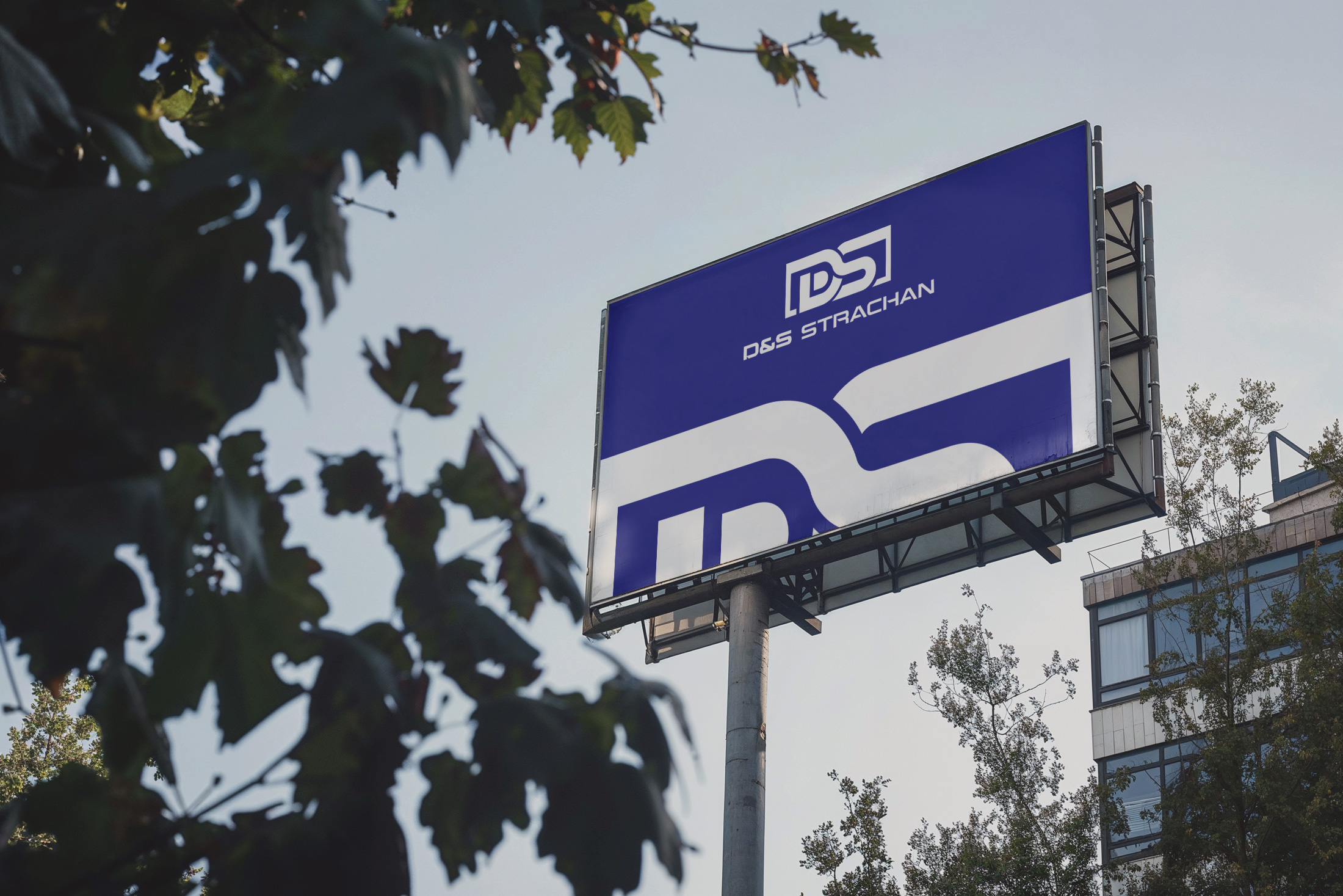
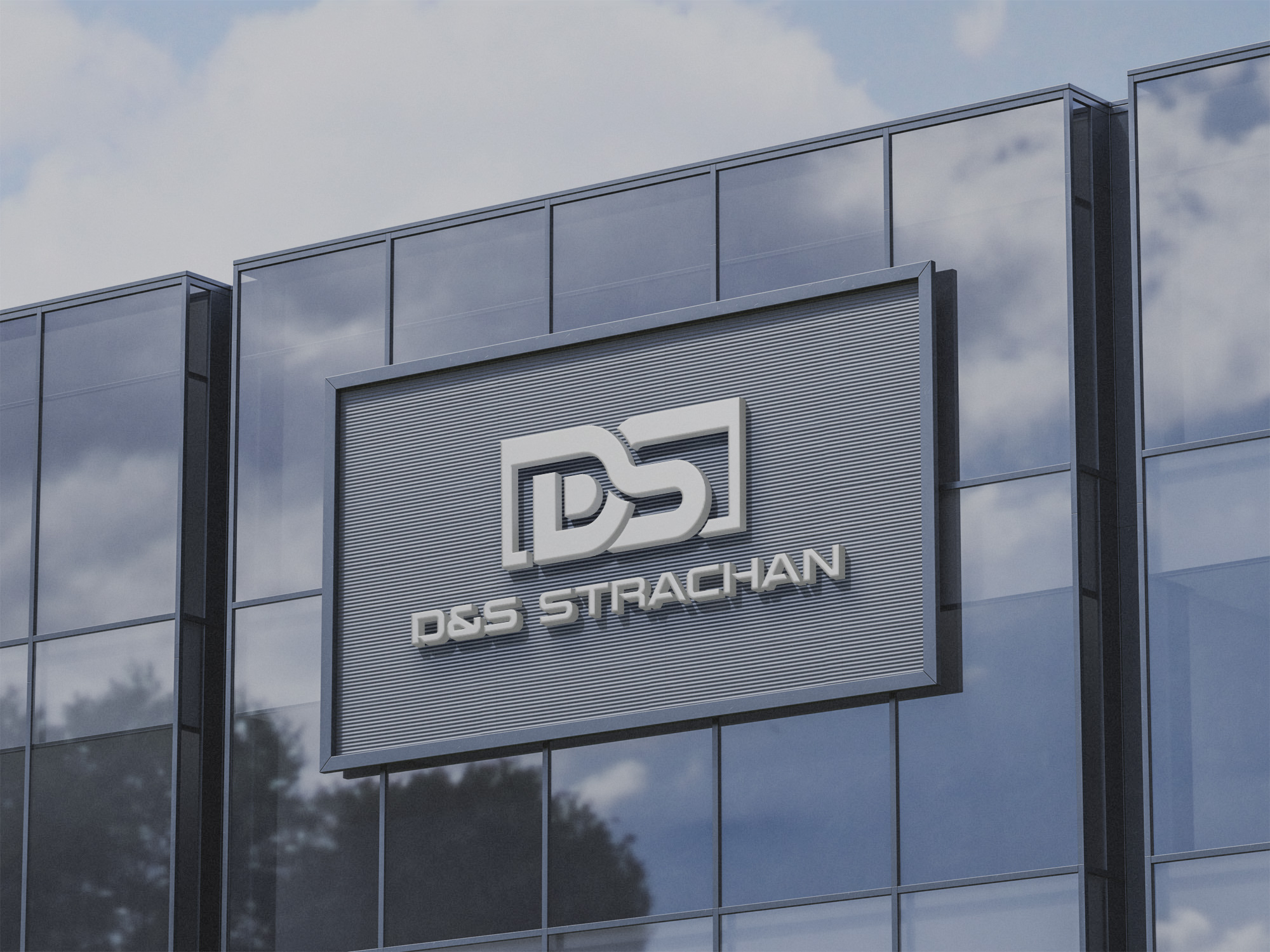
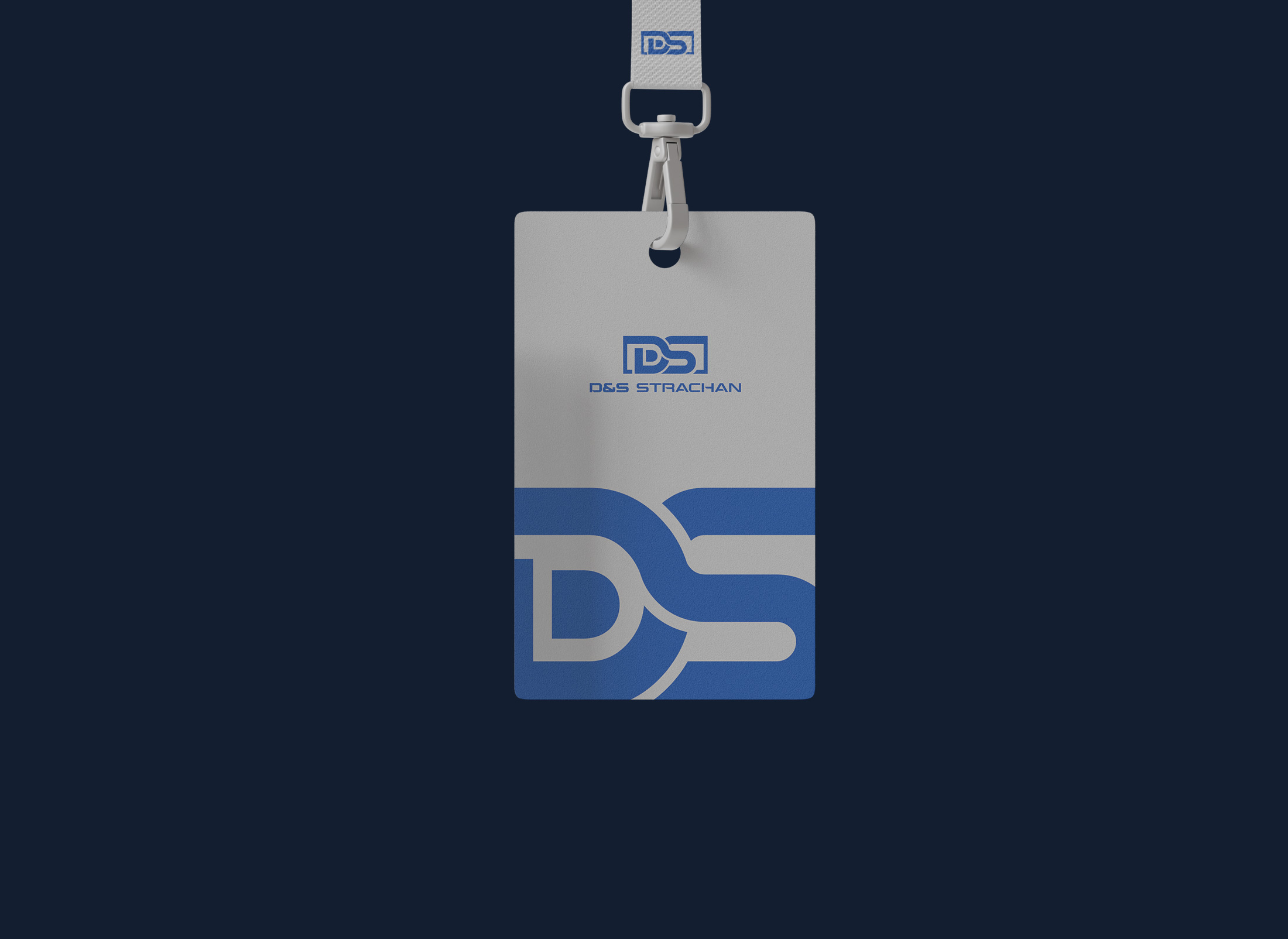
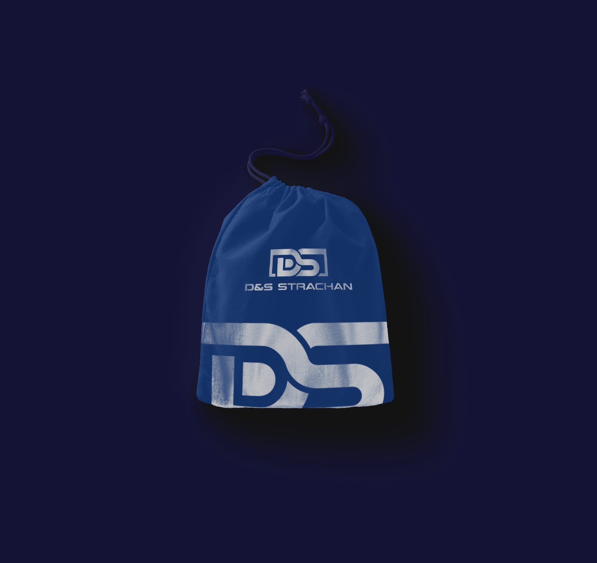
The brand application through different mockups demonstrates the logo's robust adaptability across intended uses. From billboards to business cards, the logo's versatility is showcased, reinforcing the brand's identity wherever it appears.
Conclusion
While the market introduces new brands relentlessly, only a few succeed in engraving themselves within their target industries as swiftly as D&S Strachan. Through its expertly crafted logo, the company makes a pronounced statement of simplicity, endurance, and brand integrity, welcoming an era where less might truly be more.
Start your brand journey today.


