Crafting Elegance: The Myllier Logo Journey
The meticulous rebranding journey of Myllier, an avant-garde online boutique, as it redefines elegance and craftsmanship.

The world of e-commerce is as dynamic as it is competitive, especially in the realm of high-end fashion accessories. Enter Myllier, an online boutique that's determined to bring an elevated sense of sophistication and craftsmanship to watches, sunglasses, and jewelry. With a brand ethos centered around the philosophy of 'see and be seen', Myllier positions itself in the upper echelons of the market, focusing on quality and impeccable design.
Founded on the principles of elegance and meticulous craftsmanship, Myllier sought to create a logo that encapsulated these ideals. The brand embarked on a logo design journey that involved several iterations, driven by the desire to make a memorable impact in the luxury accessory market.
The Design Brief: A Touch of Elegance
The initial brief for the Myllier logo was clear yet ambitious: design a black logo that could incorporate a subtle hint of an accent color. This color, envisioned as a deep and rich red, violet, or pink, was to be used sparingly, perhaps in a part of one letter, to convey sophistication without overwhelming the primary black motif.
The client also drew inspiration from logos previously designed by the agency, notably 'Monarch' and 'Wavvis'. These logos had qualities that caught the client's eye, primarily due to their distinctive colors and elegant design language.
First Steps: Initial Concepts
The design team responded with several logo concepts. These designs aimed to balance simplicity and elegance while presenting a brand image that is both contemporary and timeless.
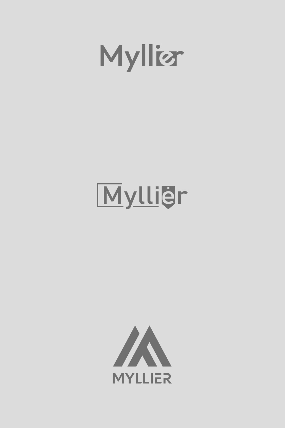
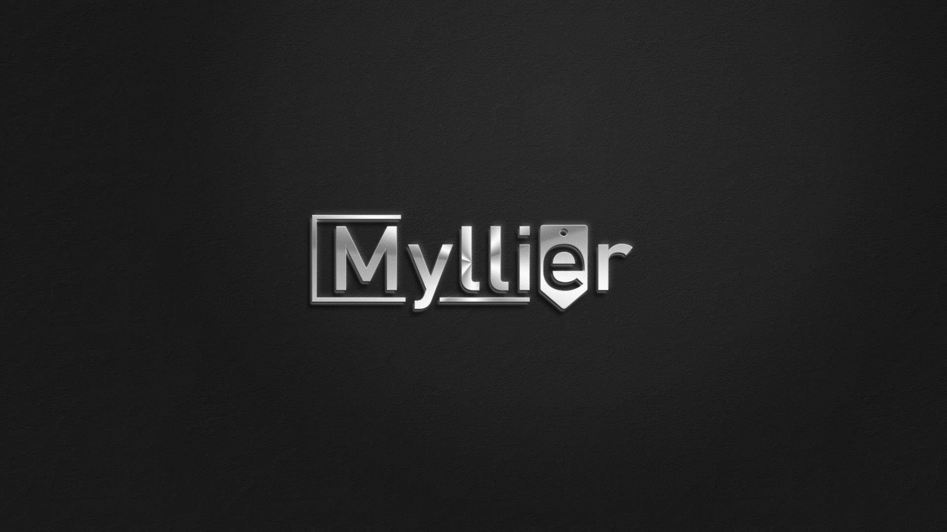

After reviewing these proposals, Myllier's team expressed a preference for Option No. 2. However, some modifications were essential: the arrow was to be removed and transformed into a box enclosing the 'e', symbolizing security and elegance. Importantly, the distinctive dot over the 'e' was to remain.
Refinement and Color Exploration
With the foundational elements decided, the next phase involved refining the chosen design and exploring the color accents. The deep crimson, violet, or pink was set to highlight the box, adding a subtle vibrancy to the otherwise black logo. This accent was not only a nod to the client's preferences but also a visual metaphor for the brand's allure and exclusivity.

Finalization and Brand Implication
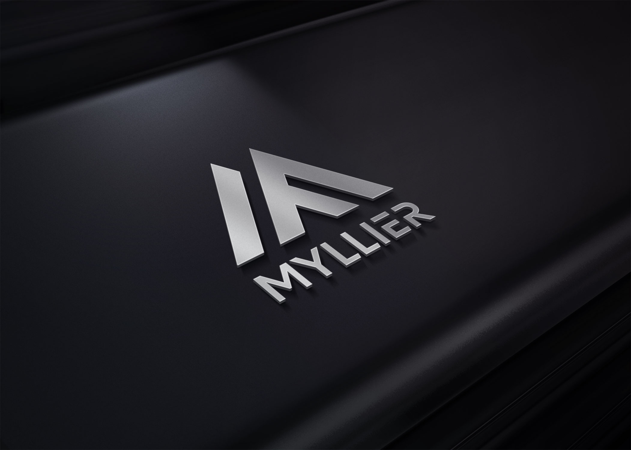
The finalized logo was approved swiftly, marking a significant milestone in Myllier's brand evolution. The combination of Tag and the chosen accent color delivers a message of elegance with a hint of playful luxury, aligning perfectly with Myllier's slogan 'see and be seen'.

As Myllier strides confidently into the market, its logo stands as a testament to the brand's dedication to quality and elegance. This visual identity will not only adorn the luxury watches, sunglasses, and jewelry that Myllier offers but will also become a symbol of refinement for its discerning clientele.
Start your brand journey today.


