Crafting a Transcontinental Identity: SMEK Global's New Brand Voyage
Dive into the branding odyssey of SMEK Global, exploring how design decisions sculpted a logo that embodies the Caribbean zest and logistical prowess.
In the mesmerizing archipelago of the Bahamas, where the horizon melts into the azure sweep of ocean, resides a logistic giant with a nascent tale. SMEK Global, a budding entity in the world of logistics and marine construction, sought to cast an identity as expansive as the seas it traverses. This narrative unfolds the meticulous evolution of its brand identity through a thoughtfully curated logo design process that embodies both its industry’s dynamism and the serene backdrop it calls home.
A Vision Anchored in Versatility
SMEK Global operates in the container shipping and logistics arena, an industry where reliability meets innovation. This company intricately weaves services like ocean freight, earth-moving, and marine construction into its operational tapestry, all centered from the sun-drenched Bahamas. The challenge for the designers was to create not just a logo but a visual homage that resonates with the company's core and the island's essence. The directive was clear: produce a versatile yet rooted identity with “island-construction” flavor alongside a modern minimalist approach.
Setting Sail: Initial Concepts and Ideation
The design exploration began with a submission array that caught the essence of both the island and modernity. The visual ideation emerged from a conceptual sketch phase, allowing SMEK Global's team to align with the creative direction. In this preliminary stage, designers presented three distinct options, each carrying unique visual propositions. From sharply defined graphics to more embracive playful cues, the design team set an immediate course for collaboration.

The Refinement Cruise: A Wind of Change
SMEK Global's feedback was prompt and precise. The merging of elements from selected options led to a robust design pathway. The desired composition included the circular graphics from one proposal interwoven with another’s arrow motifs, coupled with the sleek text from yet another—all harmonized with the Bahamian flag's colors. These strategic requests illustrated a thorough understanding of the logo’s cultural foothold and international scope, emphasizing a crisp, vivid presence through color psychology.
In response to color tweaks recommended by the client, alternate color schemes along with exact hex values were examined. One version maintained the black, gold, and blue theme derived directly from the Bahamian flag, adding layers of geographic identity and national pride. Another contrasted sharply through a palette inspired by vibrant hues provided by SMEK Global, projecting energy and dynamism.

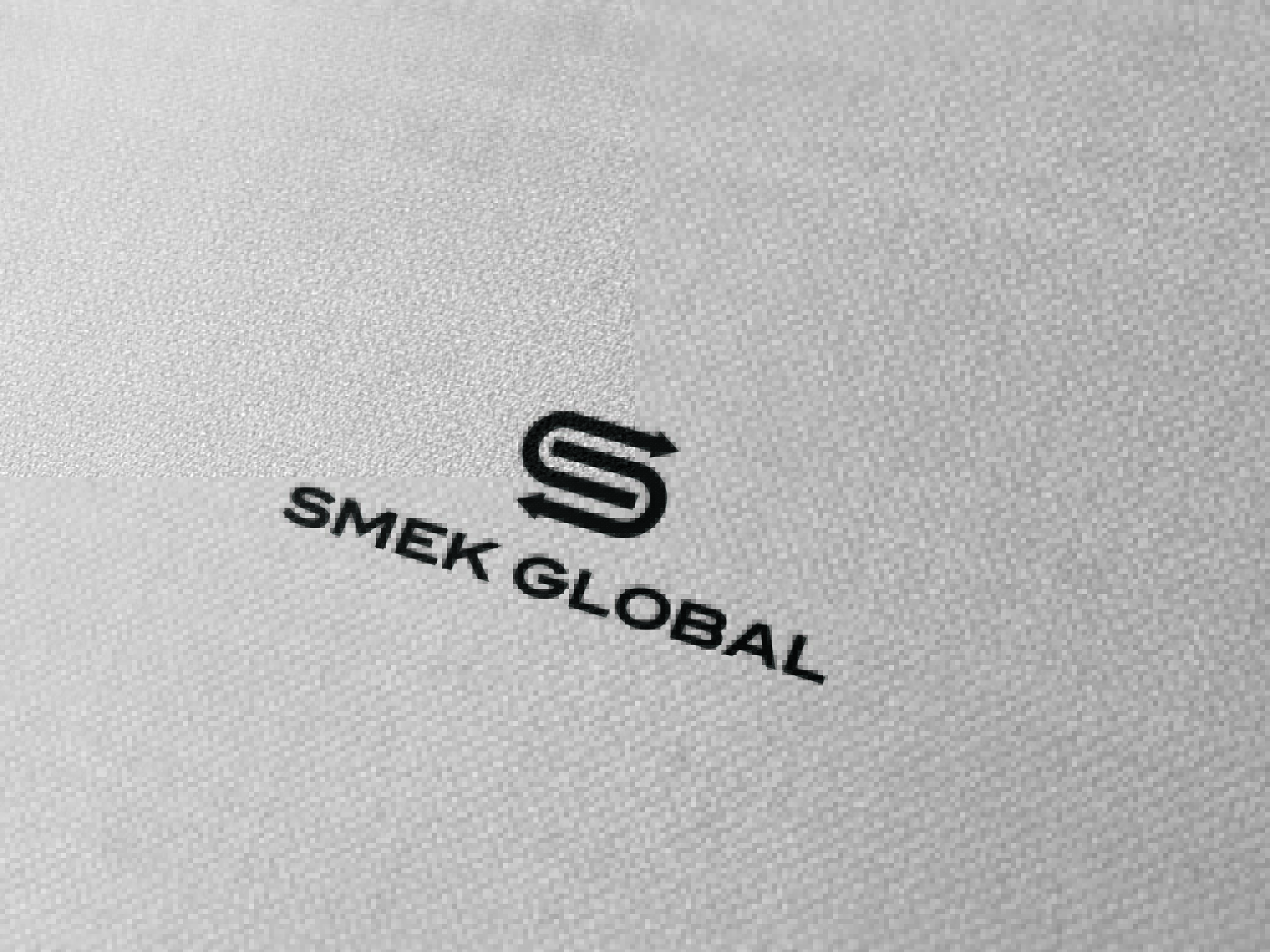
Final Bereavement: Aligning Ideals
The final approvals spurred a synthesis that aligned perfectly with SMEK Global's iconography vision. Positioned within hexagonal aesthetics and fixed into the functional forms that speak of movement and direction, the design tipped its hat to the company's seafaring roots and its industrial prowess. The meticulous attention to aligning elements ensured coherence, while every color choice was scrutinized for balance and impact.
On Deck: Real-World Applications
The culmination of strategic refinements arrived with visually arresting renderings of the final design's practical applications. The logo adorned a multitude of surfaces, from billboards and shipping containers to crane logos and industrial sites. Each mockup heralds the suite’s viability across diverse media, reinforcing SMEK Global's foundational identity across variable contexts with unerring consistency.
Conclusion: Anchored in a New Identity
The evolution of SMEK Global’s brand identity reflects a commitment to mirror the brand's industrious energy and geographically inspired vibrancy. The resulting logo marks a pivotal sail in its visual journey, charting future endeavors with a design equipped to anchor SMEK Global in the collective consciousness of international networks. Through each phase of ideation and refinement, what surfaces is a purposeful emblem of enterprise, elevated by a conscious celebration of place and purpose.
Start your brand journey today.
