Connecting Visions: The Bainkom Rebranding Journey
Explore the transformative rebranding of Bainkom, a platform revolutionizing connectivity in the architectural landscape.
In a digital age where connectivity determines success, Bainkom emerges as a significant player in the architectural domain. Bainkom, derived from the Arabic meaning 'between you', reflects the platform's core mission to serve as a nexus for professionals within the housing industry. By offering three distinct verticals - freelancers, ready-made housing plans, and supplier integrations - Bainkom nurtures an ecosystem that simplifies and elevates architectural projects. The demand for a distinct identity that encapsulates this ethos paves the way for Bainkom's recent rebranding journey.
Understanding Bainkom's Vision
Bainkom stands at an intersection where creativity meets practicality. It serves as a dynamic digital marketplace that connects architects, designers, and suppliers, fostering collaboration for housing projects worldwide. This trifold approach supports freelancers working independently, provides comprehensive blueprints, and assists suppliers in showcasing their offerings contextually. Embedded in its name, Bainkom speaks to its role as a mediator in the architectural conversation, linking minds and materials.
The Design Brief
Acknowledging the challenge of encapsulating such a philosophical and networking-centric brand into a minimalistic design, Bainkom sought a logo that was both iconic and simple. The logo needed to straddle the line between modernity and functionality, avoiding flashy colors while still making a statement. Bainkom specified the need for an emblem not entwined with text, allowing the symbol to stand alone as a representation of the brand ethos.
Creative Exploration
The design process commenced with the agency proposing several initial concepts, each differing in style yet harmonious with the brief. The presented designs highlighted Bainkom's commitment to fostering simplicity and integration. The design team's first set of options included initial sketches, focusing on fundamental geometric interactions to allude to Bainkom's connective essence.
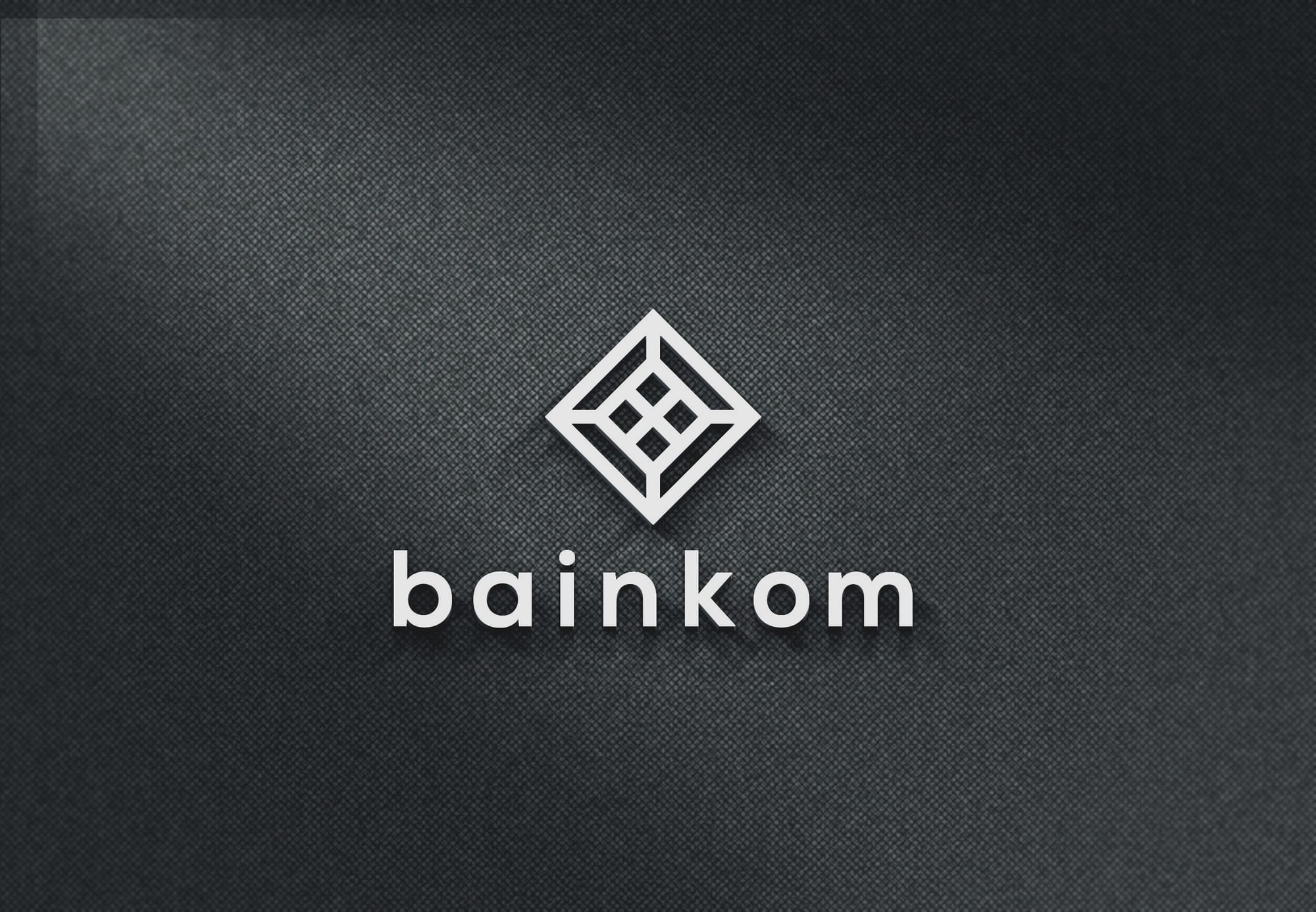
The Chosen Design
Ultimately, after careful consideration, Option 01 was crowned the winner. This option best encapsulated the brand’s mission of connection within the architectural realm. Its intertwined design resonates with Bainkom's role of linking individuals and ideas, while retaining a minimalist aesthetic.
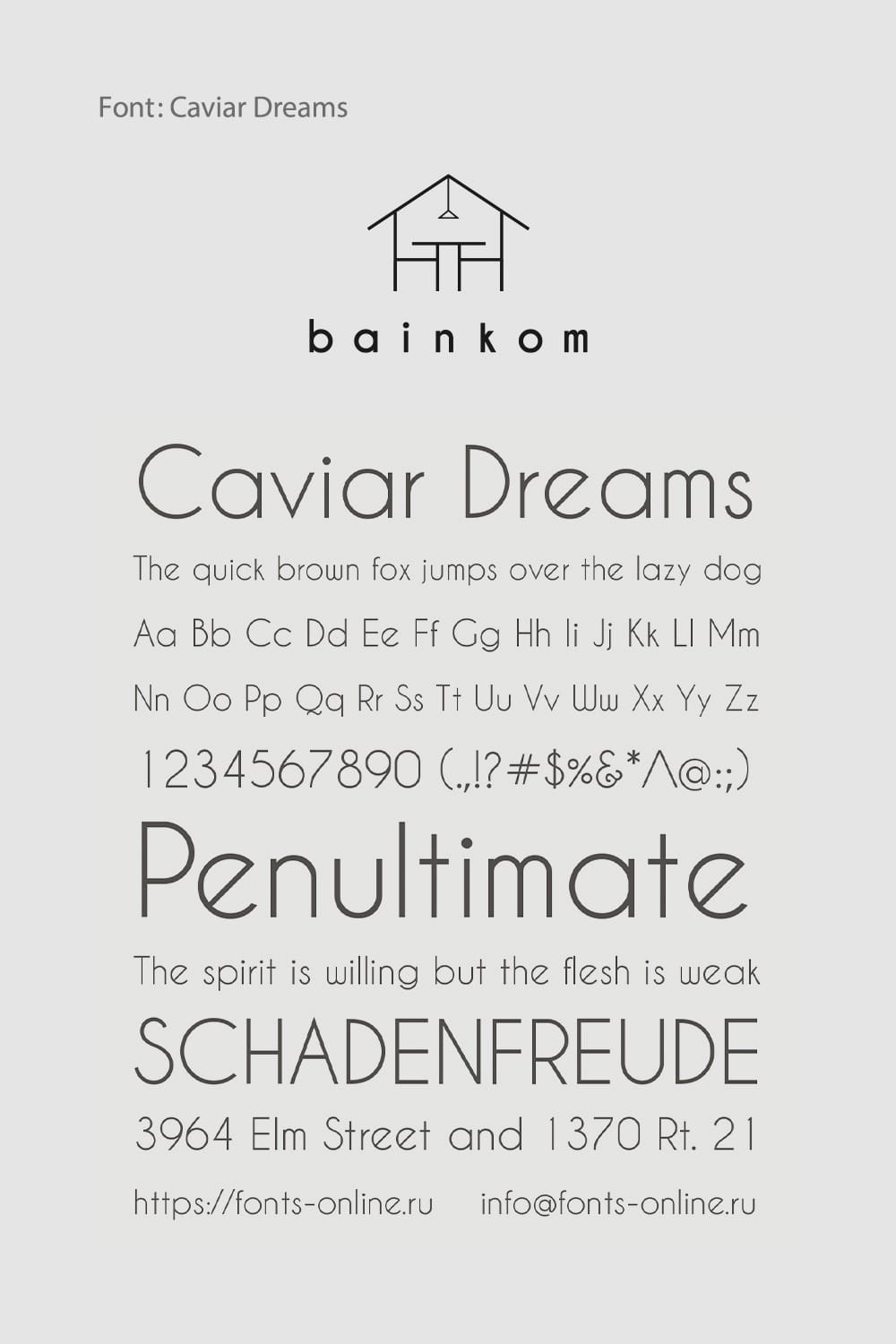
A New Chapter: The Font Selection
Beyond the emblem, typography choices hold equal significance. Bainkom's final choice, 'Caviar Dreams', resonates with its ethereal name. The typeface is both readable and modern, harmonizing effortlessly with the geometrical nature of the logo, suggesting clarity and openness.
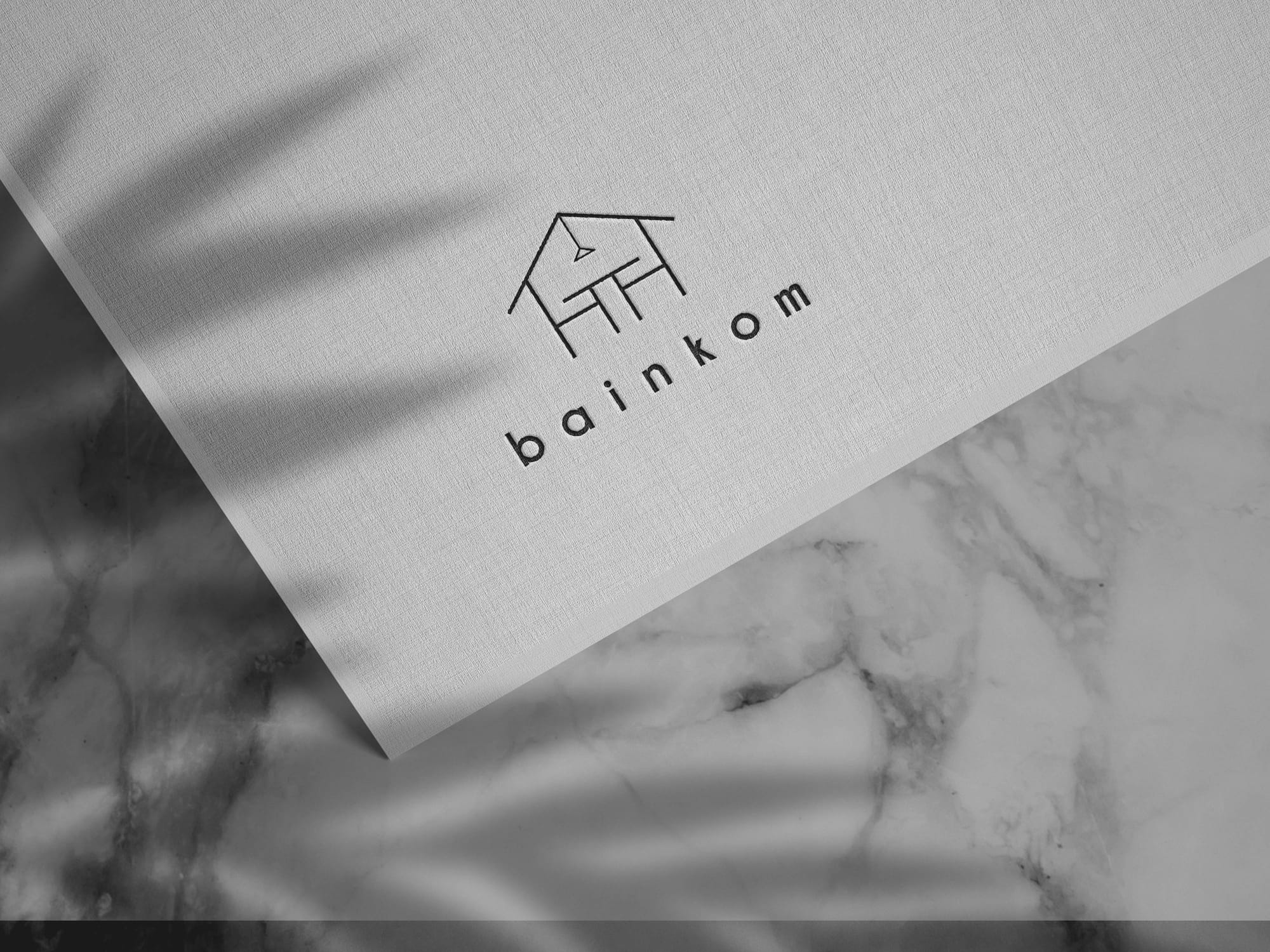
Real-World Applications
To fully appreciate a logo's impact, one must visualize its real-world applications. Bainkom's new logo adorns various business essentials, from posters to business cards and signage, reinforcing its brand identity across multiple touchpoints. These applications demonstrate how the logo elegantly scales across different mediums, embodying the company's approachable yet professional stature.
Conclusion: Bridging Ideas
Bainkom's rebranding is more than corporate identity renewal; it’s an evolution aligning with a vision of connecting creative minds. This transformation harmonizes with Bainkom’s philosophy, ushering in a new chapter that combines artistic flair with structural rigor. As it continues to evolve, Bainkom's presence promises to inspire and facilitate collaboration, leaving an indelible mark on the architectural industry.
Start your brand journey today.
