Concom Digital: Crafting a Visual Identity for the Metaverse Age
Discover how Concom Digital's logo was designed, exploring its journey from concept to creation, blending modernity and technology in one visual identity.
In the ever-evolving world of digital communication and virtual gatherings, defining a unique and captivating visual identity can be a complex endeavor. Concom Digital, an emerging online congress aimed at bringing together thought leaders in digital communication, embarked on this very journey.
With the name rooted in its Spanish origins, 'Congreso de Comunicación Digital', the brand sought a logo that not only reflected its identity but also resonated with the themes of modernity, technology, and the metaverse.
Inspiration and Initial Brief
The client came forward with a clear vision: a modern tecno-inspired logo with metaverse influences. The primary color was to mimic the vibrant blues seen in technology YouTube videos, reminiscent of the shades used by Zoom and Meta.
The brief detailed a requirement for a unique symbol centered around the phrase 'concom', with 'digital' serving as a secondary element. This guidance laid the foundation for the creative minds at the design agency to bring the brand's essence to life.
The Design Journey
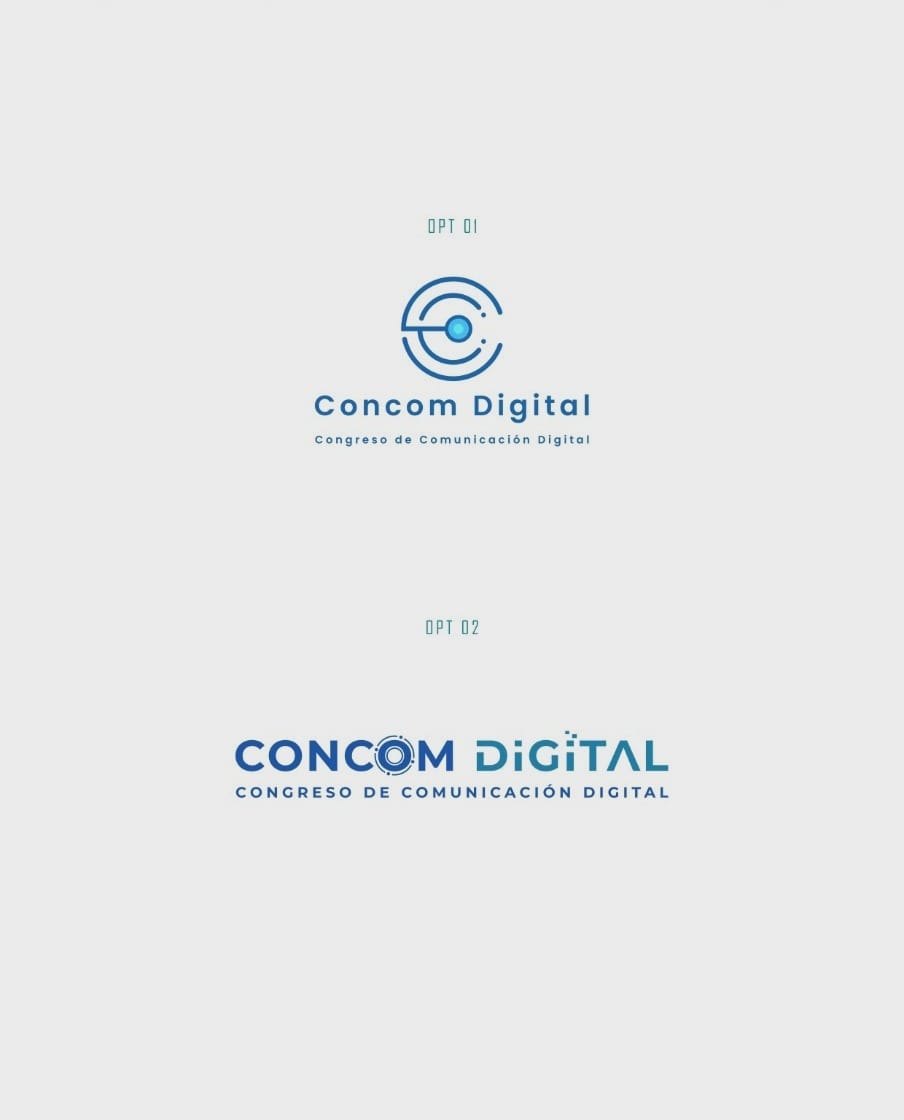
The initial designs presented included two distinct options. The first logo focused on a bold, geometric representation, while the second featured a distinctive circular 'O' element that hinted at a more fluid and interwoven design. Images of the initial options were shared to ensure the client's vision was being realized.
Upon review, the client expressed a desire to blend elements from both concepts, specifically the circular 'O' from the second design with the layout of the first. This feedback was pivotal, guiding the design team to refine the logo further.
The Final Selection
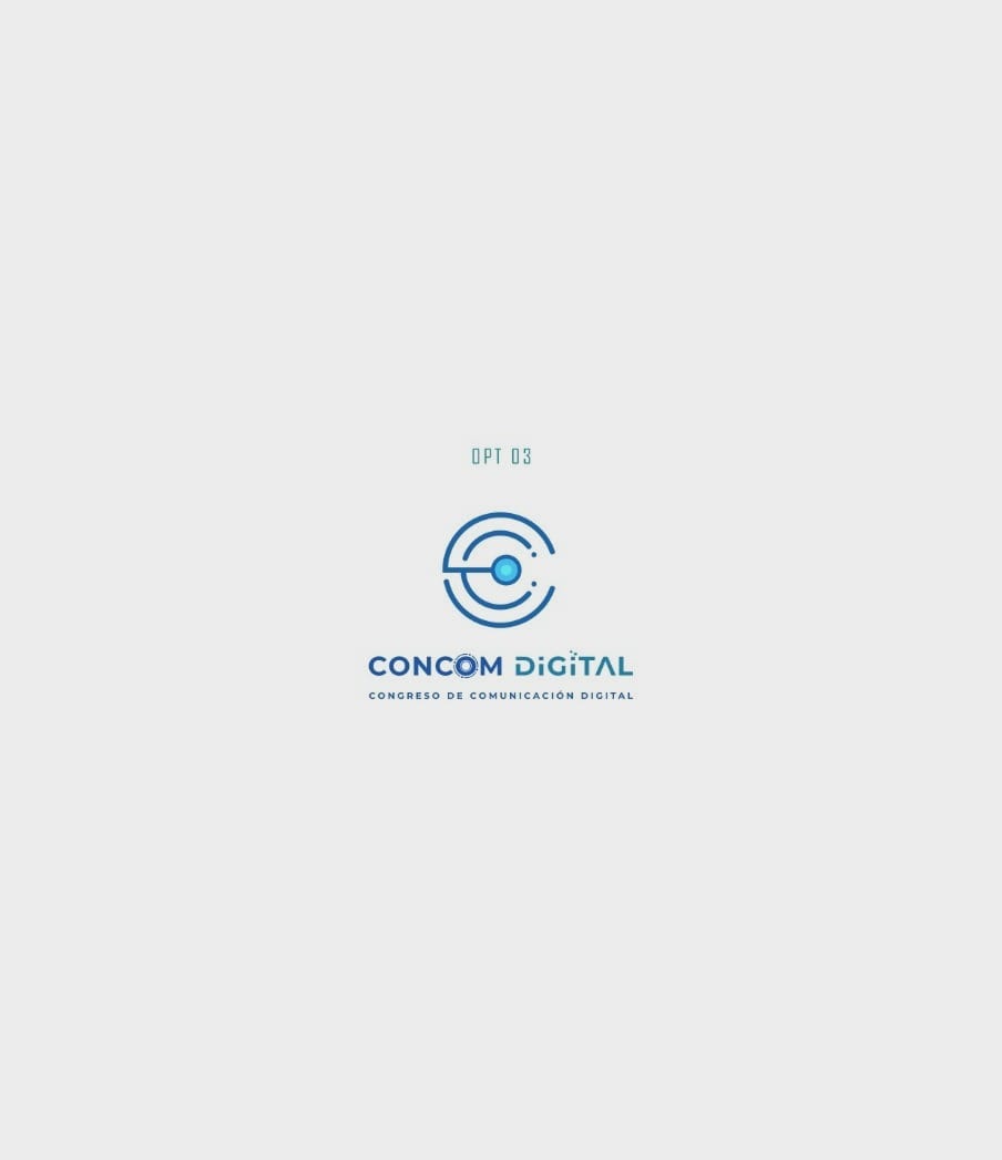
Ultimately, the third iteration emerged as a clear favorite. This version met the brief with flying colors, integrating the client's feedback to perfection. The design harmoniously balanced boldness and fluidity, symbolic of the digital era's connectivity and dynamism.
Typography Selection
The choice of the Poppins font further enhanced this design. Known for its clean, geometric look, Poppins added a layer of sophistication and readability, crucial for a logo intended for a digital experience.
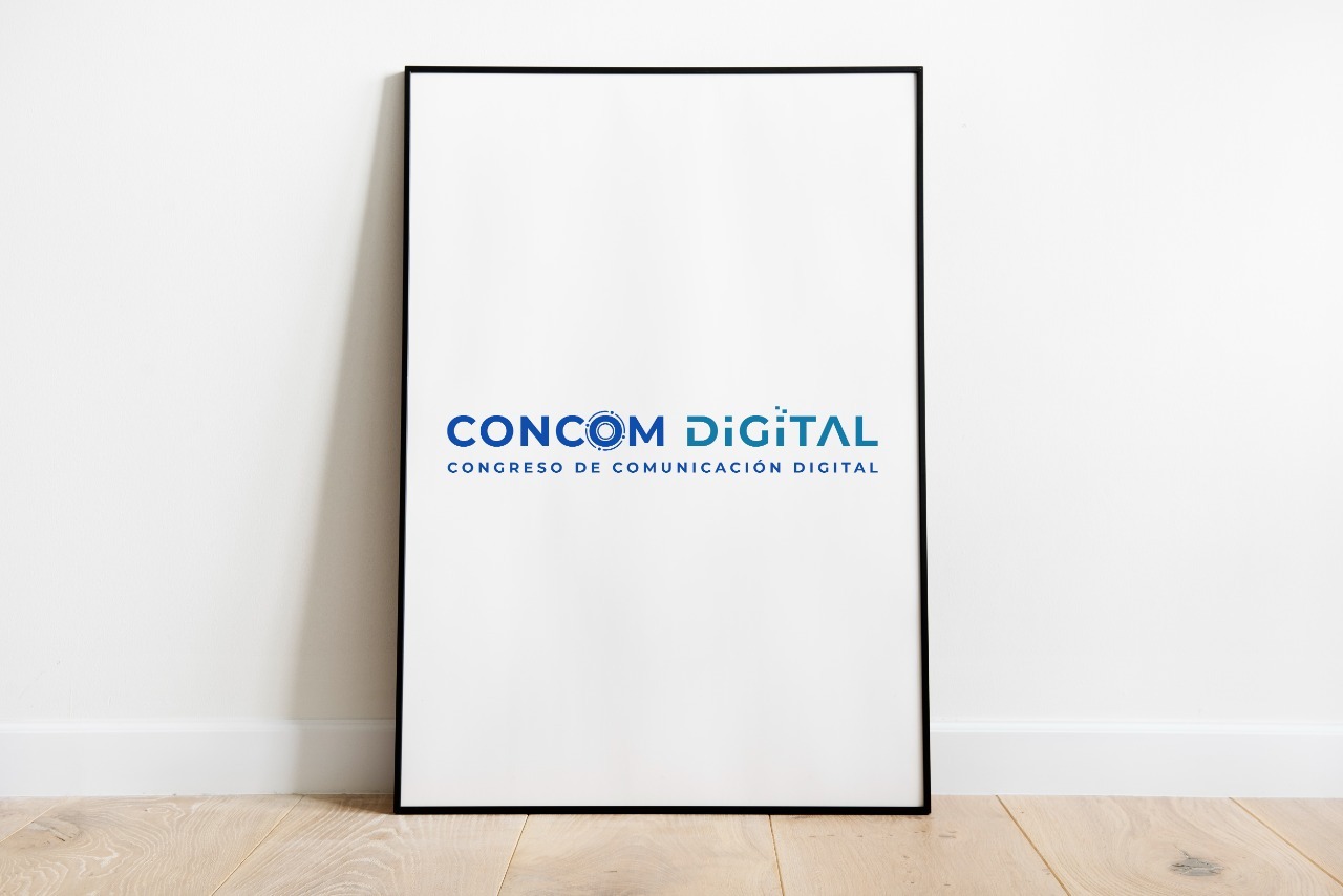
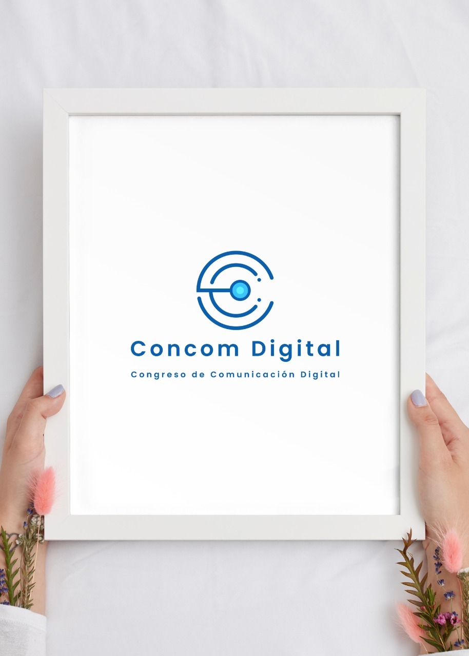
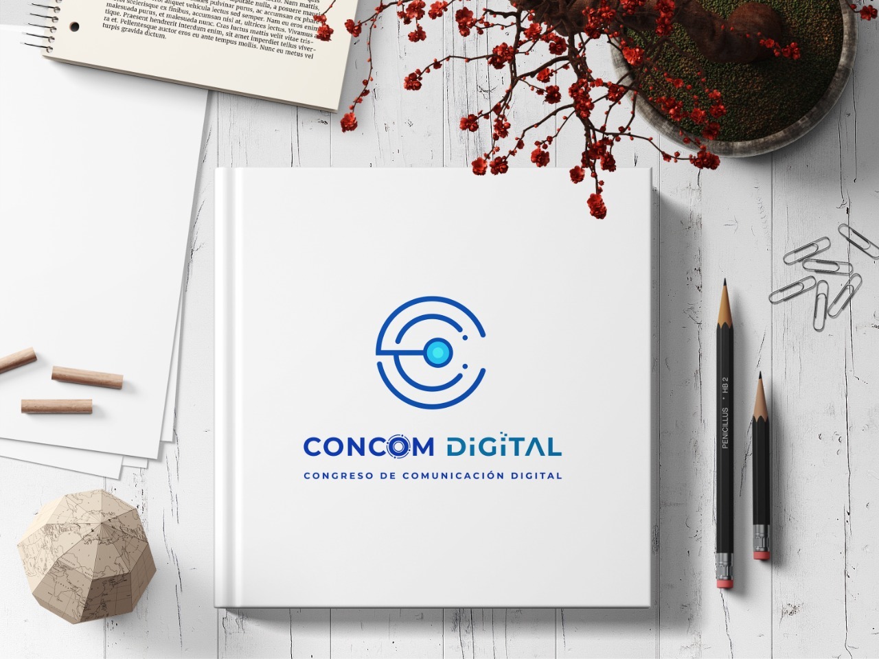
Real World Application
As the design reached its final form, mockups were crafted to visualize the logo in real-world scenarios, from billboards to digital screens. This dimensional insight provided the client with a tangible sense of the logo's potential and versatility.
Conclusion
Concom Digital's logo doesn't just make a statement; it's a visual bridge to the ever-expanding universe of digital communication. It successfully encapsulates the look and feel of the virtual world, creating a cohesive identity that's ready to shine in the metaverse age.
Start your brand journey today.