C2ESP: Elevating Higher Education Consultation in Portugal with a Distinctive Brand Identity
Discover the journey of creating a distinctive brand identity for C2ESP, a higher education consultancy based in Portugal, focusing on transforming logos into a reflection of trust and expertise.
In the dynamic world of higher education consultancy, establishing a distinctive brand identity is crucial. C2ESP, standing for 'Conseiller Expert en Études Supérieures au Portugal', is a burgeoning brand based in Porto, Portugal, that aims to streamline the journey of aspiring healthcare professionals.
Born from the desire to focus specifically on Portugal, the brand not only serves dental and physical therapy students but also has aspirations of expanding throughout the country. Coupled with its ambition is a comprehensive vision for branding, culminating in the development of a logo that encapsulates its mission.
The Challenge of Crafting an Identity
The creation of a brand identity for C2ESP involved lessening the associations with its predecessors, EMS European Medical Studies and ESEE Études Superieures en Europe, which had a pan-European focus. C2ESP's brief emphasized the need to accentuate the brand’s specificity to Portugal, ensuring it resonated with its target audience. The designers were tasked with crafting an identity that mirrored the consultancy’s refined expertise and its focus on the Portuguese context.
Concept to Creation: Initial Designs
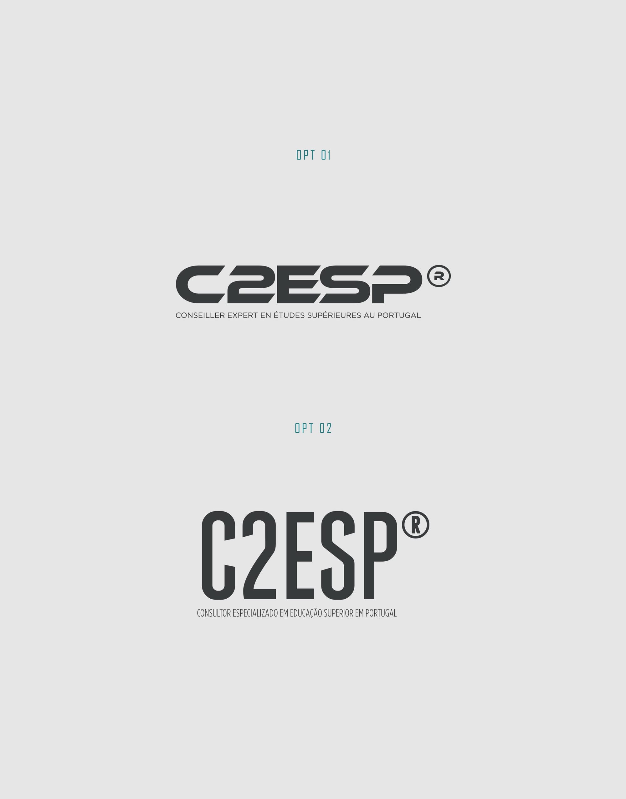
The design team embarked on this journey by producing several initial concepts. One of the early versions showcased modern typography and minimalistic elements, aimed at conveying professionalism and clarity. The proposed logos integrated the acronym 'C2ESP' in a bold, authoritative manner, laying the groundwork for subsequent iterations.
The Challenge of Crafting an Identity
The creation of a brand identity for C2ESP involved lessening the associations with its predecessors, EMS European Medical Studies and ESEE Études Superieures en Europe, which had a pan-European focus. C2ESP's brief emphasized the need to accentuate the brand’s specificity to Portugal, ensuring it resonated with its target audience. The designers were tasked with crafting an identity that mirrored the consultancy’s refined expertise and its focus on the Portuguese context.
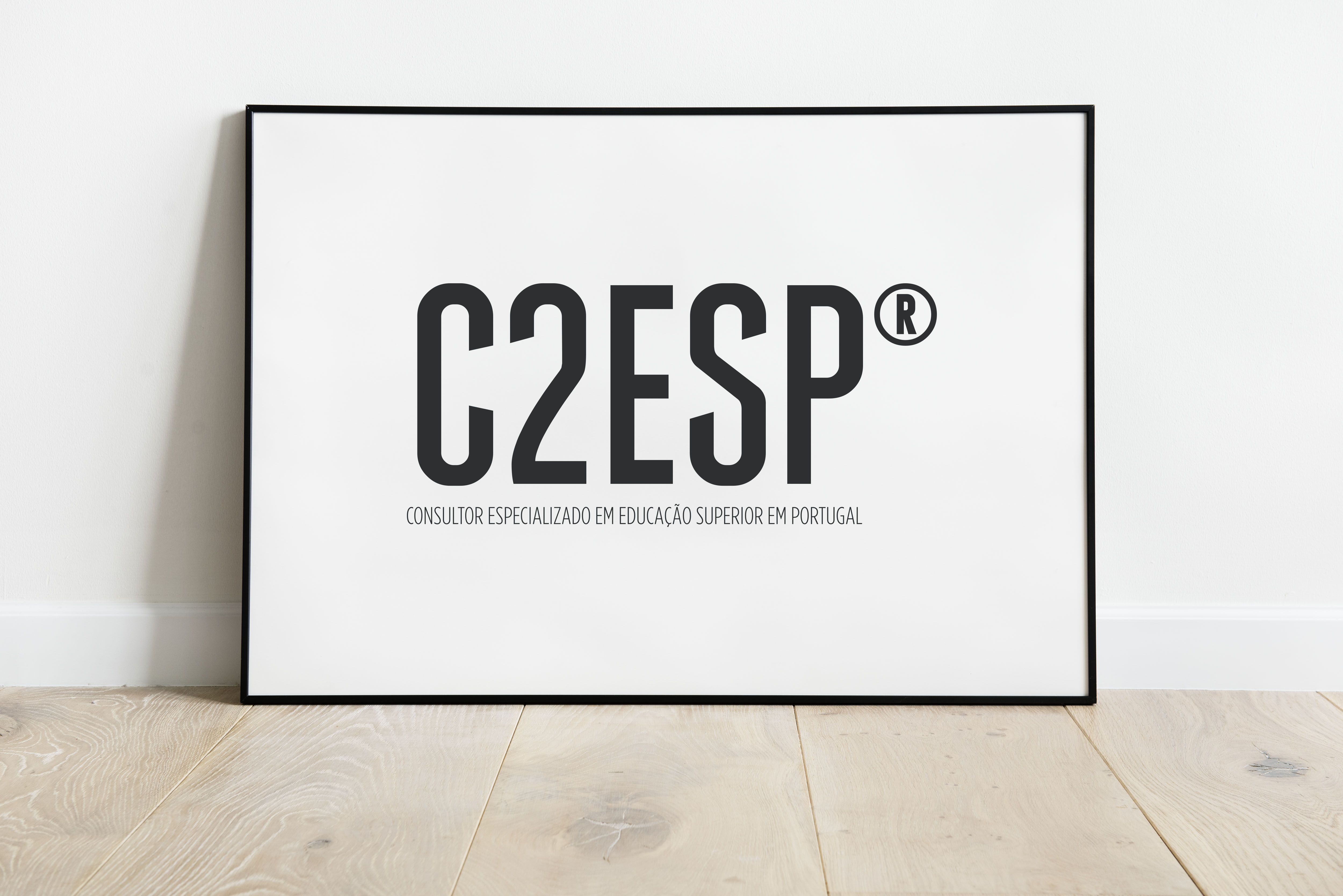
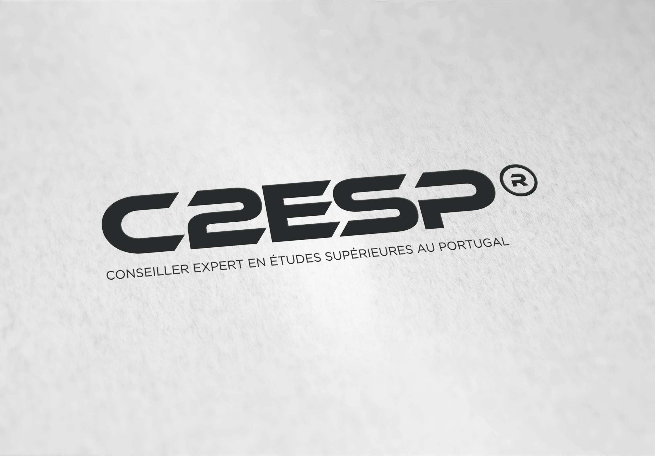
Simultaneously, the process involved aligning visual components with the brand's ethos. The initial suggestions found a balance between modernity and simplicity, fundamental characteristics desirable for higher education-focused identities.
Iterative Refinement
In response to feedback, the design team refined the logos to incorporate bilingual elements. The client emphasized the need for the brand to speak to both French and Portuguese audiences. The iterations highlighted the full name of the consultancy in both languages while maintaining visual elegance and coherence. Such accommodations underscored the brand's inclusive ethos and its mission to support diverse student groups aspiring to excel in Portuguese institutions.
The Final Logo: A Harmonious Blend
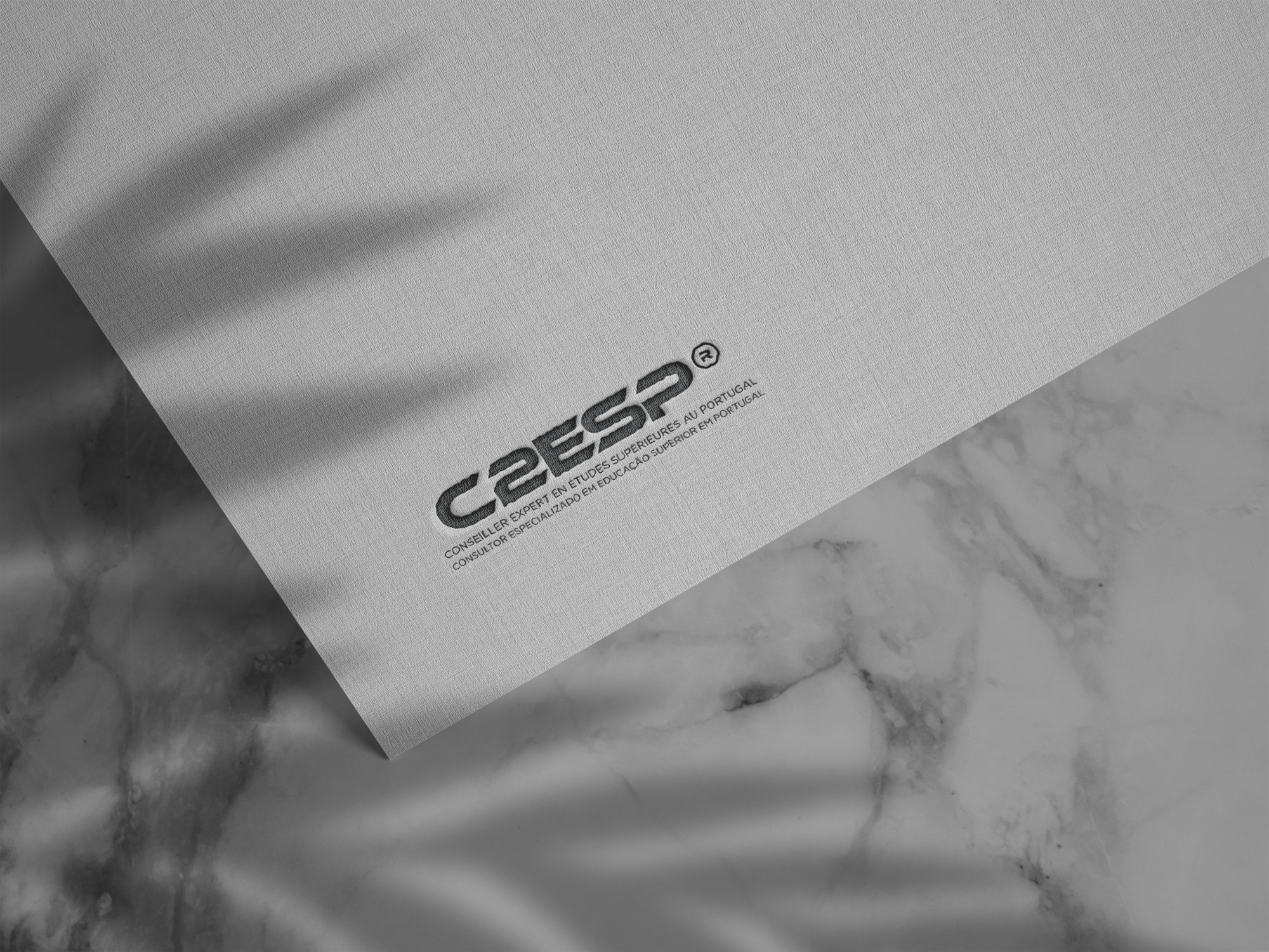
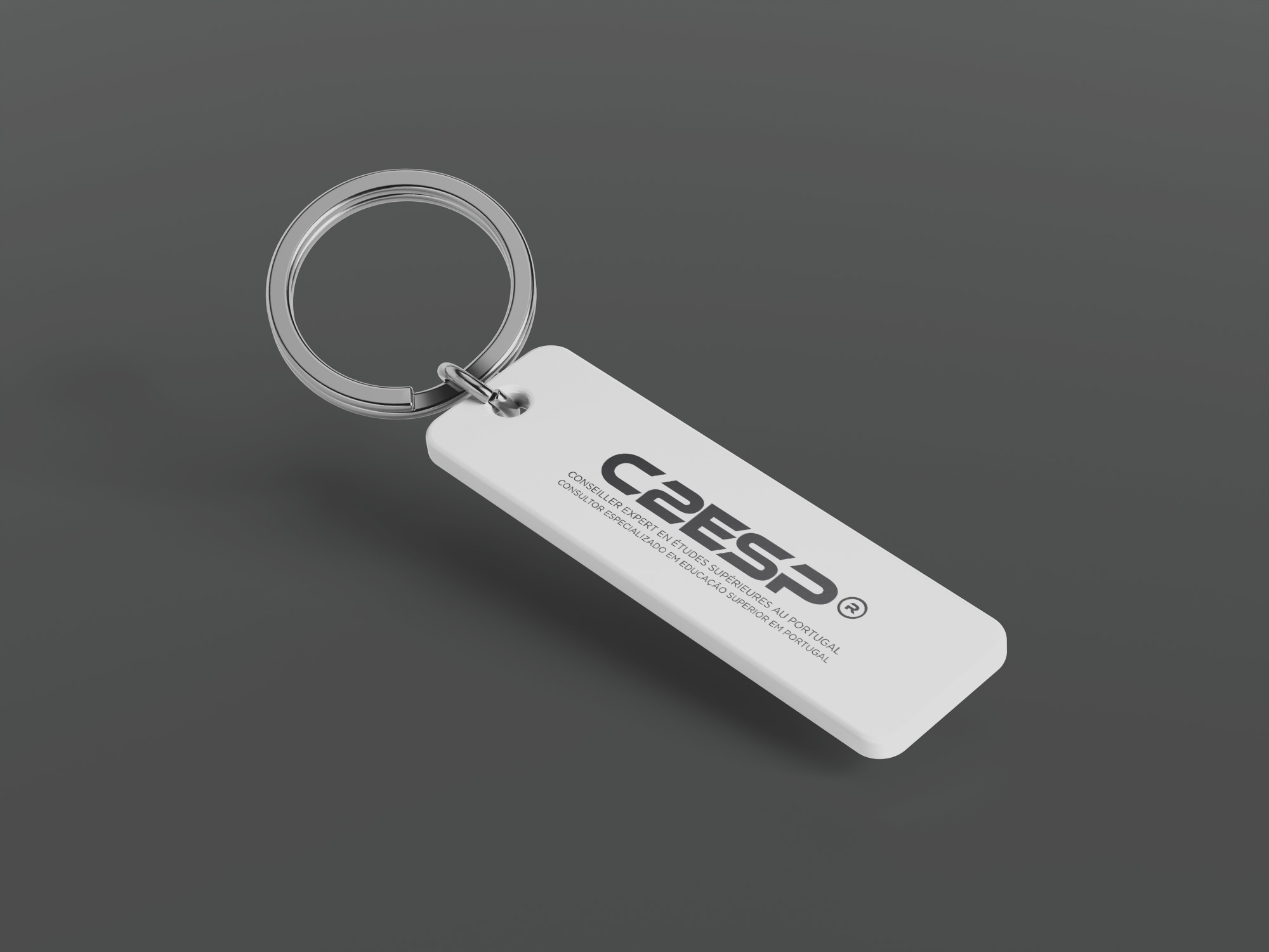
The culmination of these efforts was a logo that seamlessly integrated the acronym C2ESP with both full titles in French and Portuguese, underlined by the Ethnocentric font. This typeface complemented the logo’s contemporary look and feel, exuding a sense of modernity and precision.
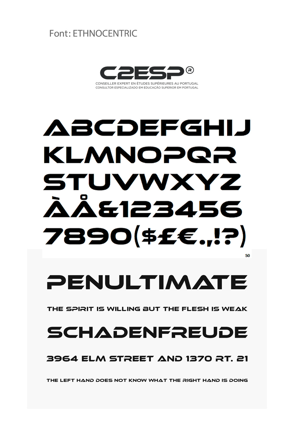
The resulting design not only reflects the consultancy's dedication to fostering educational pursuits but also signifies reliability and expertise qualities that prospective students and parents prioritize when selecting a consultancy. This careful construction of visual identity helps ensure that C2ESP resonates in an industry built on trust and guidance.
Implementing the New Identity
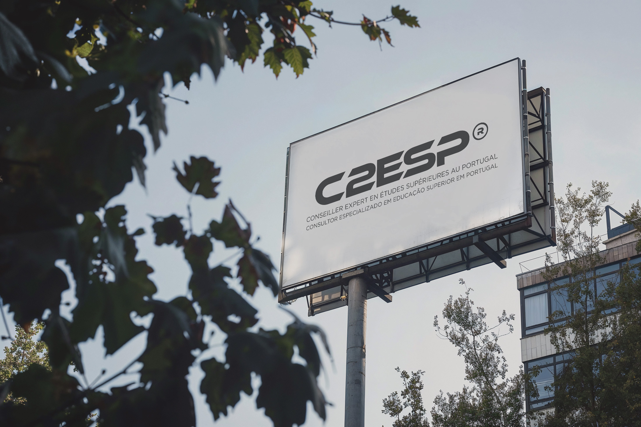
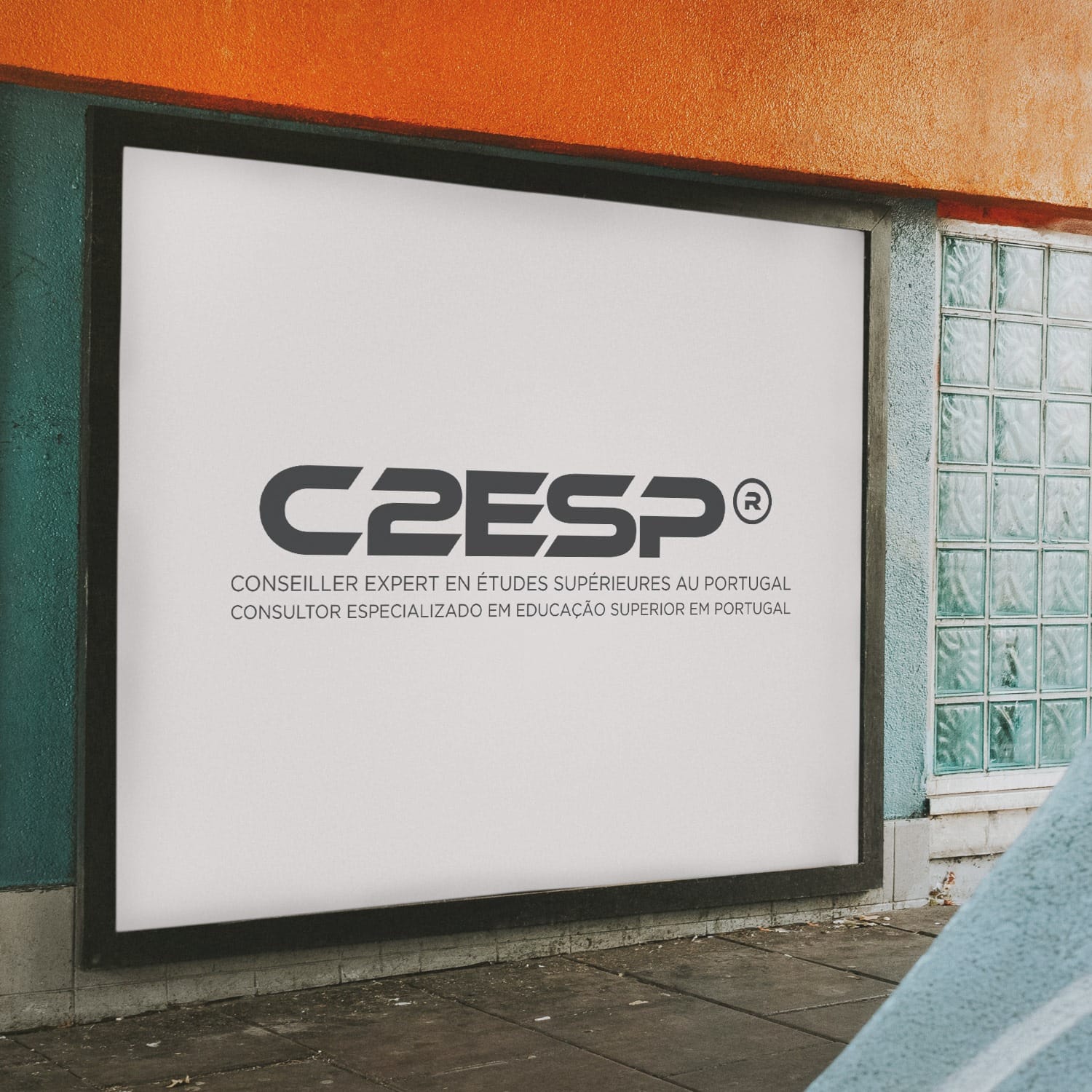
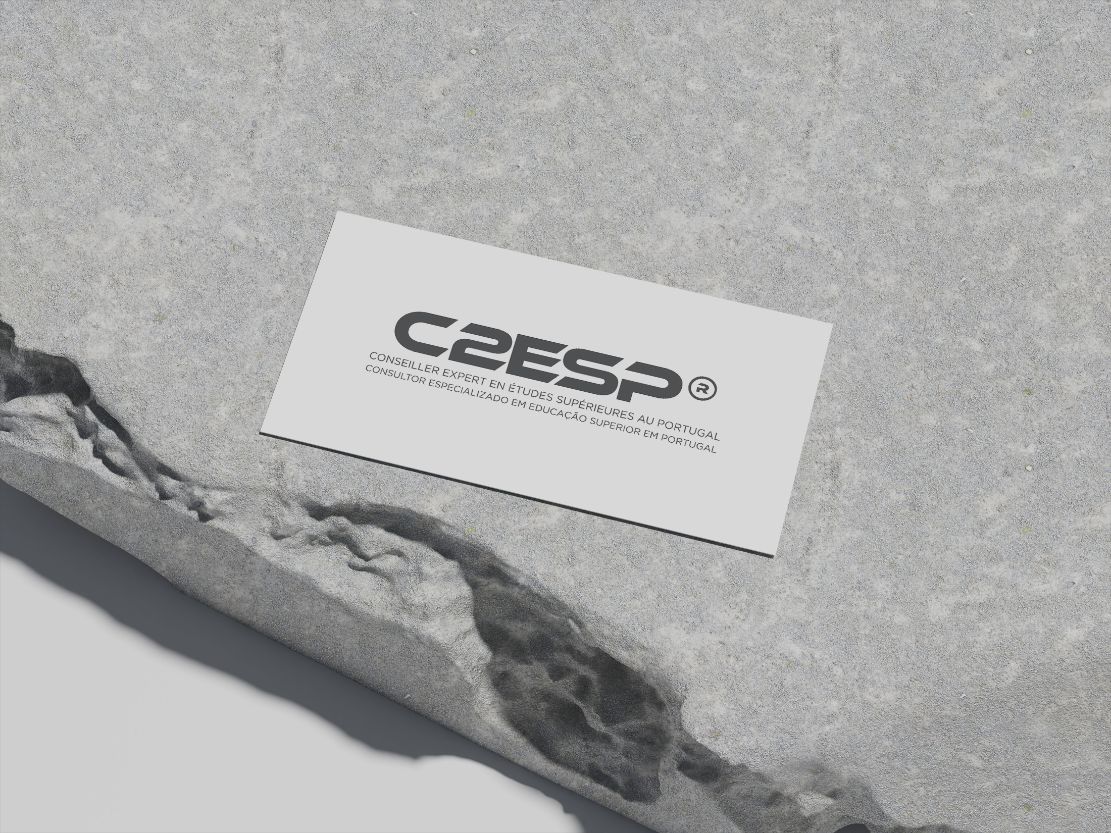
Once finalized, the logo found its way into various applications, from digital platforms to tangible merchandise. Its versatility was showcased in mockups featuring keychains and container mockups, illustrating the logo’s adaptability and aesthetic appeal in real-life settings.

Conclusion
Through this transformative journey in branding, the C2ESP logo embodies the consultancy’s pivotal role in the educational landscape of Portugal. It stands as a beacon for students aiming to carve a niche in the fields of dentistry and physical therapy within the picturesque confines of Portugal, marking the brand as a dedicated partner in their academic endeavors.
Start your brand journey today.


