Bridging Minimalism and Functionality: The Evolution of Barepump Apparel Branding
Discover the story behind Barepump's minimalist logo design and its journey to revolutionizing fitness apparel with modern branding.
In the ever-evolving landscape of fitness apparel, branding plays a crucial role in setting a label apart in a crowded market. Barepump, a dynamic entrant in the field, is positioned to become a leader with its newly-minted sleek and minimalist approach to design. Located in the vibrant city of Los Angeles, this brand's mission is to merge performance with style, offering fitness enthusiasts gear that speaks the language of modernity and functionality.
Understanding Barepump's Vision
The name 'Barepump' itself evokes a sense of raw energy and unfiltered performance. It's a brand that empowers its users, bridging the gap between the individual and their athletic goals. The envisioned result was clear from the start: a logo that could embody confidence while remaining flexible enough for various applications, from gym wear to casual fashion.
From the onset, the client provided a detailed brief highlighting their aspiration: a simple yet powerful logo reminiscent of the fitness apparel community's dynamic spirit. With a preference for blue undertones, Barepump aimed to maintain reliability and trust, a color scheme effectively mirroring sky and sea, infinite possibilities, and depth.
Inspiration and Reference Points
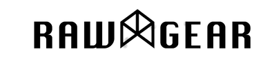
The client was influenced by the Rawgear Athletic Brand, a name synonymous with contemporary athletic apparel. This reference was crucial, guiding the design team towards a blueprint that valued clarity and impact.
The Collaboration: Steps to Final Design
From receipt of the brief to the final design, the journey was collaborative. The design team responded swiftly with several initial concepts. The emphasis was on modularity, ensuring that the final logo could be easily integrated into various apparel forms, an essential feature for a brand with the slogan, 'Wear it your way.'
Initial Design Options:
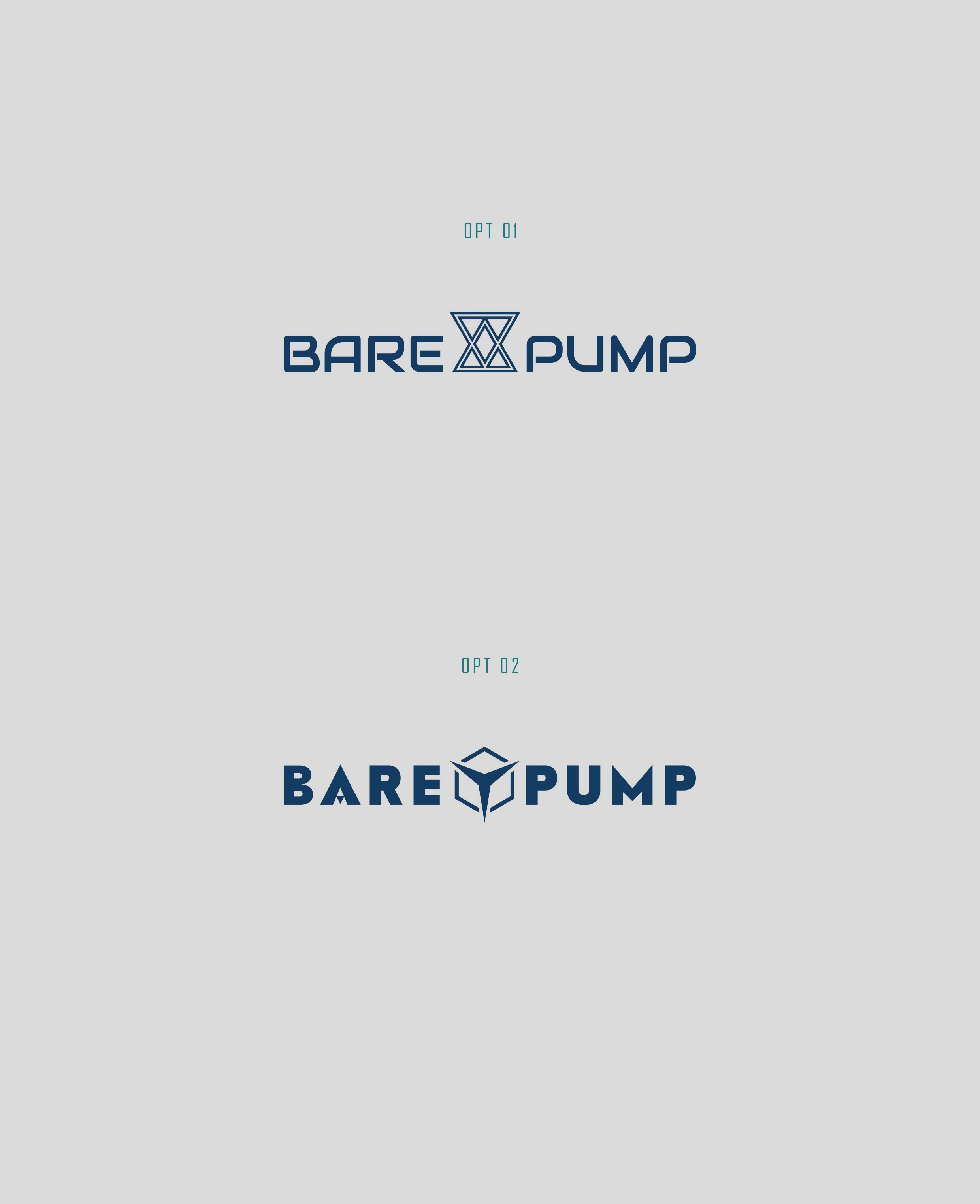
The client ultimately chose option one, signaling approval for its embodiment of simplicity and powerful messaging.
The Power of Typography: Rainfall Black
Typography plays a significant role in logo design, influencing the perception and memorability of a brand. The chosen typeface, Rainfall Black, is a contemporary serif that balances modernism and tradition, providing a sophisticated yet approachable aesthetic that perfectly characterizes Barepump's ethos.
Font Image:
Showcasing the Final Logo Design
The finalized logo was effortlessly adaptable across various touchpoints, a testament to its thoughtful design. Its adaptability displayed prominently on diverse mediums, from a trendy can drink to apparel such as t-shirts and beanies, showcased the brand's flexibility.
Conclusion: Embodying Energy and Simplicity
Barepump's strategic brand evolution is a modern encapsulation of high-functioning minimalism. The collaboration process, guided by a clear brand ethos, anchors Barepump firmly in the future of fitness apparel. Through thoughtful adjustments and careful consideration of brand objectives, this logo design delivers on its promise, a testimony to flexibility, simplicity, and the verve of athletic style. As Barepump continues to grow, its branding success sets a transformative benchmark for companies navigating the vibrant fitness world.
Start your brand journey today.
