Branding Evolution of Tuesday Night Distro: A Harmonious Blend of Professionalism and Appeal
The design journey of Tuesday Night Distro, as it embraces a sophisticated yet youthful brand identity for the adult alternative product market.
The design landscape is ever-evolving, constantly adapting to meet the needs and perceptions of diverse markets. A notable player in this dynamic space is Tuesday Night Distro, a company that, true to its name, delivers adult alternative products with a unique flair. Spanning an array of products including nicotine, CBD, hemp, cannabis, and kratom, Tuesday Night Distro sought a brand revamp that not only echoes its professionalism but also appeals to a younger demographic.
Embarking on the branding journey, Tuesday Night Distro presented a clear vision: a logo that transcends negative perceptions and resonates with their core audience aged 22-32. Their aspiration to be the 'Apple' of their industry set the stage for a design challenge that required balancing clean, simple aesthetics with a touch of hipness.
Client's Vision and Initial References
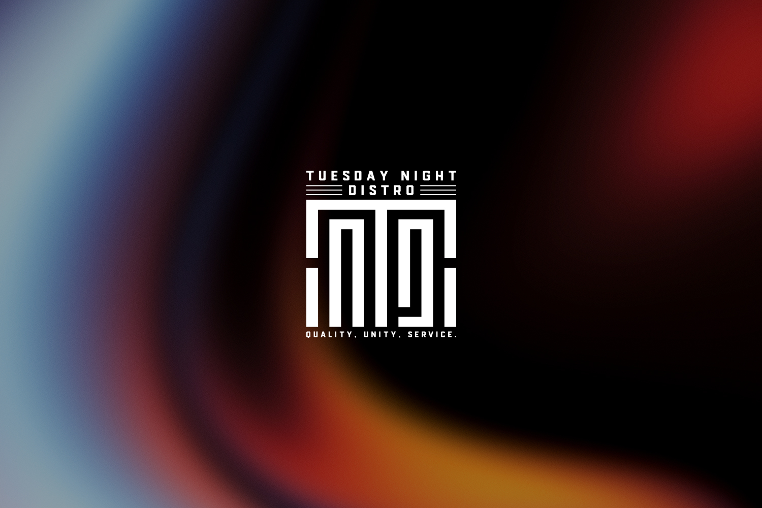
In its initial phase, the project brought forth references that were integral to defining the aspirational quality of the new logo. The client shared previous logo attempts, emphasizing the need for a fresh start. The foundational mantra of 'Quality, Unity, Service' served as a guiding light throughout the design process.
Color preferences were clear yet sophisticated, including a palette of black, white, silver, and grey. A meticulous approach was deemed vital, aiming for a polished yet approachable image, suitable for a brand at the juncture of innovation and reliability.

Design Iteration and Solution
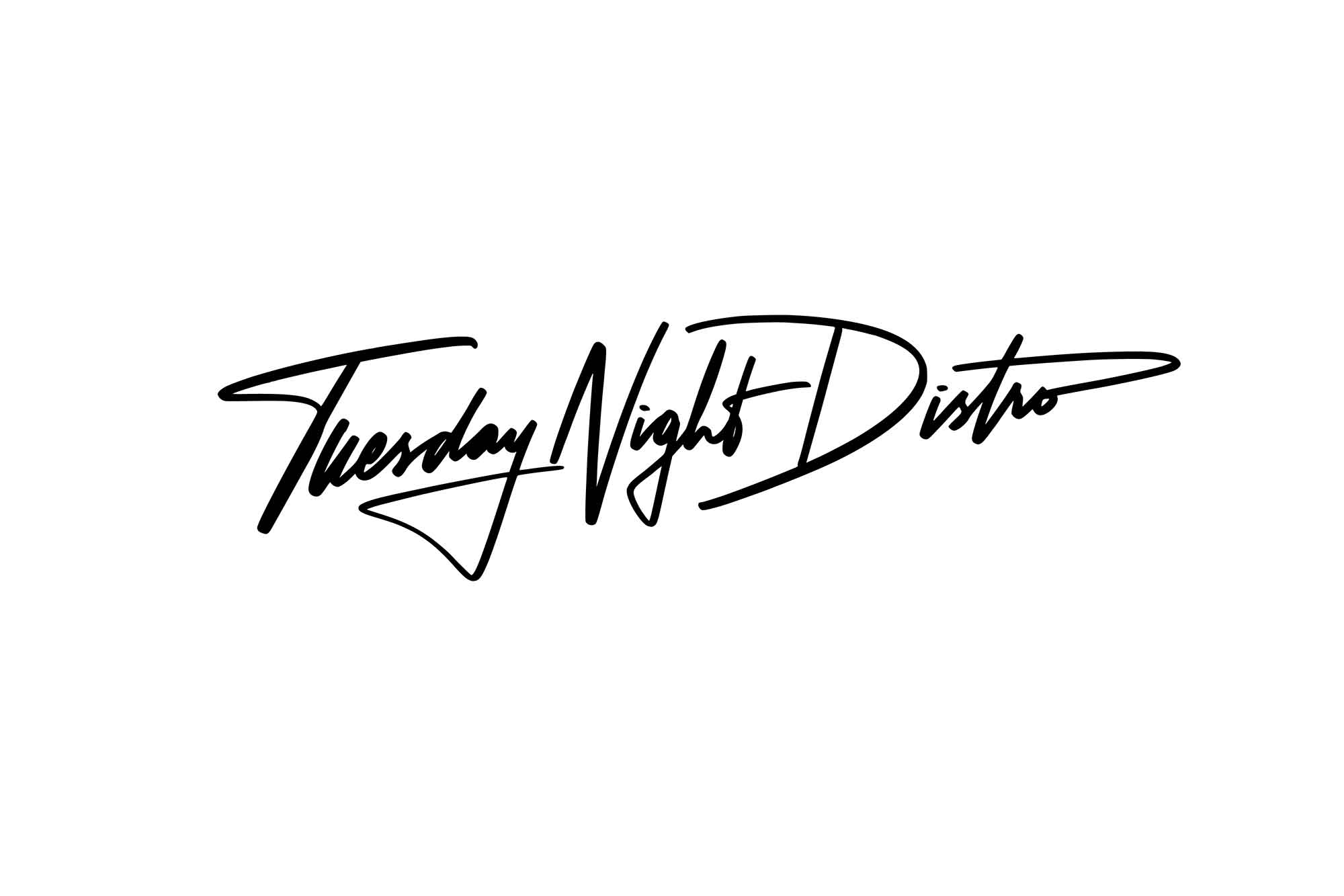
Guided by the client's directives, the design team embarked on creating a suite of four bespoke options. Each option was crafted with careful attention to detail, ensuring alignment with the client's vision. The options were diverse yet consistently professional, marrying modernity with a classy touch.
Option four emerged as the frontrunner, celebrated for its outstanding balance of clarity and stylish appeal. This logo encompassed the essence of the company's ethos — a harmonious blend of reliability and contemporary allure.

Final Design and Deliverables
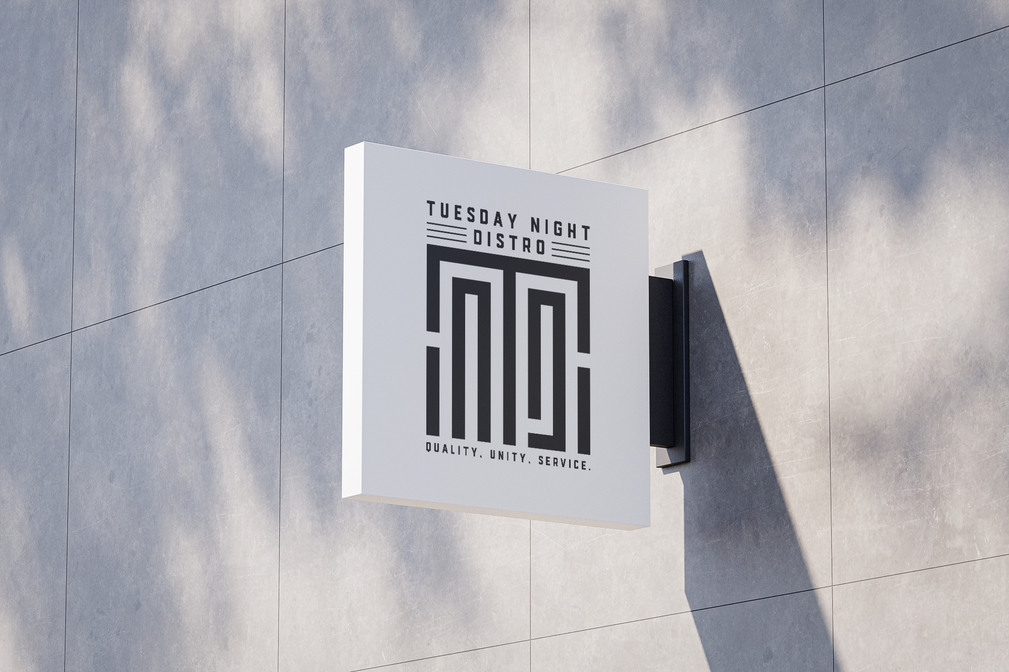
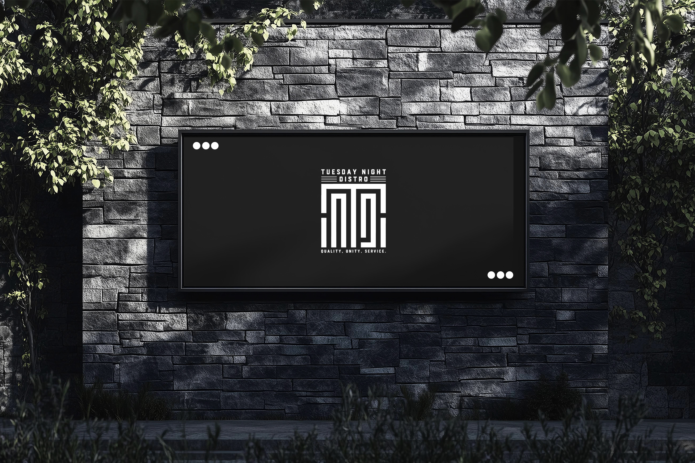
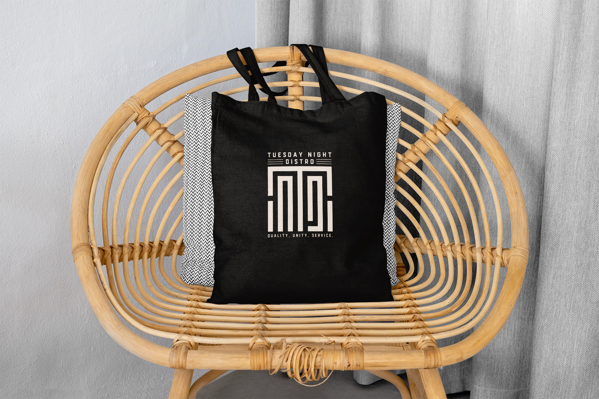
Upon approval of option four, the finalized logo was rendered into several mockup scenarios, demonstrating its versatility across various applications. These mockups play a crucial role, visually communicating how the logo would seamlessly integrate into real-world settings, from packaging to digital platforms.

Conclusion
Tuesday Night Distro’s rebranding is a testament to the power of thoughtful design in transforming perceptions and elevating brand identity. The new logo not only represents the core values of quality, unity, and service but also aligns aesthetically with the lifestyle aspirations of its audience, ensuring it stands out in a niché yet competitive market.
Start your brand journey today.
