Branching into New Horizons: The Crafted Identity of Top Branch Film Consulting
Explore the visual journey of Top Branch Film Consulting’s brand identity, an insightful melding of nature and cinema, crafted with elegance and precision.

In an industry teeming with creativity and delicacy, finding a visual identity that resonates with both clients and the values of the firm is akin to a delicate dance. Top Branch Film Consulting, with its poetic name evoking both grandeur and balance, embarked on this journey to bring its brand to life with a logo that encapsulates its essence and elevates its narrative.
A Cinematic Vision Rooted in Nature
Top Branch Film Consulting operates at the nexus of the film industry, guiding projects from concept through implementation with meticulous preparation a sentiment perfectly captured in their slogan, 'Fix it in prep.' Based in a landscape where the natural world often intertwines with cinematic storytelling, the company sought a brand identity that symbolized both artistic insight and organic growth.
The Client’s Creative Brief
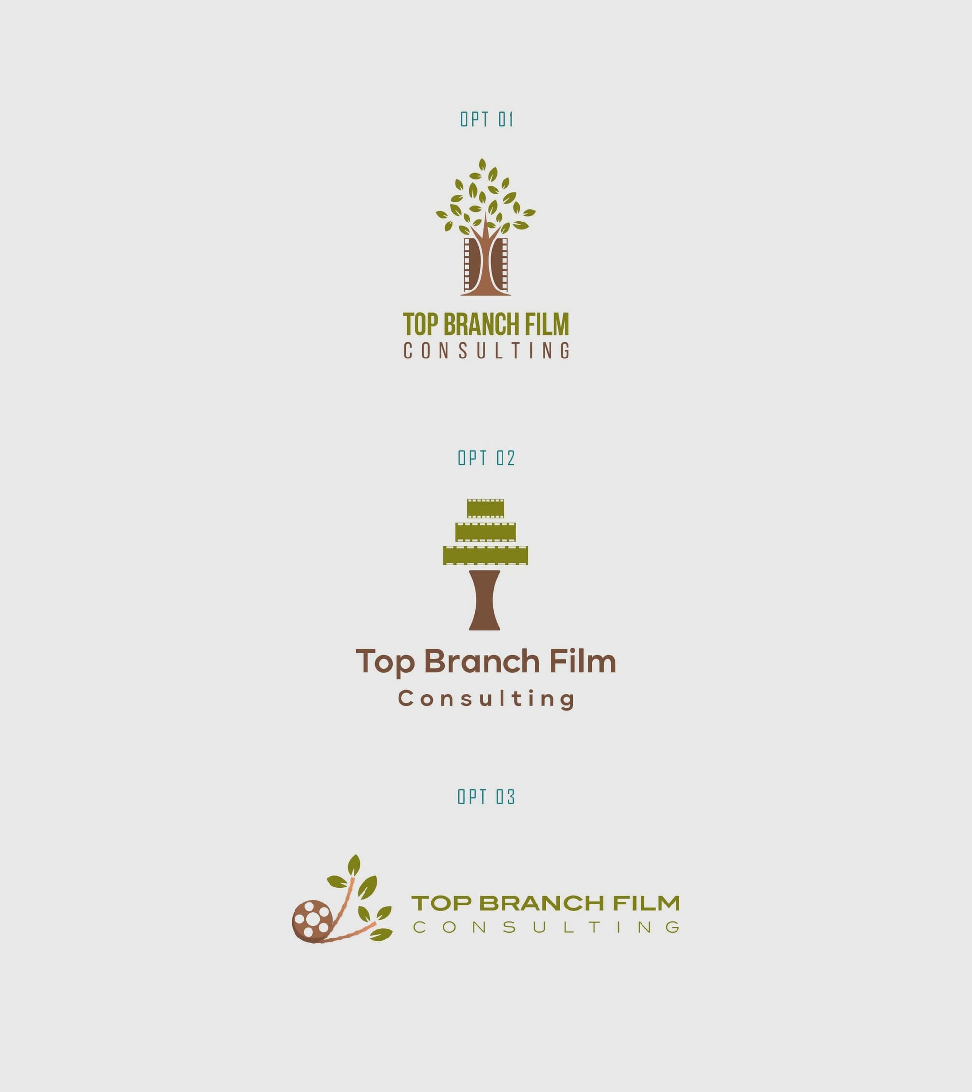
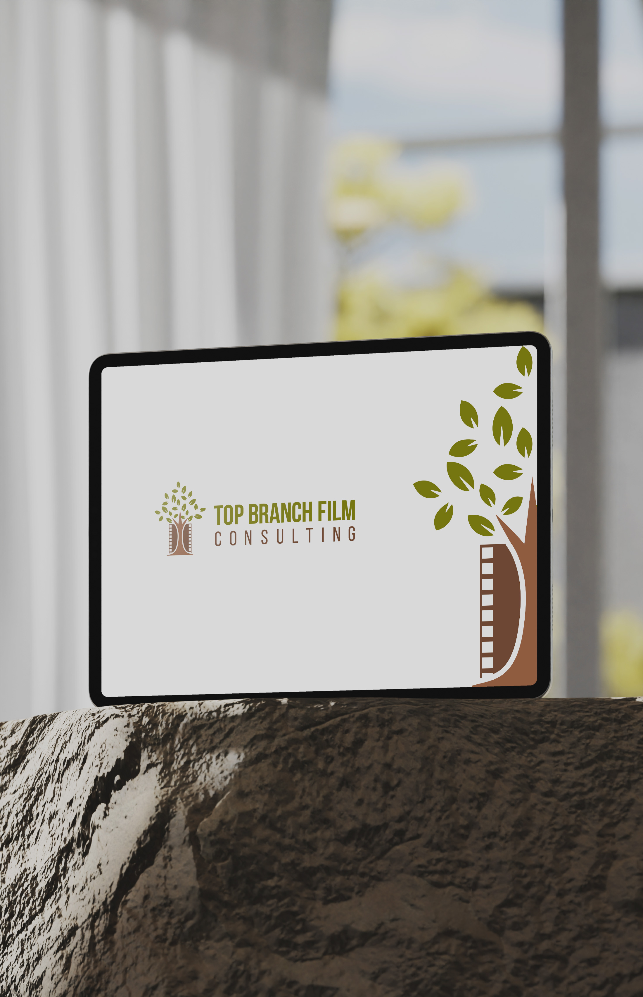
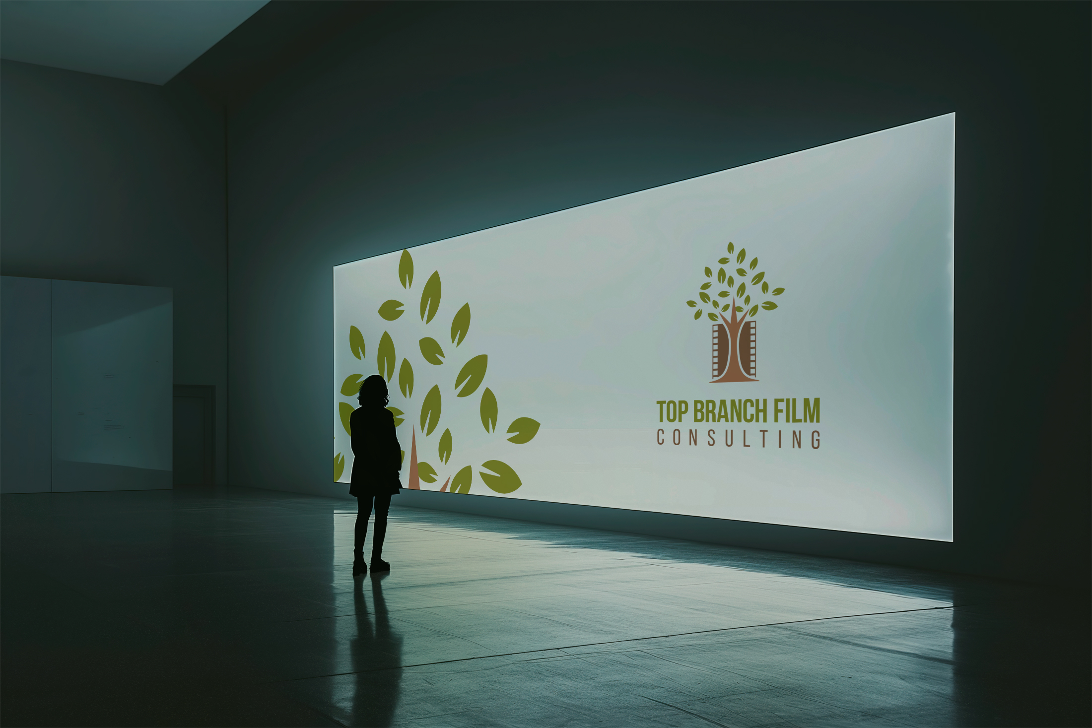
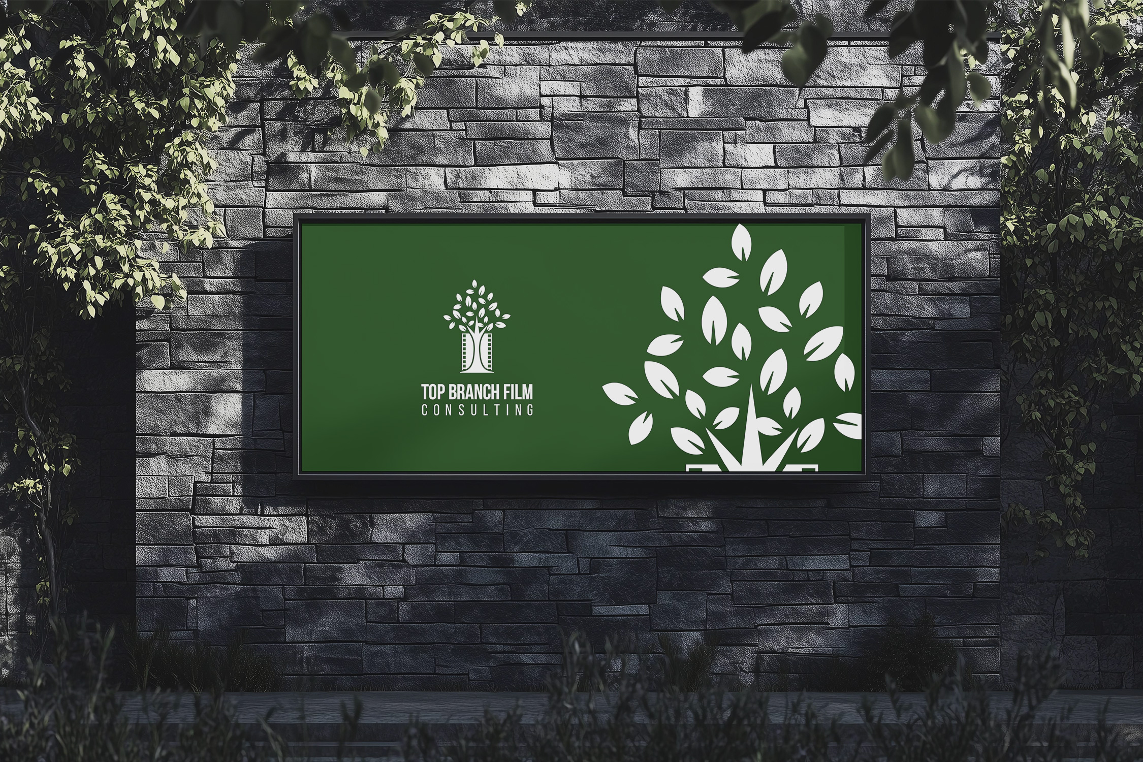
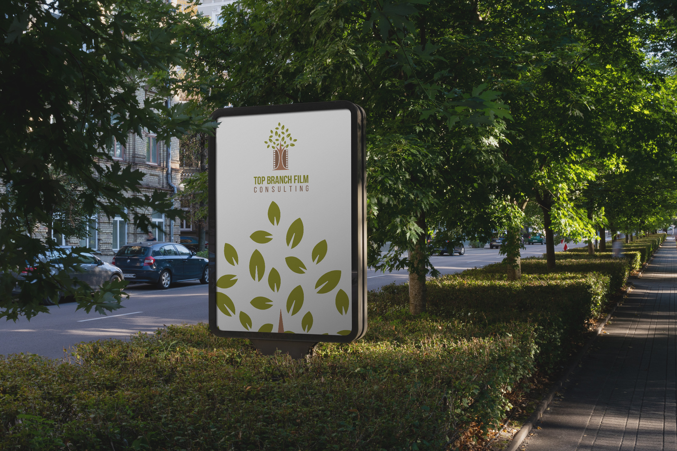
The vision behind the logo was clear and intentional. The client expressed a desire for a design that would marry natural elements with cinematic motifs, suggesting two initial concepts: one revolving around a tree and another featuring leaves on a branch. Central to their vision was the integration of a film reel, a motif proposed to manifest in stark black, set against a palette featuring lively leaf green and earthy tree brown. Their decision for the background was to provide a contrast that makes these colors stand out, potentially using white as a base.


Crafting the Concept
The design team took these guidelines to heart, crafting an initial set of logos that delved into this visual fusion. The options presented varied in their interpretation, each exploring a unique balance of cinematic and natural elements, and embodying the narrative essence of both nature and celluloid strips. After presenting these initial designs, it was option number one that distinctly captured the client's vision, embodying the perfect marriage of sophistication and earthly charm.
The Typeface of Expression
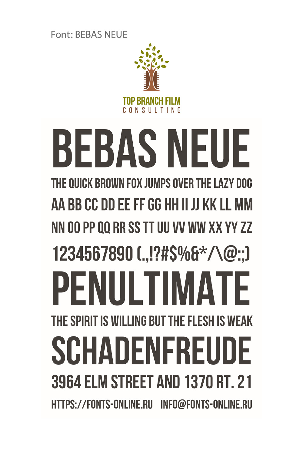
The final design was complimented with the use of the Bebas Neue font, a modern sans-serif that is simultaneously impactful and accessible, ideal for encapsulating the forward-thinking ethos and reliability inherent in consulting.
From Vision to Reality
The final logo, a testament to thoughtful design and collaborative insight, reflects the ideals of Top Branch Film Consulting with a nuanced blend of color, form, and symbolism. By focusing on essential elements symbolic of growth, stability, and artistic fluidity the design speaks the language of both the natural realm and the avant-garde film industry.
Conclusion: A Foundation for Growth
The identity of Top Branch Film Consulting stands as a beacon of where mindful design meets strategic storytelling, offering a visual that is both evocative and functional. As it carves its niche in the bustling film landscape, this newly forged identity affirms their position and promises growth, much like the tree that forms its emblem. With a design as rooted in philosophy as in professionalism, Top Branch Film Consulting’s brand is primed for the screens and skies to come.
Start your brand journey today.


