Brabant & Co. Consulting Services: Crafting Minimal Elegance in Logo Design
Discover the creative journey behind Brabant & Co. Consulting Services' minimalist logo, reflecting their commitment to strategic and timely delivery.
In an ever-evolving marketplace, branding serves not merely as a visual identifier but as an embodiment of an organization's philosophy, mission, and vision. For Brabant & Co. Consulting Services, a government contracting firm, a new minimalist logo was not just an aesthetic choice; it was a strategic move to mirror its core ethos, "From Strategy to Delivery, on Time Every Time." This case study delves into the intricate design process that resulted in a logo that is as much a work of art as it is a pillar of branding excellence.
A Vision in Navy
Colors tell stories, evoke emotions, and set moods. For Brabant & Co., the choice of navy blue, light blue, and white was deliberate, reflecting professionalism, trust, and a touch of optimism. These colors were not just aesthetic selections but strategic decisions to resonate with their target demographic and brand identity.
Initial Concepts and Client Vision
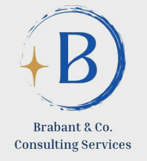
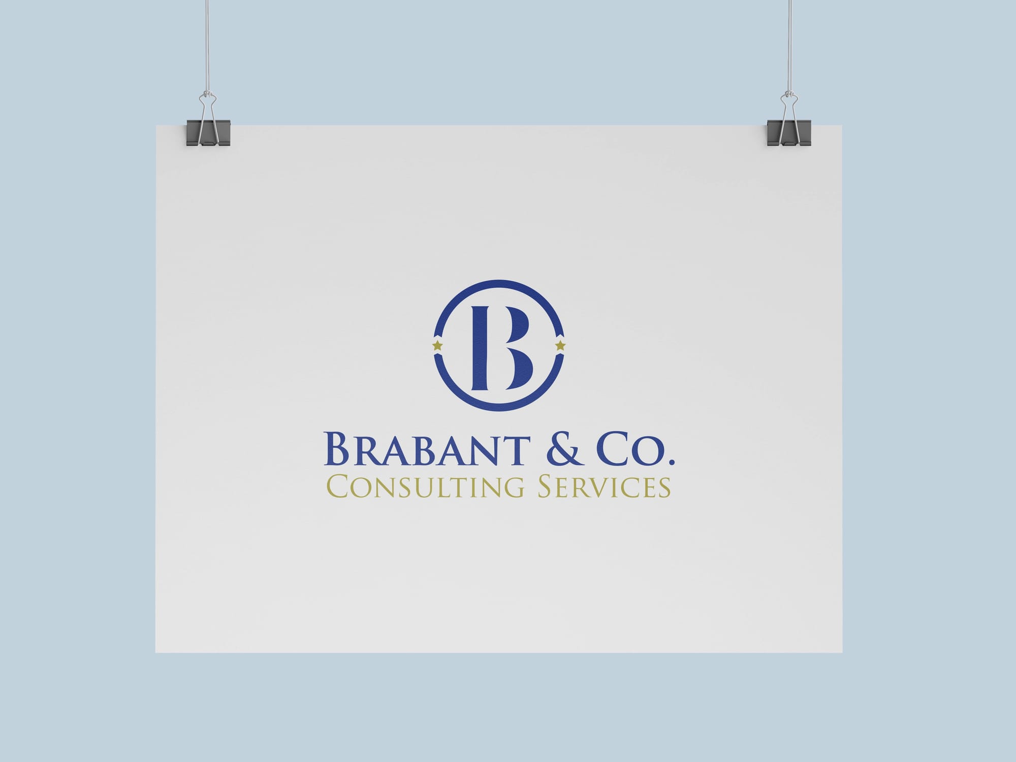
The client outlined a preference for a minimalist logo where the "B" in Brabant stands as a focal point. Initial references included two visual guides that suggested direction without constraining creativity.

Exploring Design Solutions
The design team presented a series of logo concepts—each weaving minimalism into the fabric of Brabant & Co.'s identity. The sheet of initial ideas demonstrated varying levels of abstraction and stylization of the "B."
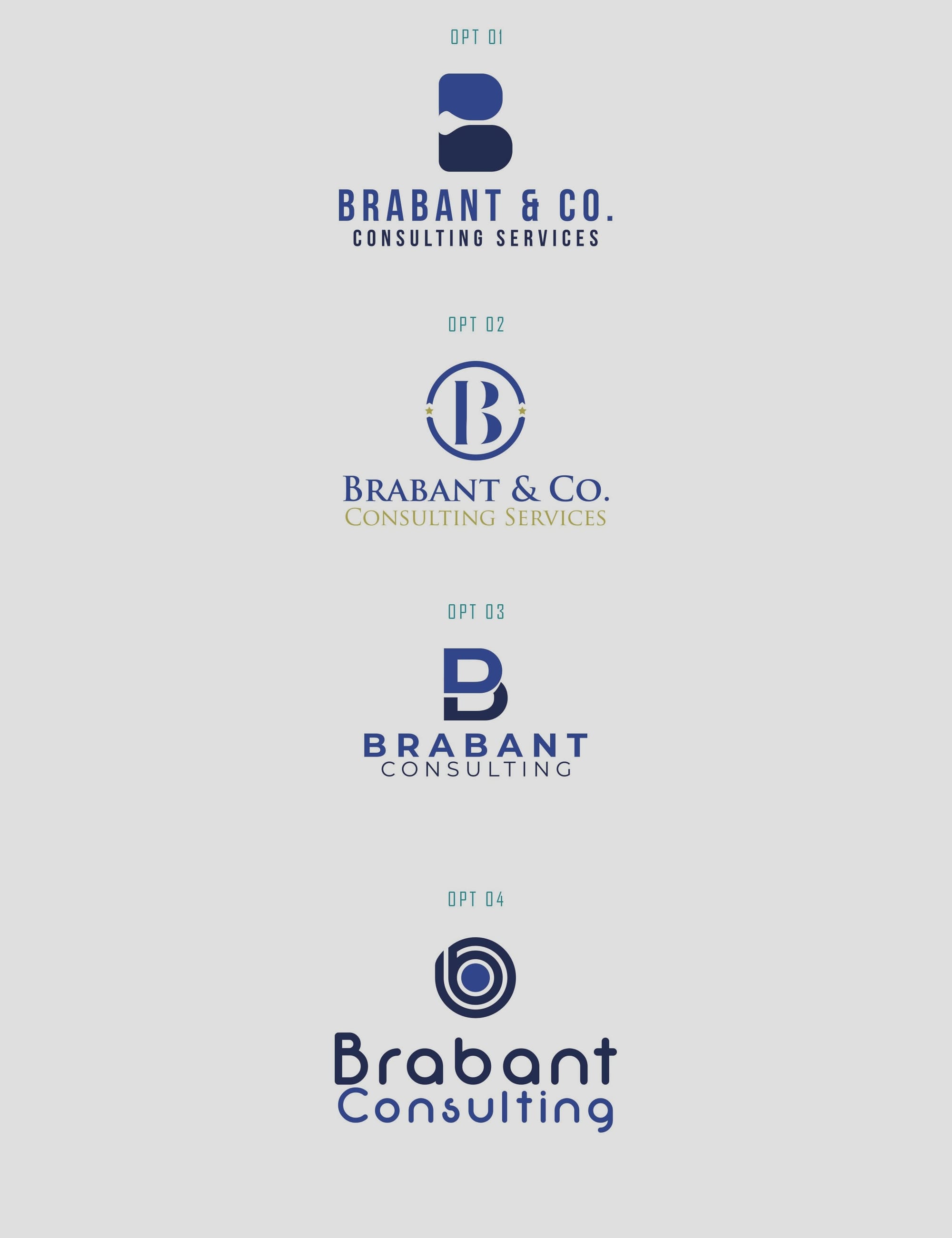
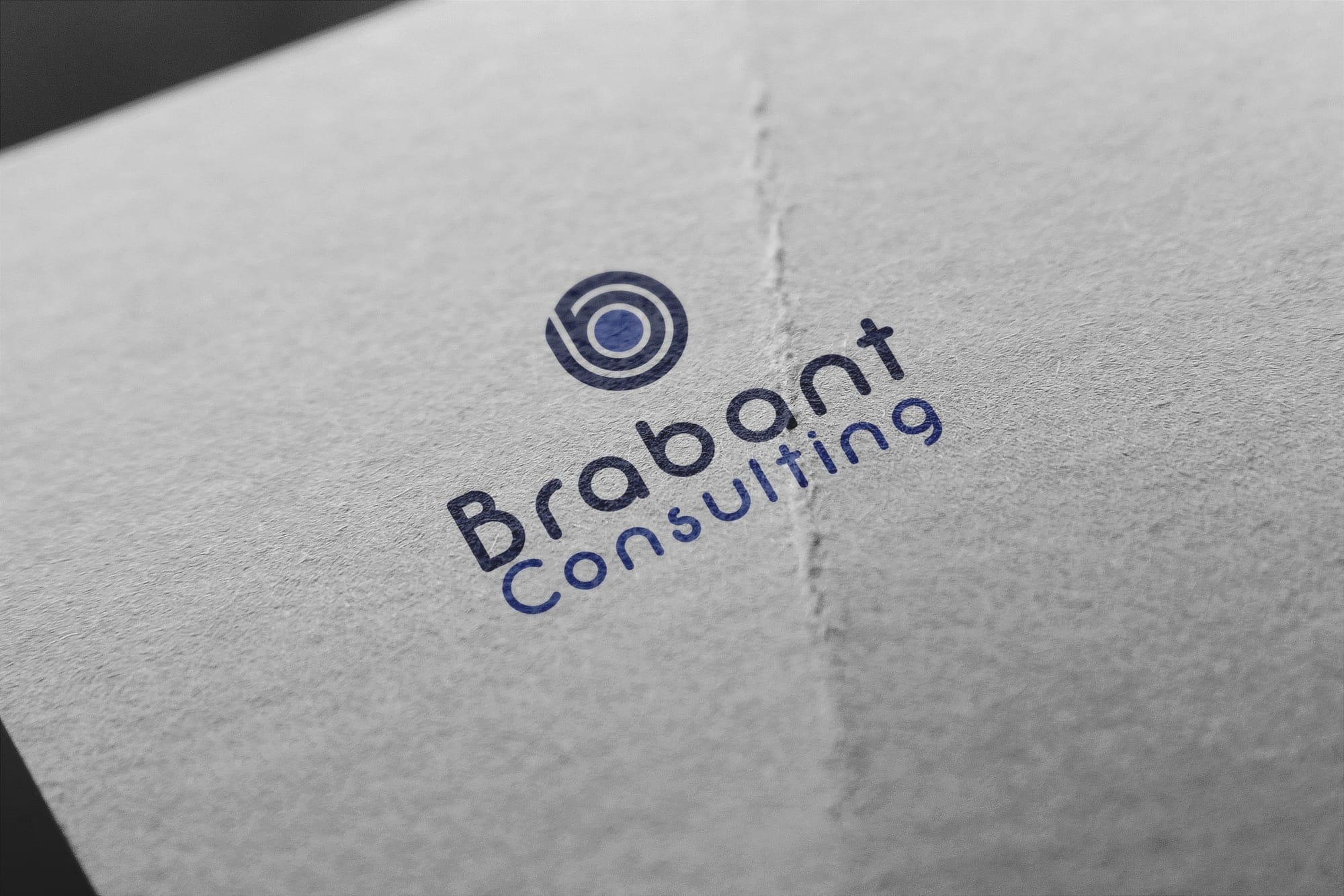
Refining the Logo
Out of the numerous options, four concepts stood out. Each option explored different dimensions of minimalism and symbolism. Option 1, however, immediately struck a chord with the client, delivering precisely the visual narrative they were searching for.
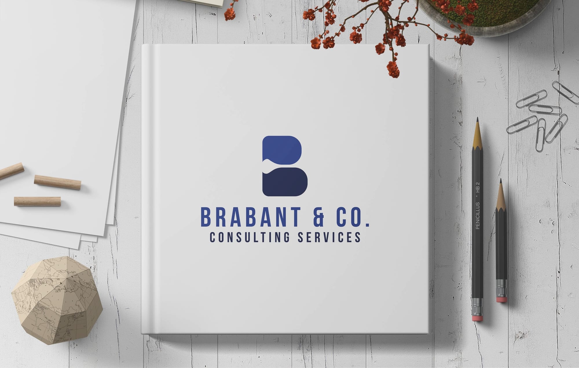
The Chosen Design
The client eagerly affirmed that Option 1 was the ideal logo. This design encapsulated Brabant & Co.'s core values with its sleek, sophisticated lines and bold letter presence. The decision was unanimous and encapsulated the client's aspirations for a clean, modern look that resonated with their operational philosophy.
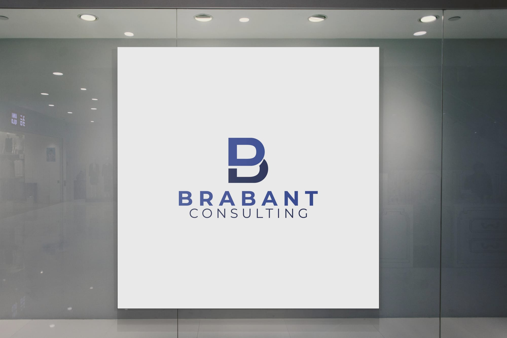
Final Delivery
With Option 1 approved, the design team delivered various branded images illustrating the logo's versatility across different platforms and settings. The scenarios on various backdrops such as buildings, laptops, and vehicles showcased how the logo maintained its elegance in different environments.
The Typography: Bebas Neue
The choice of Bebas Neue for the typography in the logo reinforces the brand's modern yet timeless appeal. Known for its clean aesthetic and straightforward readability, Bebas Neue perfectly complements the minimalist design ethos of Brabant & Co.
As Brabant & Co. stands poised to make its mark in the consulting landscape, the new logo serves as a visual testament to their unwavering dedication to strategic excellence and timely delivery. It's a brand identity that not only captures where they are now, but also where they aim to go, providing a foundation for growth and success in a highly competitive industry.
Start your brand journey today.
