Bold Innovation in Real Estate: The Agent Command Visual Identity
Discover the creative journey behind Agent Command's bold new logo, designed to disrupt the real estate lead generation market.

In the bustling world of real estate, where competition is fierce and innovation is key, Agent Command emerges as a bold disruptor. The company aims to revolutionize real estate lead generation by taking an assertive, memorable, and trustworthy approach. With this vision at the forefront, they sought a compelling visual identity that echoes their ambitious mission, resulting in a striking rebranding journey.
Understanding Agent Command
Agent Command, with its powerful slogan 'Take command of your prospecting,' sets its sights on empowering real estate professionals with innovative lead generation solutions. Their ambition to stand out from the crowded market drove the need for a logo that encapsulates their bold spirit while inspiring trust. It's no wonder then that they gravitated towards iconic disruptors like Tik Tok, Airbnb, Uber, and Zoom for reference, brands that are not only memorable but also synonymous with groundbreaking innovation.
The Design Brief
The design brief presented by Agent Command was clear and compelling: create a logo that's bold, aggressive, and unforgettable. The brand wanted to disrupt the status quo, necessitating a visual identity that was not only vibrant in its bold red color but also simple enough to be instantly recognizable. Agent Command aimed for a combination of image and text, a hallmark feature of brands that changed the game and stayed etched in public memory.
Design Iterations
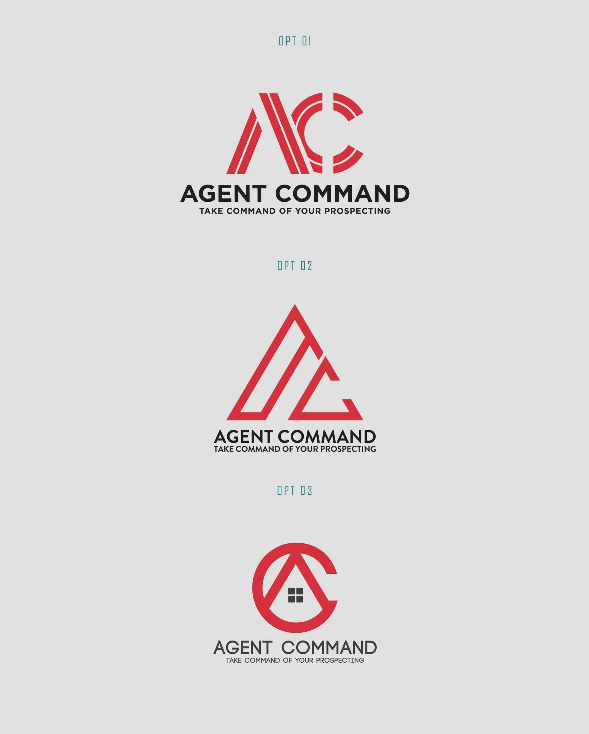
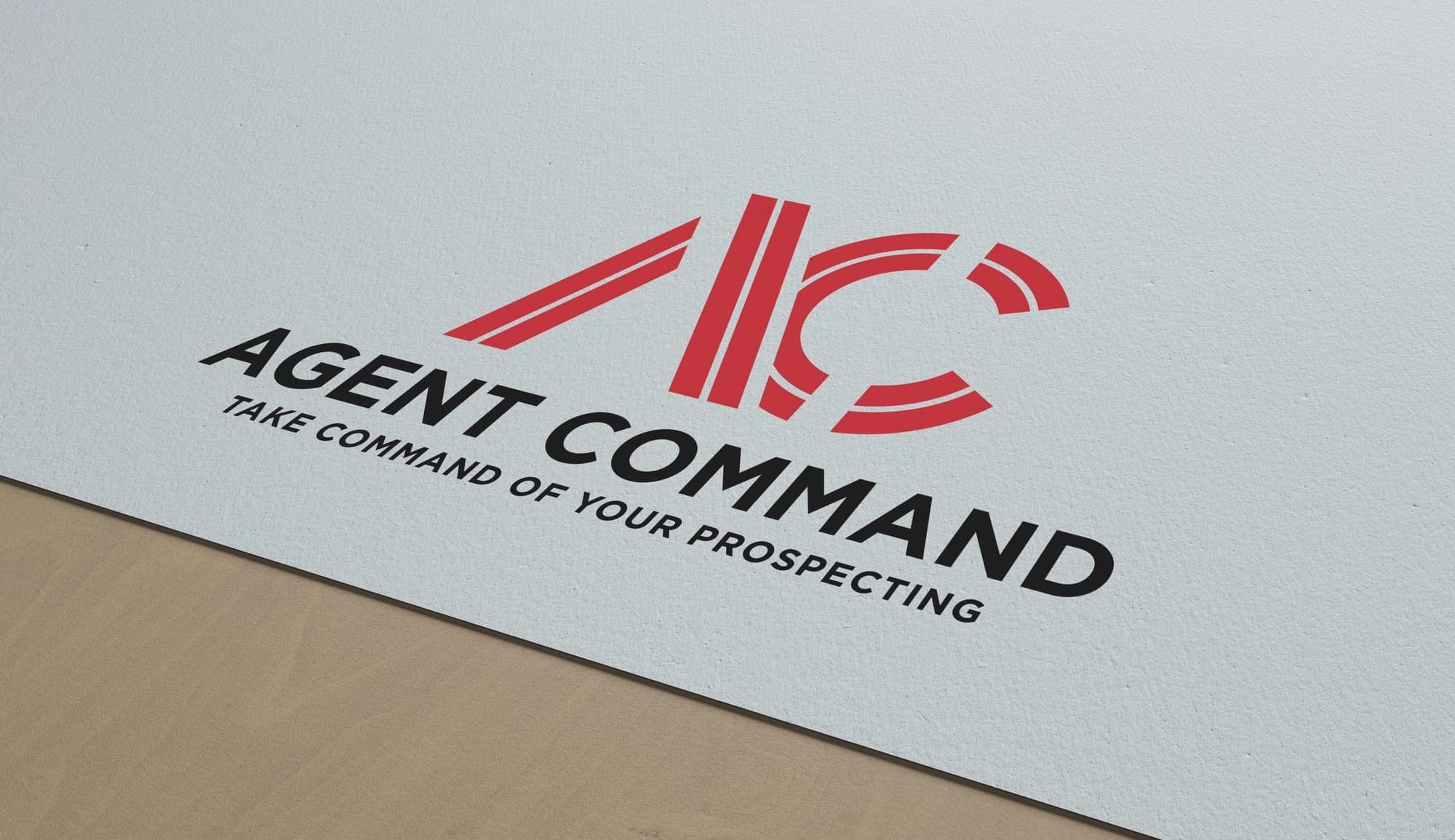
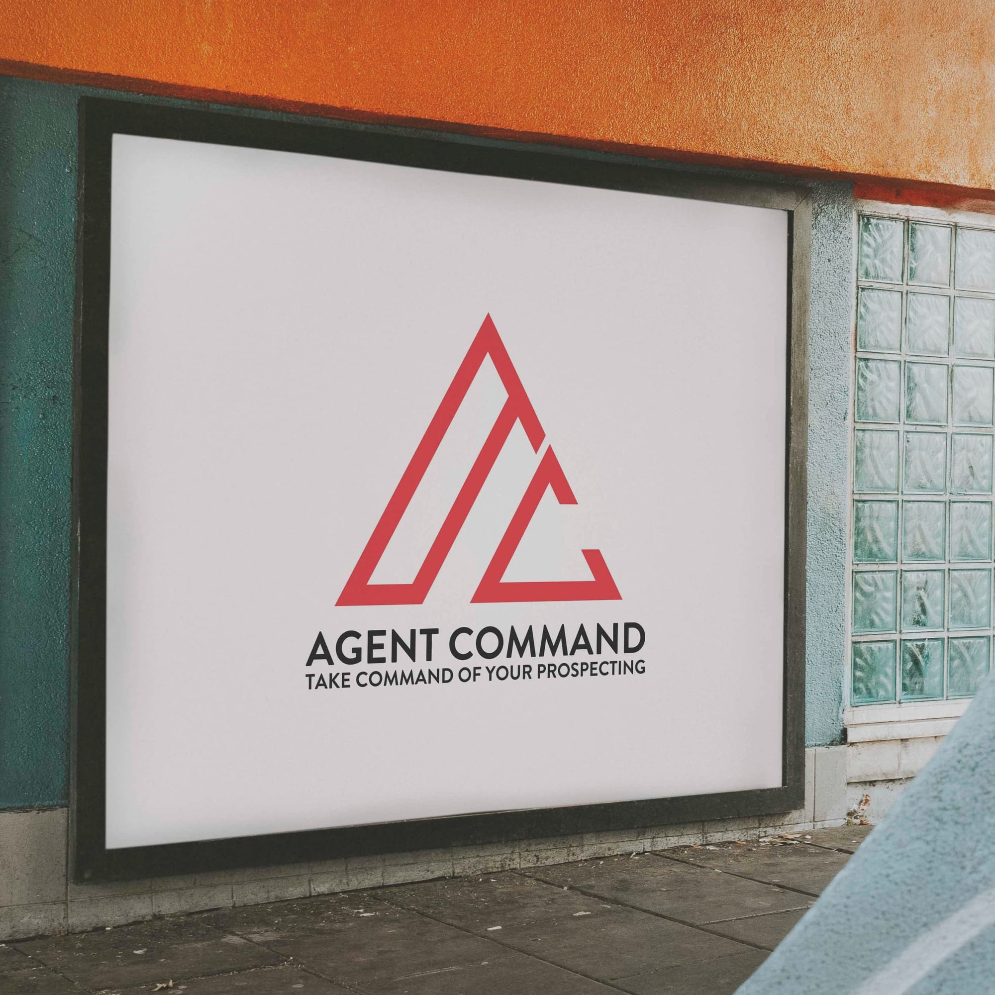
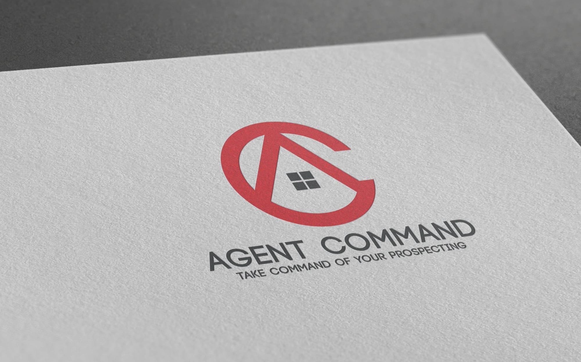
In response to the brief, the design team embarked on a creative journey, delivering various options that encapsulated the brand's essence. The initial batch included distinctly different concepts, each reflecting the brief's requirements. This phase was integral in honing down the vision through visuals. The options presented were vibrant and memorable, drawing on bold typography and sleek graphics.
Client's Choice and Approval
The company chose the second option, a choice that seamlessly aligns with their vision. This logo option was embraced for its ability to capture the essence of what Agent Command stands for: a marriage of bold imagery and impactful typography.
Final Logo and Brand Impact
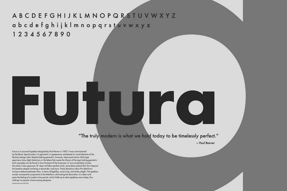
The finalized logo uses Futura, a typeface synonymous with efficiency and modernity, rendered in a striking red and black color palette. The use of Futura was strategic as it accentuates the logo’s modern appeal while remaining rooted in trustworthiness. The choice of colors and fonts reflects a balance between an aggressive market stance and a steadfast reliability that clients can trust.
A Bold Future
Agent Command's reimagined visual identity is more than just a logo; it's a statement of intent. It marks the brand's outreach to clients seeking innovative and reliable solutions in real estate prospecting. The visual identity promises to leave a lasting impression, mirroring the brand's goal to remain unforgettable in the minds of its audience as it continues to lead the way in transforming real estate lead generation.
Start your brand journey today.

