Bloggercube: Crafting a Digital Identity in the Token Era
Explore Bloggercube's logo design journey, where modern aesthetics meet the digital currency world, forging a new brand identity.

In the rapidly evolving landscape of digital currencies, capturing the essence of a brand in a single visual identity is a considerable challenge. Bloggercube, a nascent player in the cryptocurrency world, embarked on this path, seeking a logo that not only represented its digital coin but also its ethos of connectivity. The project was straightforward yet multifaceted, beginning with a concise brief from Bloggercube's team.
Understanding Bloggercube's Vision
Bloggercube is setting its sights on the vast horizon of the digital currency market with a new token poised to make its mark akin to the global impact of Bitcoin. The brand, characterized by its slogan "connect you idol," strives to foster a unique bridge between influencers and their audiences using the power of cryptocurrency. In this spirit, Bloggercube’s visual representation had to embody modernity, innovation, and a touch of familiarity that could resonate within the digital realm.
The journey started with Bloggercube expressing an interest in developing a logo similar to the iconic Bitcoin, yet distinct enough to stand on its own. The brand envisioned a design that would seamlessly integrate into digital environments while showcasing their core identity and values.
The Design Process: Initial Concepts and Revisions
The design team quickly got to work, presenting initial concepts that explored a contemporary palette and forms designed to evoke professionalism and modernity. Their first set of ideas presented to the client brought forth exciting options, each speaking a different design language of innovation and clarity.
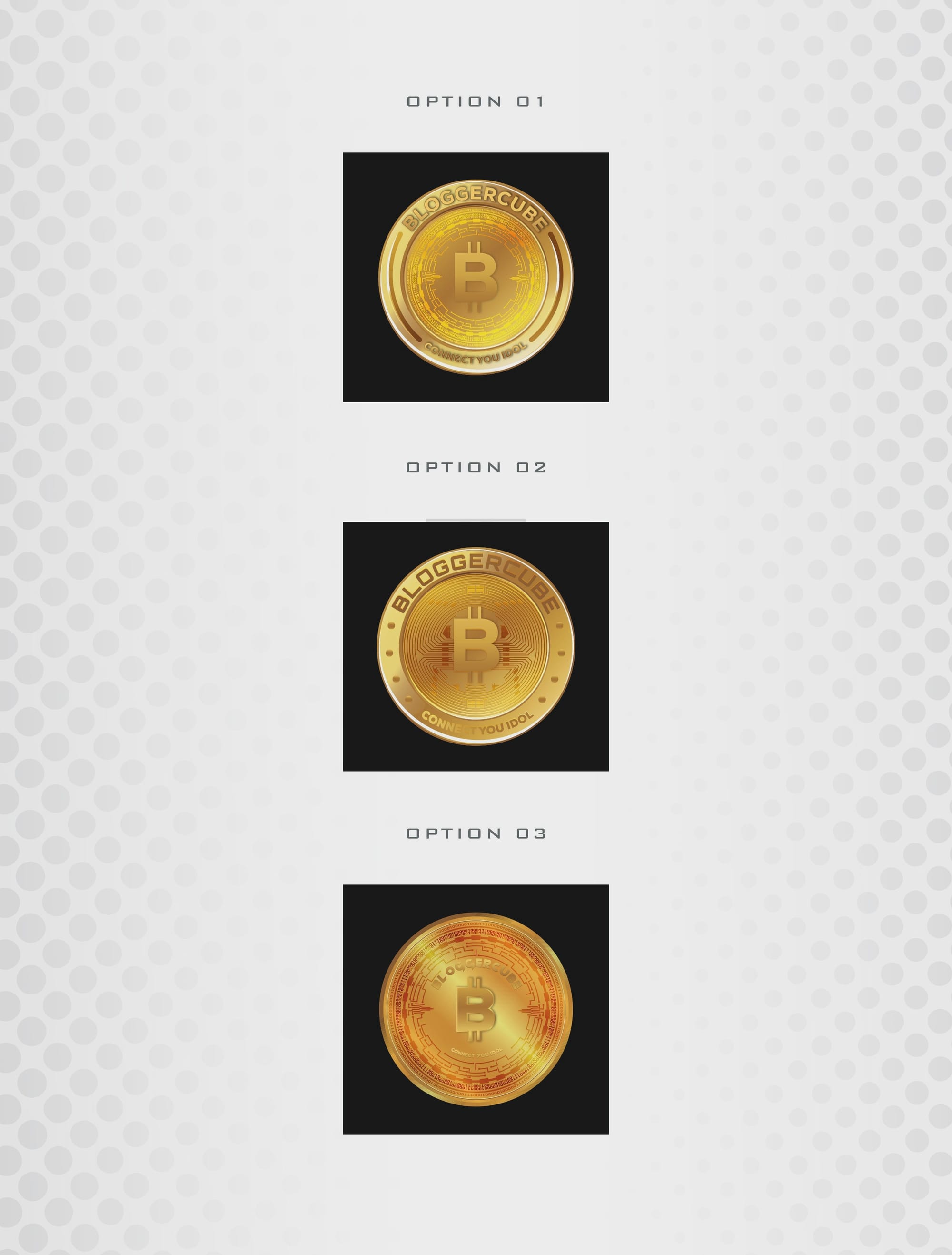

Of the initial concepts, the client expressed a strong preference for the second design option but desired further revisions to enhance the appeal further. The request was to incorporate the initials "BC" into the logo’s core and pivot towards a more elegant typographical style.
Refining the Design
Responding swiftly to the client's feedback, the design team crafted several refined options. These iterations focused on positioning the letters "BC" more prominently and exploring a variety of typefaces. Notably, the Arial font was suggested for its balance of simplicity and professional undertone.
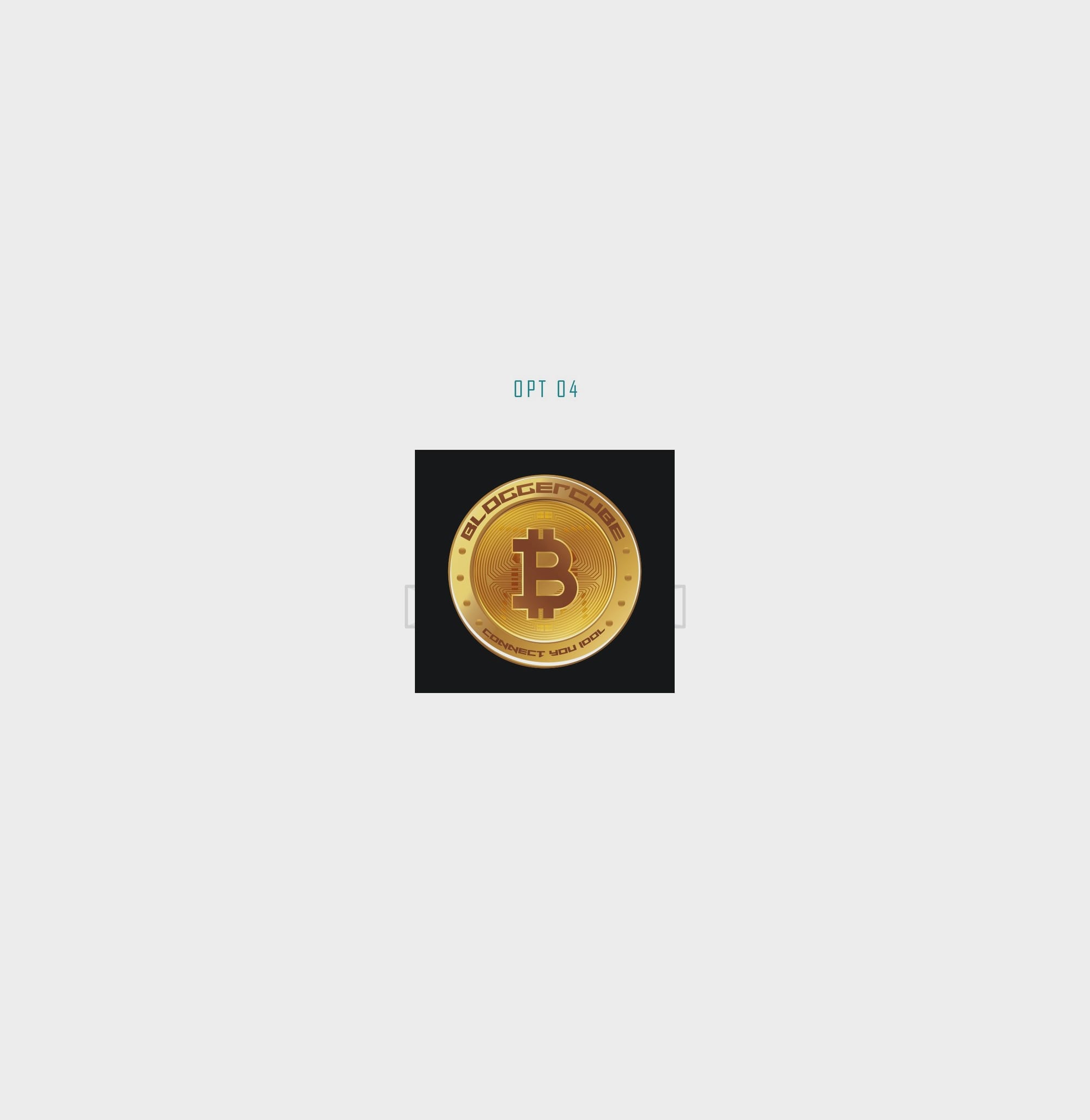
The team infused creativity diligently, enhancing every element from spacing to font curvature, refining the visual identity that preserves the essence of Bloggercube's mission.
Final Designs and Outcome
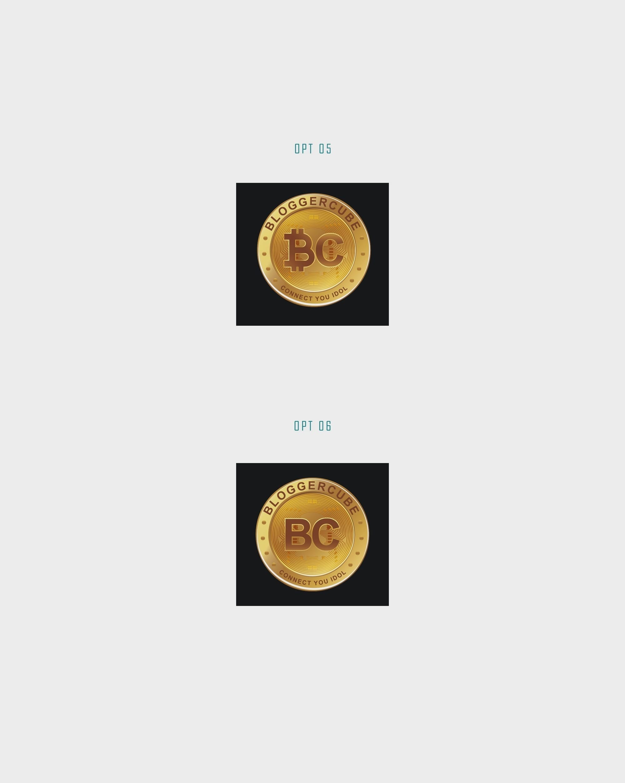
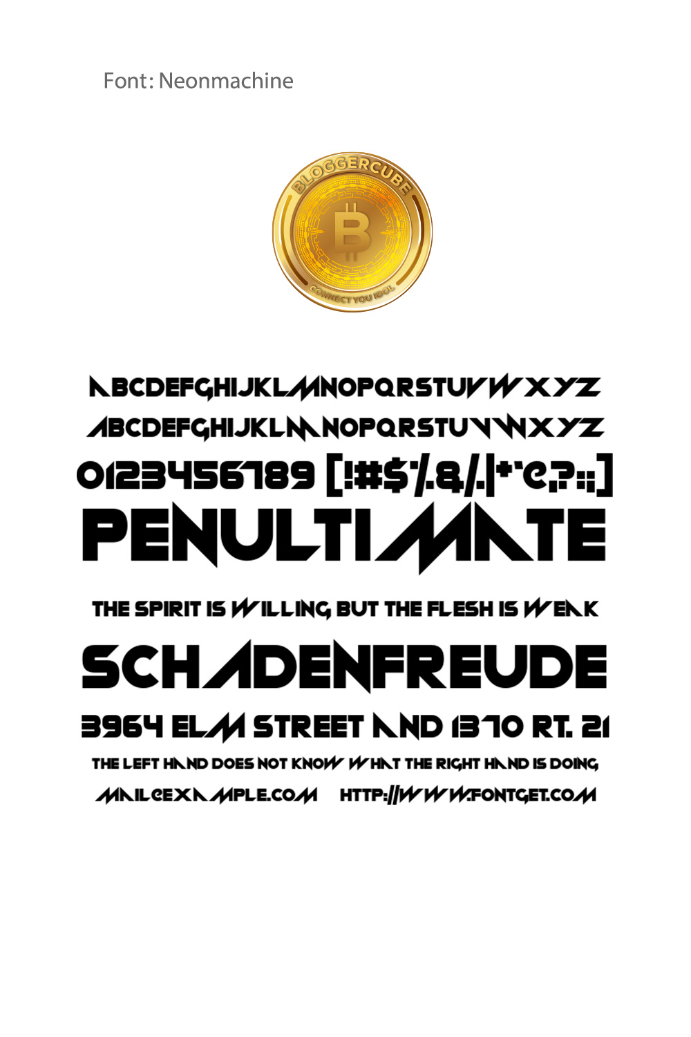
The approved design incorporated the "BC" element in a manner that mirrored the connectivity Bloggercube champions. The font, Neonmachine, offered the necessary futuristic touch, balancing the stability of Arial with a new-age flair.
Typography Selection
The chosen typography complements the logo’s modern and professional tone, offering a clean and confident visual presence. Its balanced letterforms ensure legibility across both digital and print mediums, reinforcing the brand’s credibility and contemporary appeal.
Mockup Presentation and Brand Visualization
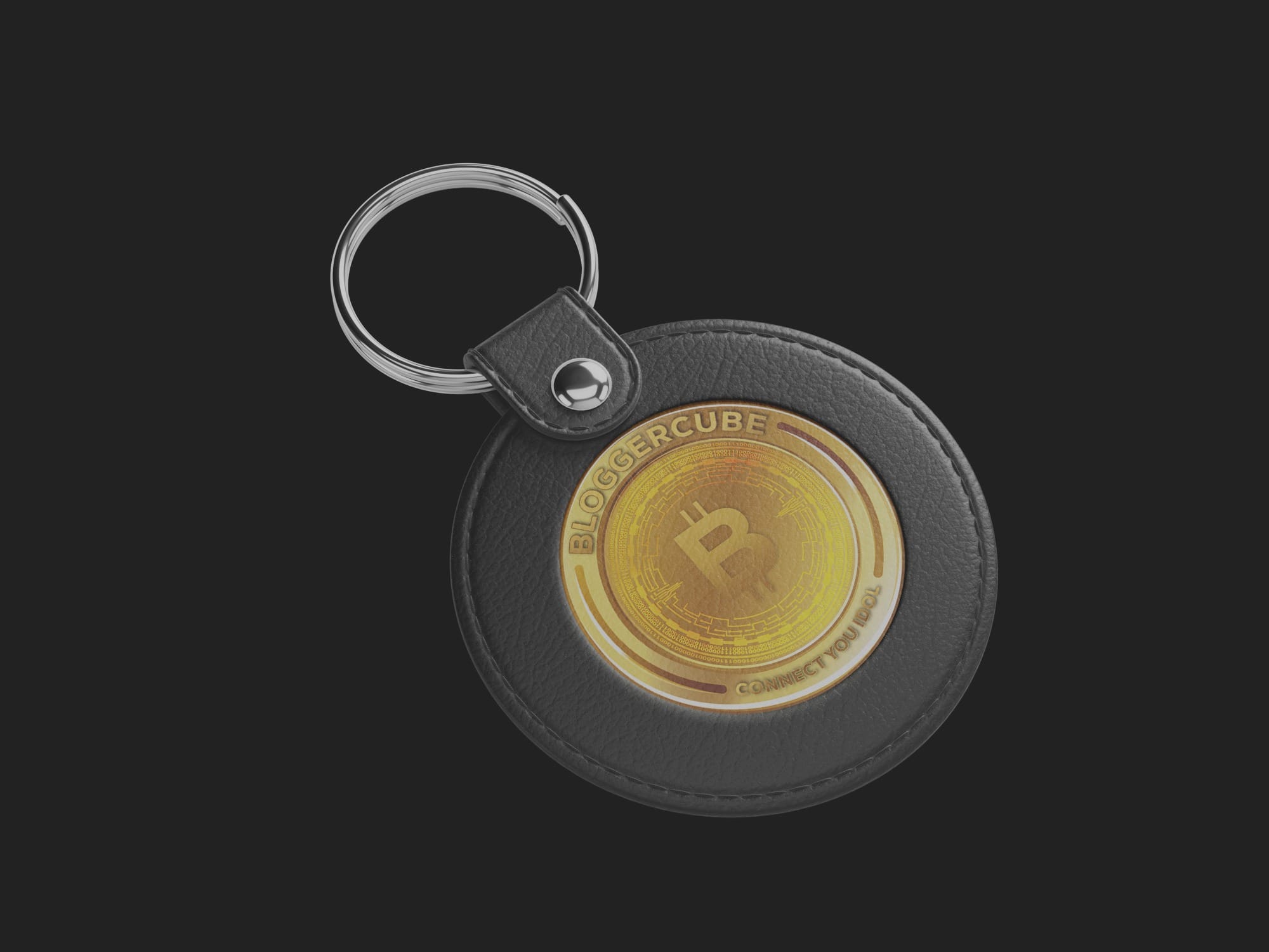
To bring the logo to life, a series of realistic mockups were developed to showcase its versatility across various applications. From ATM screens and business cards to digital dashboards and outdoor signage, each mockup was thoughtfully curated to demonstrate how the identity performs in real-world scenarios.





Conclusion
The visual identity crafted for Bloggercube is a testament to the synergy of design and vision. It speaks volumes about the brand’s mission to innovate within the digital currency space while maintaining a relatable, accessible aesthetic. As Bloggercube continues to grow, its logo will undoubtedly stand as a pillar of its identity, embodying the intersection of tech-forward-thinking and community connection.
Start your brand journey today.

