Beetle: Capturing the Future with a Revitalized Logo Design
Explore the journey behind Beetle's new logo design, blending tech-like simplicity with a modern touch in the emerging drone industry.
In the fast-evolving world of technology and design, high-tech startups constantly seek to carve a unique identity amid ever-growing competitors. Beetle, a promising tech start-up, finds itself standing at the cusp of such a crucial juncture. Specializing in pocket-sized drones, Beetle's mission taps into a youth-driven market obsessed with photography and social media. This article unpacks the design process behind Beetle's latest visual identity overhaul.
Exploring Beetle's Creative Genesis
Beetle's inception lies in the heart of technological innovation, focusing on small, portable drones aimed at enhancing social media photography for young consumers aged 13 to 30. At the core of Beetle's identity is a vision to "Capture your world differently," a tagline symbiotic with its groundbreaking product line.
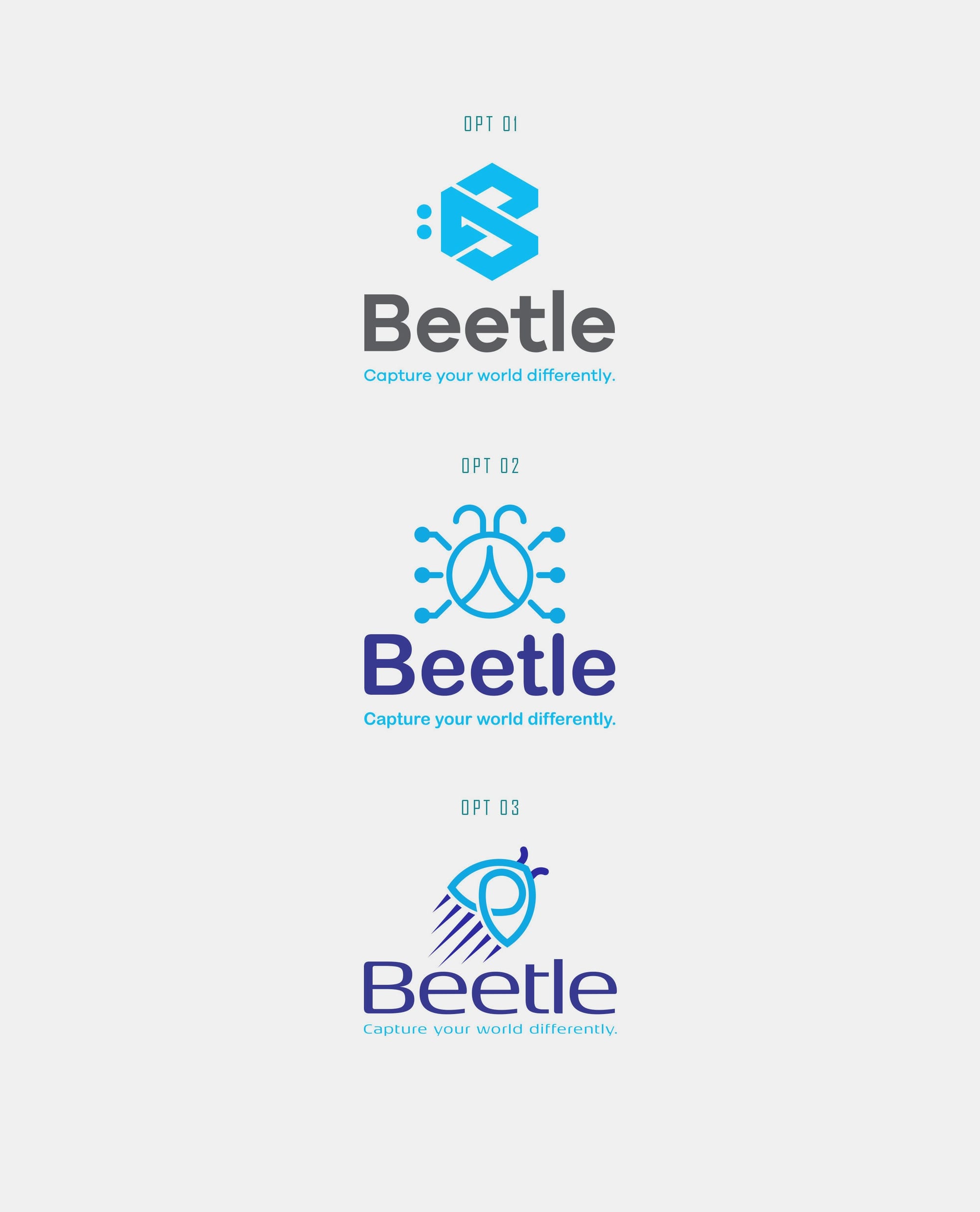
The initial brief drawn for Beetle’s new logo centered around a logo-focused design with clean, tech-like aesthetics. This requirement drew parallels with iconic giants such as Facebook, Apple, and Google, setting a daunting yet inspiring benchmark. The branding aimed to incorporate a symbolism of a beetle, but without losing touch with modernity and dynamic appeal. A soothing baby blue was preferred to resonate a calm, approachable vibe.
Design Team's Strategic Approach
With the client’s vision impeccably sketched, the design team plunged into the creative phase. Initial responses showcased various logo concepts. These concepts struck a balance between simplicity and symbolism, hinting subtly at a beetle’s form while adhering to modern design principles.
Multiple iterations were proposed, inviting critical analysis and feedback from Beetle's team. Tensions often run high when such branding exercises unfold. However, the collaborative feedback resulted in refined strategies, mirroring Beetle’s dynamic product aspirations.
Feedback Loop and Final Selection
The design journey branched forth intriguing dialogues between the client and design team. Upon reviewing the preliminary logos, Beetle expressed preference towards an amalgamation of Option 1's text with the logo design from Option 3. Centralized tweaks, such as angling adjustments and color consistency, were crucial touchpoints in subsequent drafts.
The design language matured to embrace an upward-facing emblem, embodying Beetle's futuristic ethos. Triangular elements saw reduction in size to streamline the overall appearance while preserving the logo's identity. The choice of utilizing a singular, compelling color code (#89CFF0) harmoniously brought uniformity to Beetle’s visual narrative.
The Winning Logo and Its Real-world Implications
Ultimately, Option #01 materialized as the triumphant logo, capturing Beetle’s multifaceted essence. This concluding design symbolizes adaptability and movement, essential traits for Beetle's high-tech products, which transcend traditional barriers to re-imagine creativity and connectivity in the digital age.
The Typeface: Galano Grotesque
Galano Grotesque, characterized by its geometric simplicity and contemporary edge, was the chosen typeface that accentuated Beetle’s revitalized identity. Its balanced character structure mirrored Beetle’s brand philosophy, enriching its visual impact.
CONCLUSION
As Beetle prepares to launch its innovative drone technology into the market, its new logo nods toward a promising future where technology and creativity coalesce harmoniously. This visual overhaul not only enhances brand visibility but also solidifies its messaging with the digitally-driven consumers.
Start your brand journey today.
