Bartholomew Dentistry: A Harmonious Blend of Elegance and Simplicity
Explore the rebranding journey of Bartholomew Dentistry, where a minimalist yet sophisticated logo design elevates the brand's visual identity.
Bartholomew Dentistry: Crafting a Visual Identity
Bartholomew Dentistry, a name that resonates with both tradition and innovation, embarked on a transformative rebranding journey to harmonize its visual identity with the premium dental services it offers. Located in the urban expanse of a bustling city, Bartholomew Dentistry recognized the need to refresh its brand image to create a lasting impression on its clientele, new and old.
Navigating the Rebranding Challenge
The transition towards a new brand identity posed several challenges. Bartholomew Dentistry strived to maintain a balance between sophistication and approachability. The visionary leadership of the practice aspired to reflect a premium yet welcoming environment through its logo, an emblem that would serve as a beacon of the trust and fidelity they had established within the local community.
To commence this journey, Bartholomew Dentistry provided a detailed logo brief, emphasizing the desire for a minimalist tooth outline to be integrated within the design. The color palette was thoughtfully selected to employ white and light blue, inspired by UNC Blue, symbolizing purity, health, and tranquility.
Designing with Intent: The Initial Concepts
The design team's mission was to craft several logo iterations that encapsulated the essence of Bartholomew Dentistry while also granting it a fresh, modern appeal. The initial designs offered a range of options, varying in complexity and subtlety. These iterations encompassed the feedback and preferences shared by the client, including the adaptability for embroidery.
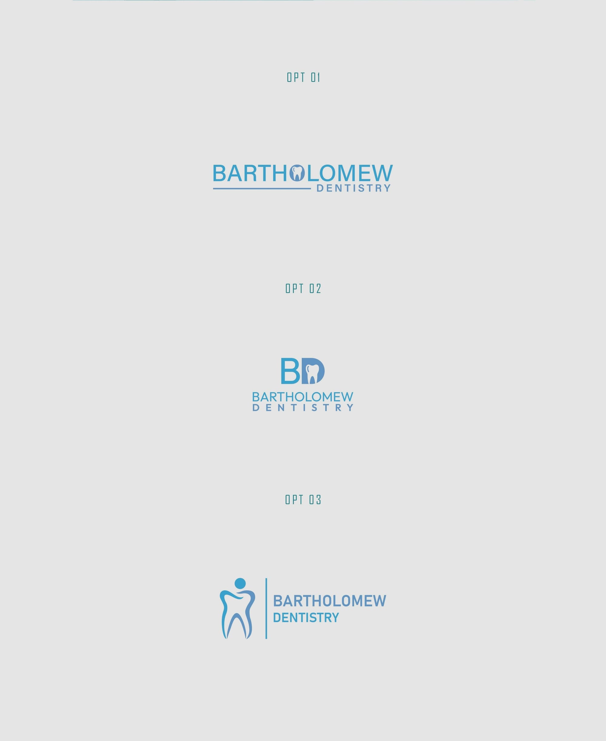
Feedback: Reaching the Pinnacle
The client showed enthusiasm for the work presented, selecting Option 1 as an ideal candidate for signage while envisioning Option 3 as the choice for embroidery purposes. Amidst curiosity, the client inquired about incorporating the extended name, "Bartholomew Restorative Dentistry," into the logo, a reflection of their comprehensive dental services.
A seamless dialogue between the client and the design team led to the finalization of Option 3, described by the client as a clear winner. The selected logo design distinctively represents the premium care and innovative practices that Bartholomew Dentistry stands for.
The font PANTON RUST was introduced into the final logo design, offering an understated sophistication. Its textured appearance not only adds depth but underscores the reliability and resilience associated with Bartholomew Dentistry.
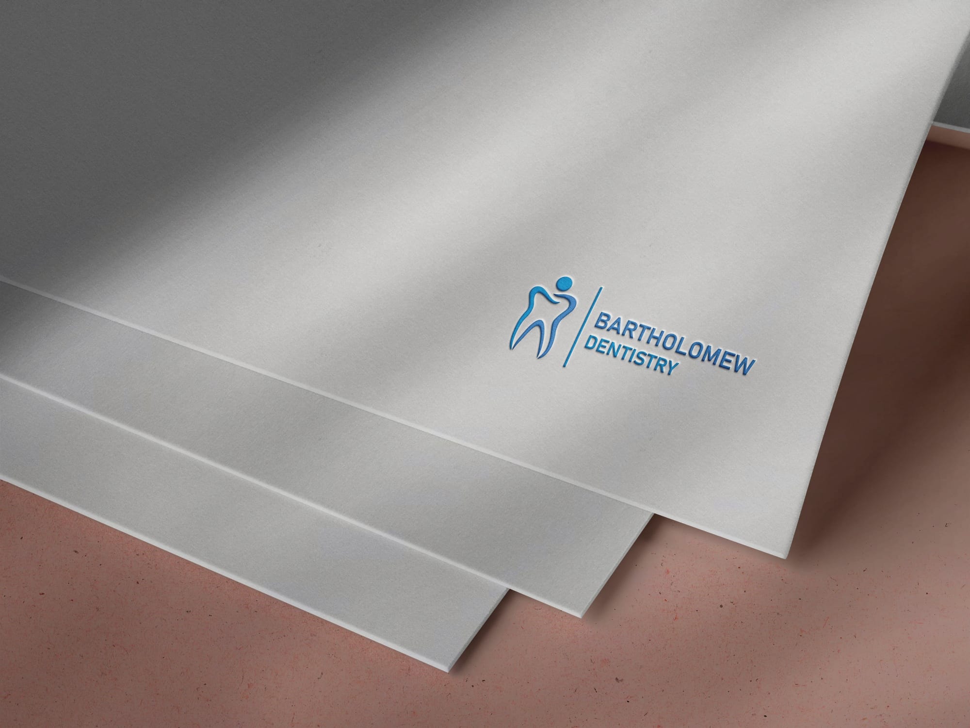
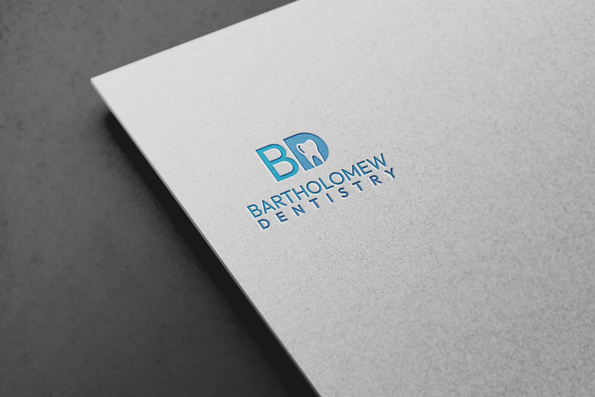
Bringing the Brand to Life: Mockups and Real-World Applications
Ultimately, to visualize the logo's application in real-world scenarios, a series of mockups were produced. These mockups vividly illustrate how the new logo serves multiple purposes, ranging from building signage to uniforms, echoing a unified brand presence across various touchpoints.
Concluding Thoughts: Embodying the Bartholomew Philosophy
The rebranding of Bartholomew Dentistry exemplifies how a thoughtfully crafted logo can be both an aesthetic triumph and an effective tool for communication. More than just an icon, it serves as a testament to the care, expertise, and trust that Bartholomew Dentistry instills within its community.
Start your brand journey today.
