Alterra at 50: A Celebration of Legacy Through Rebranding
Explore Alterra's journey to create a 50th-anniversary logo that honors its rich legacy and embraces future aspirations.
Celebrating a half-century of excellence, Alterra has embarked on a journey to refresh its visual identity with a logo that honors its legacy and heralds its future. Known for its significant contributions in the real estate development sector, the company thrives at the crossroads of innovation and tradition. Headquartered in Toronto, Canada, Alterra's 50th birthday calls for a visual reinvention that resonates with its storied past and promising innovation.
Understanding Alterra's Milestone
In an era of rapid change, a brand touching the golden milestone of fifty years is a testament to its resilience and relevance. Alterra's pursuit for a 50th-anniversary logo isn't just about aesthetics; it's about encapsulating a narrative that spans from 1973 to the present day. With a logo that marries past achievements with tomorrow's aspirations, Alterra seeks to captivate its audience anew.
The Creative Brief Unfolded
The initial design brief laid a clear path: retain the existing 'Alterra' logo while introducing the element of 50 years (1973-2023). The visual language had to articulate the timeline of this journey, incorporating corporate hues of black and white with Modern pops of green, a fresh addition to Alterra's color palette. With Roboto as their corporate typeface, the challenge was to create continuity and evolution elegantly.
Design Vision and Strategy
Upon receiving the brief, the design team embarked on crafting three distinctive options. The design needed to be respectful of the original yet modern in scope, thereby speaking to the longevity and forward-thinking philosophy of Alterra.
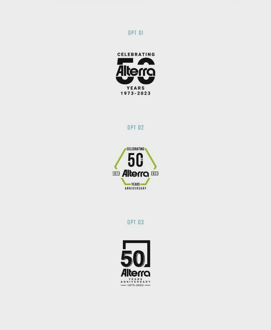
The first option adhered strictly to the black and white aesthetic, presenting a high contrast and clean approach. For many, black and white elevates a design's timeless quality. However, it is the second and third options that dared to venture into the bold inclusion of green, aligning with Alterra's evolving brand narrative.
Feedback and Refinement
The journey of creation is as critical as the final product itself. Alterra's team played a pivotal role in steering the design to its desired destination. They emphasized aligning their legacy 'A' with the curve of the '50', a subtle yet significant tweak that resonates with their brand philosophy of precision and attention to detail.
The Chosen Path:
Ultimately, it was option 03 that emerged as the preferred choice a harmonious balance of the iconic Alterra emblem with the celebratory 50th-anniversary insignia. This selection marked a moment where legacy met innovation, encapsulating what Alterra stands for.
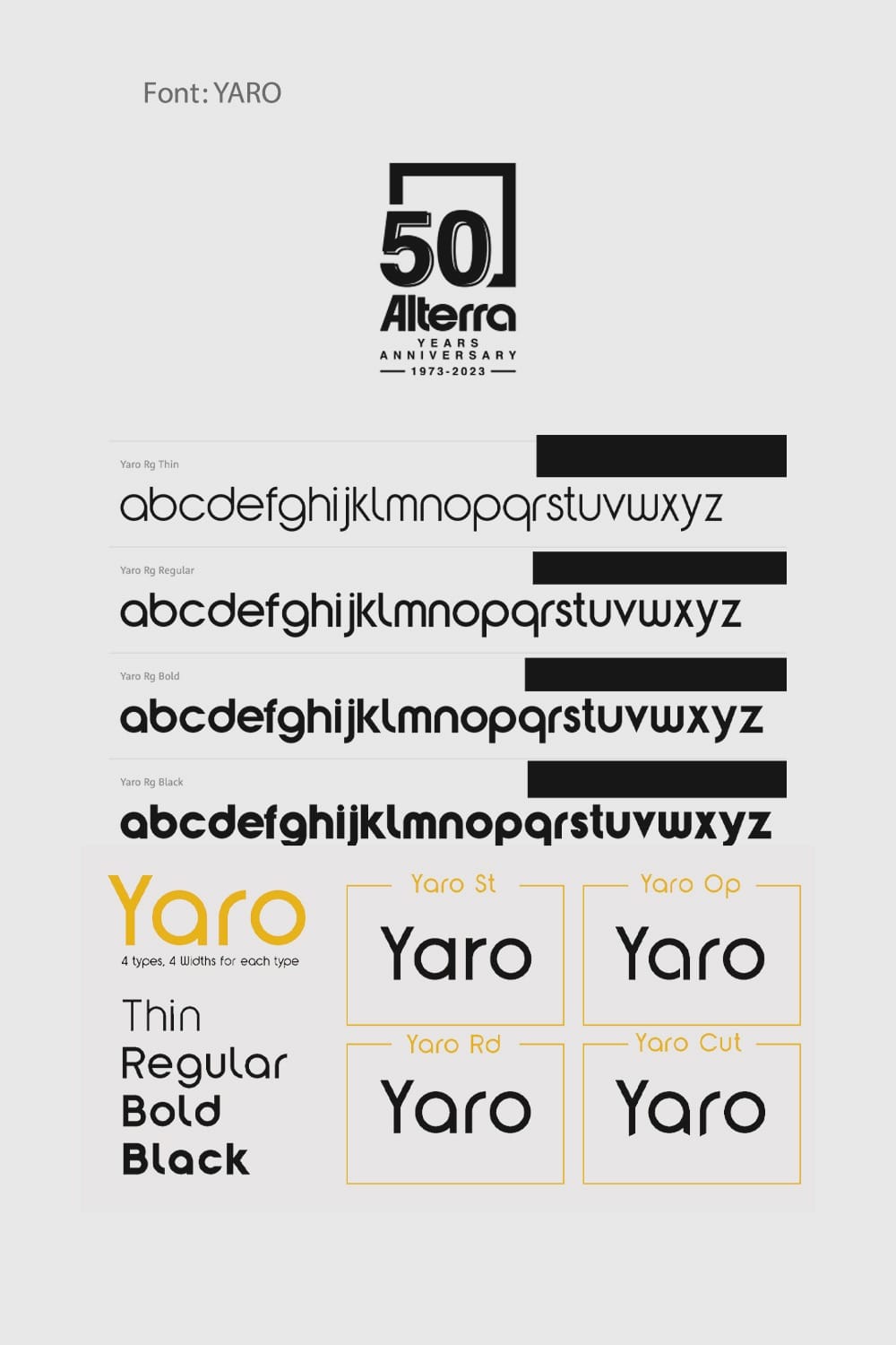
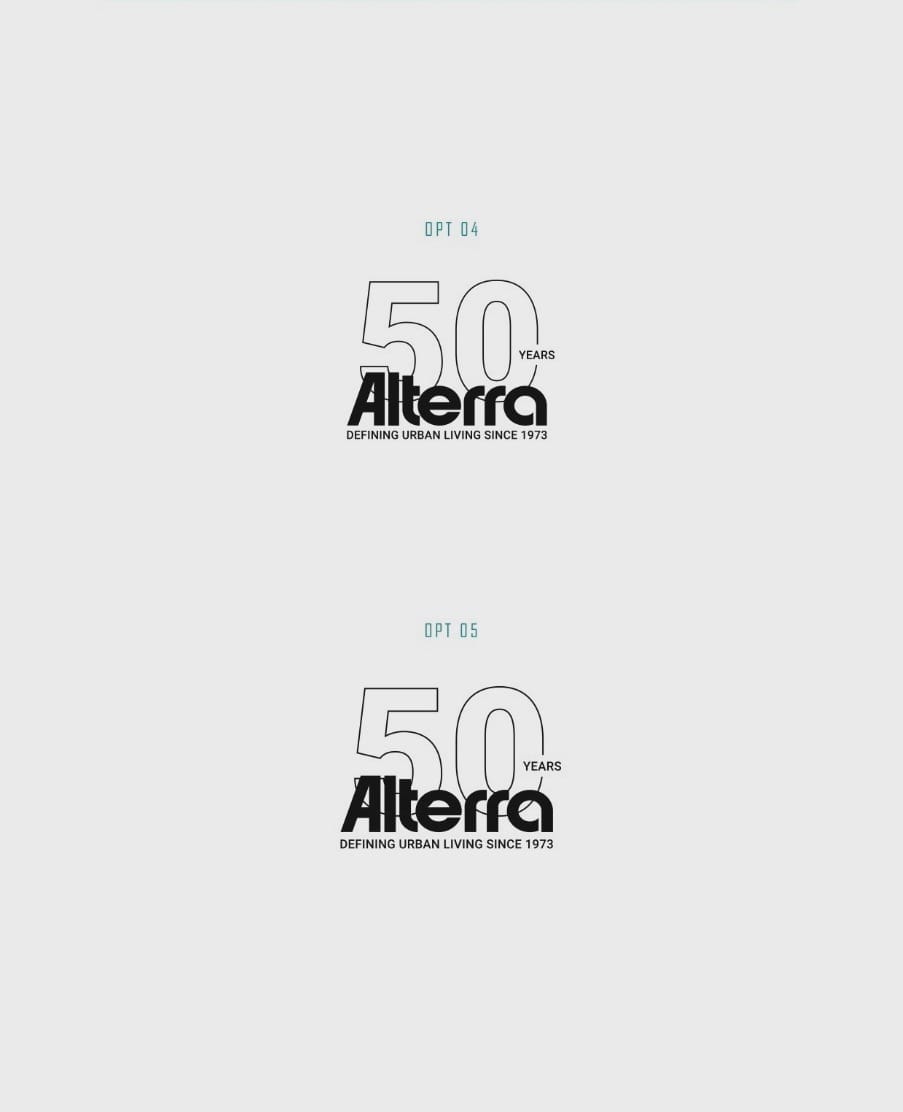
Typography with Substance: YARO Bold
For this special milestone, the typeface YARO Bold was chosen to narrate the story through its solid yet stylish letterforms, underpinning the robust yet visionary outlook Alterra cultivates.
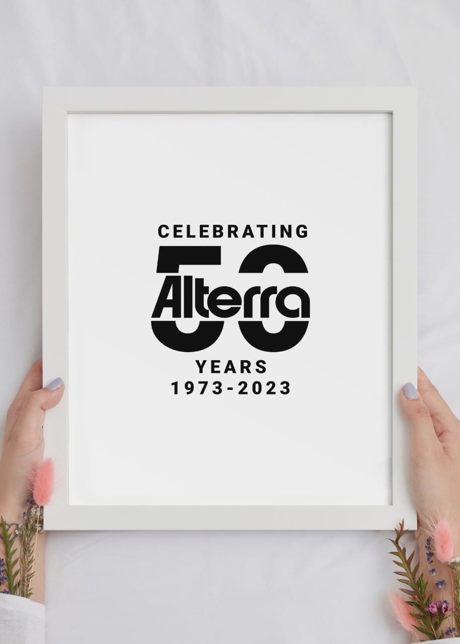
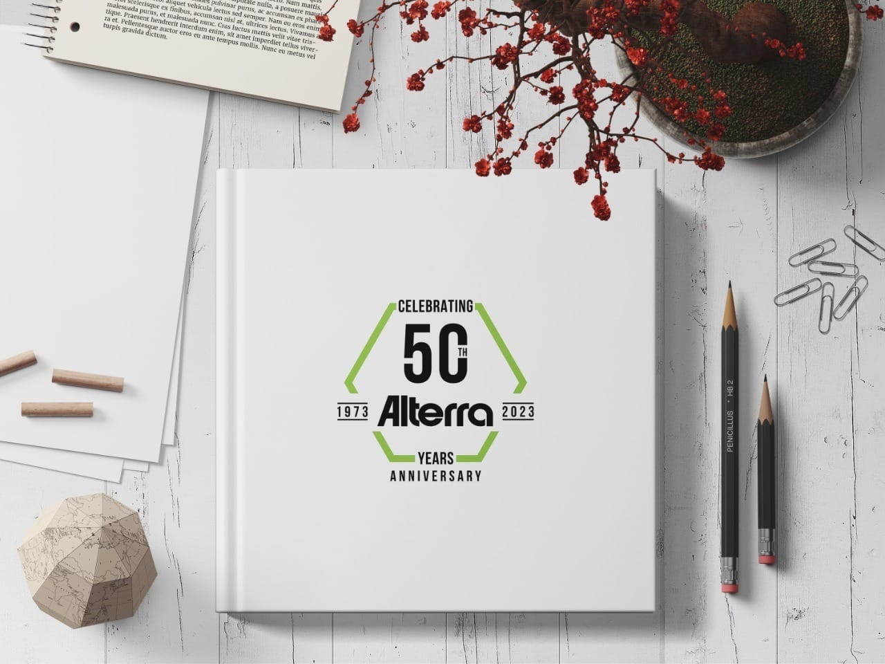
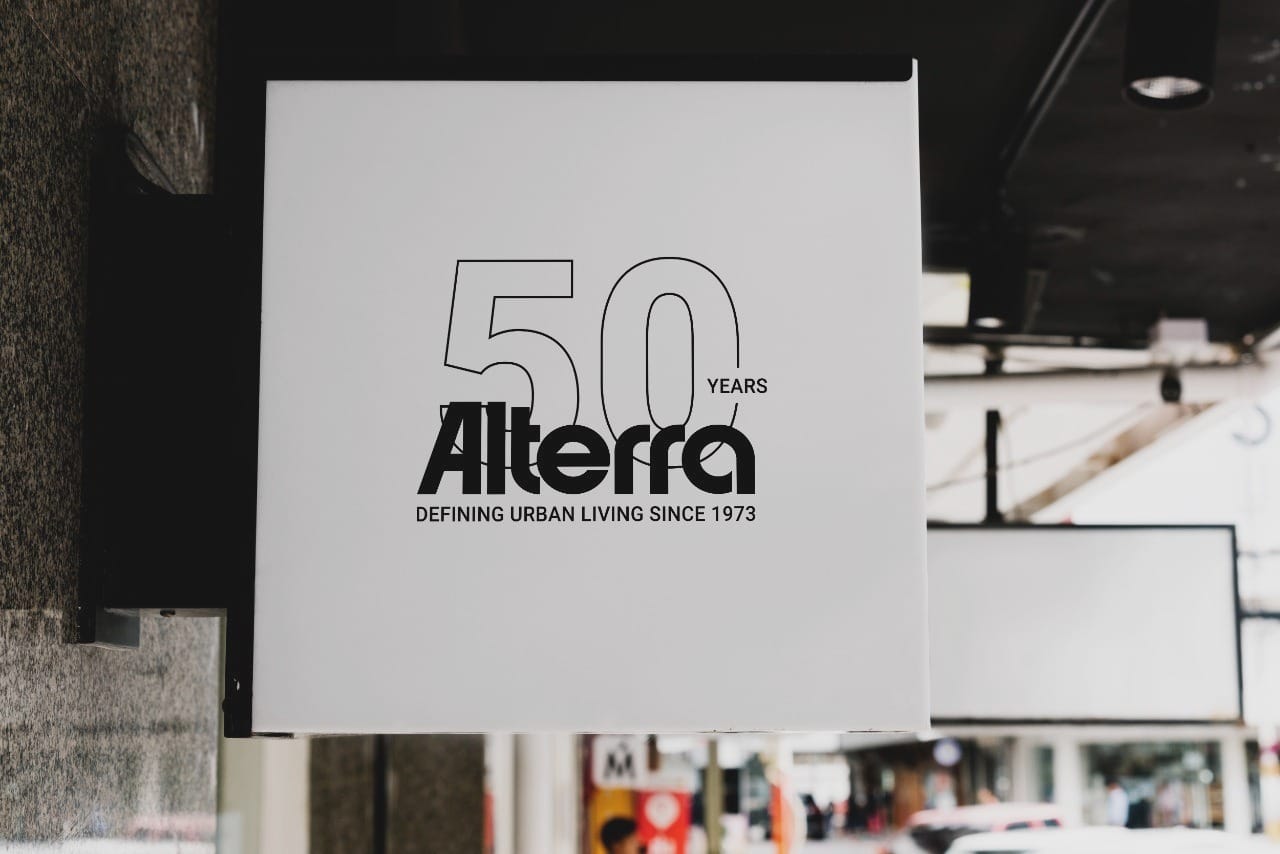
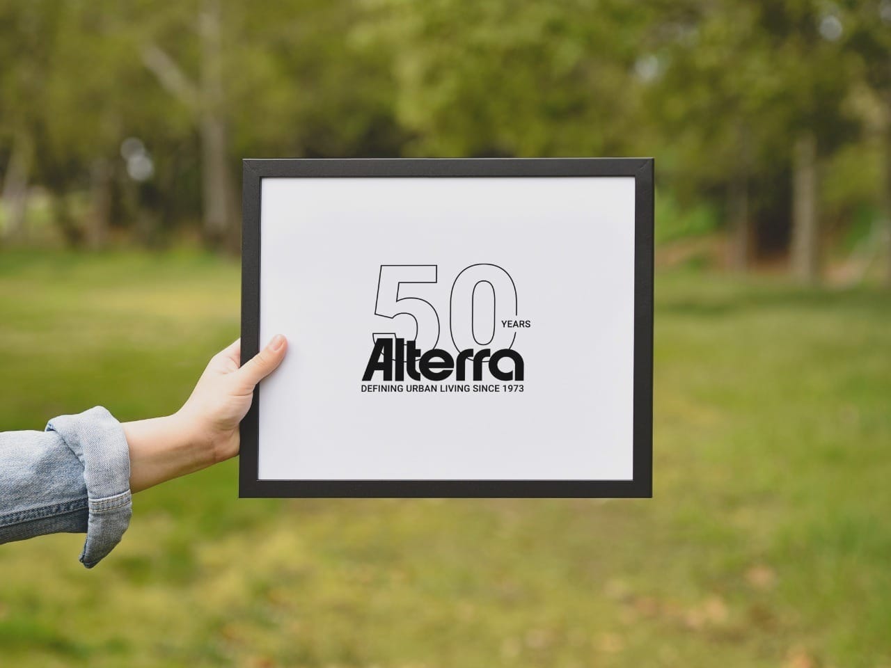
The Real-World Application
The new logo seamlessly integrates across various mediums a testament to its thoughtful design. Whether emblazoned on bags, signage, or merchandise, Alterra's 50th-anniversary emblem exudes a cohesive brand narrative.
Start your brand journey today.
