Adobo Fresh Mexican Kitchen: A Flavor-Filled Visual Identity
A detailed insight into Adobo Fresh Mexican Kitchen's rebranding venture, capturing the essence of Mexican culture through a modern design approach.
Navigating the bustling streets of culinary branding, Adobo Fresh Mexican Kitchen reimagines its visual identity with a rich, flavorful design that embodies its essence and vibrant offerings. Drawing from a detailed creative journey, we unravel the layers of this branding process, deeply influenced by Mexican culture and the essential charm of urban appeal.
Client's Vision and Design Brief
Adobo Fresh Mexican Kitchen, a culinary gem dedicated to delivering authentic Mexican flavors, embarked on a mission to refresh its brand identity. Located within an urban setting, the brand's objective was to capture the vibrancy and authenticity of Mexican cuisine while appealing to a metropolitan audience. The initial client brief called for an urban Mexican color palette, visually connecting with elements like burritos, avocados, tortillas, cacti, and peppers.
The Design Exploration
Responding to the brief, the design team began its exploration with multiple logo concepts that reflected Mexican motifs. The aim was to integrate cultural elements into a design that speaks both to tradition and modernity. The team produced a series of initial drafts embodying different aspects of the client's vision.
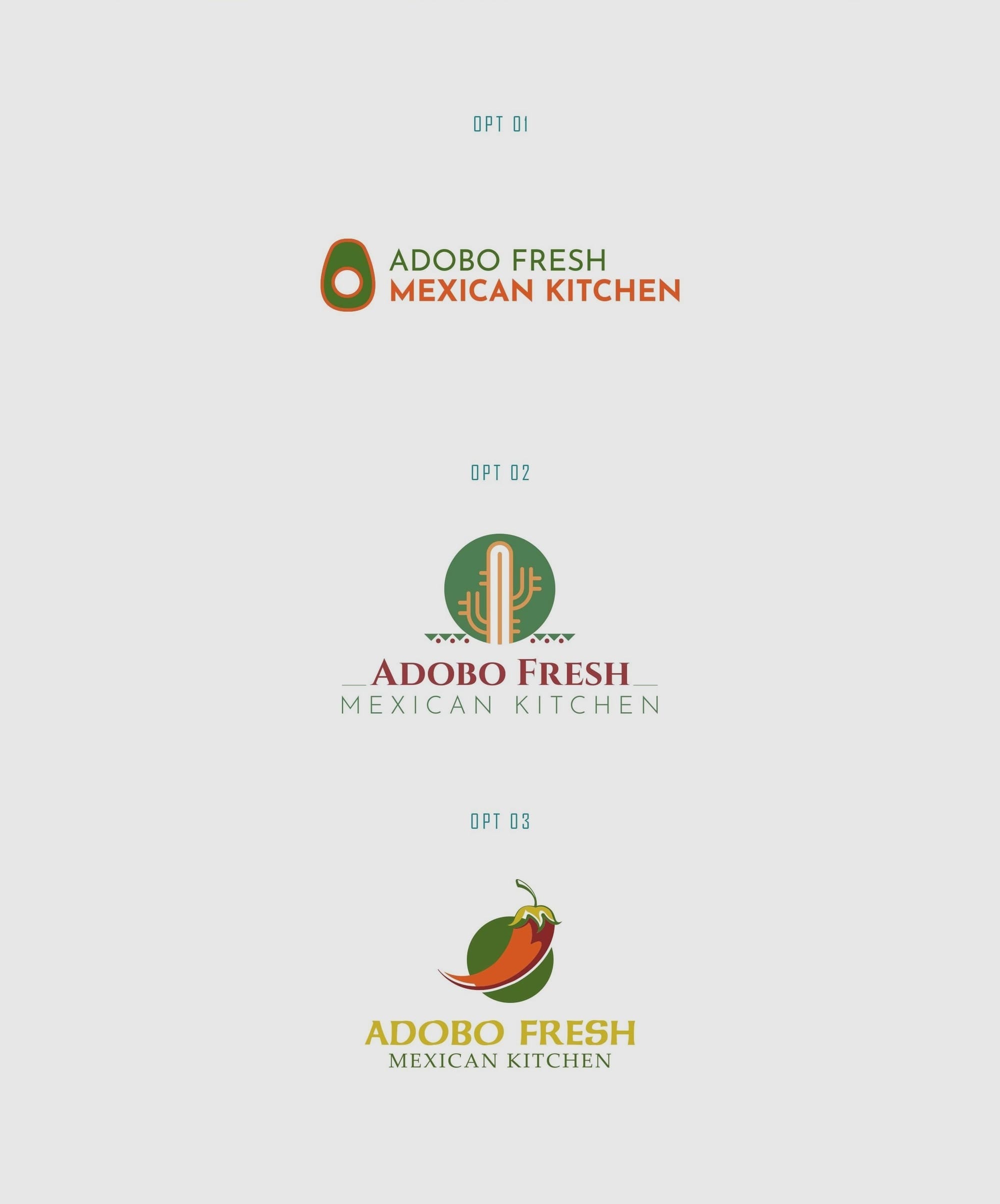
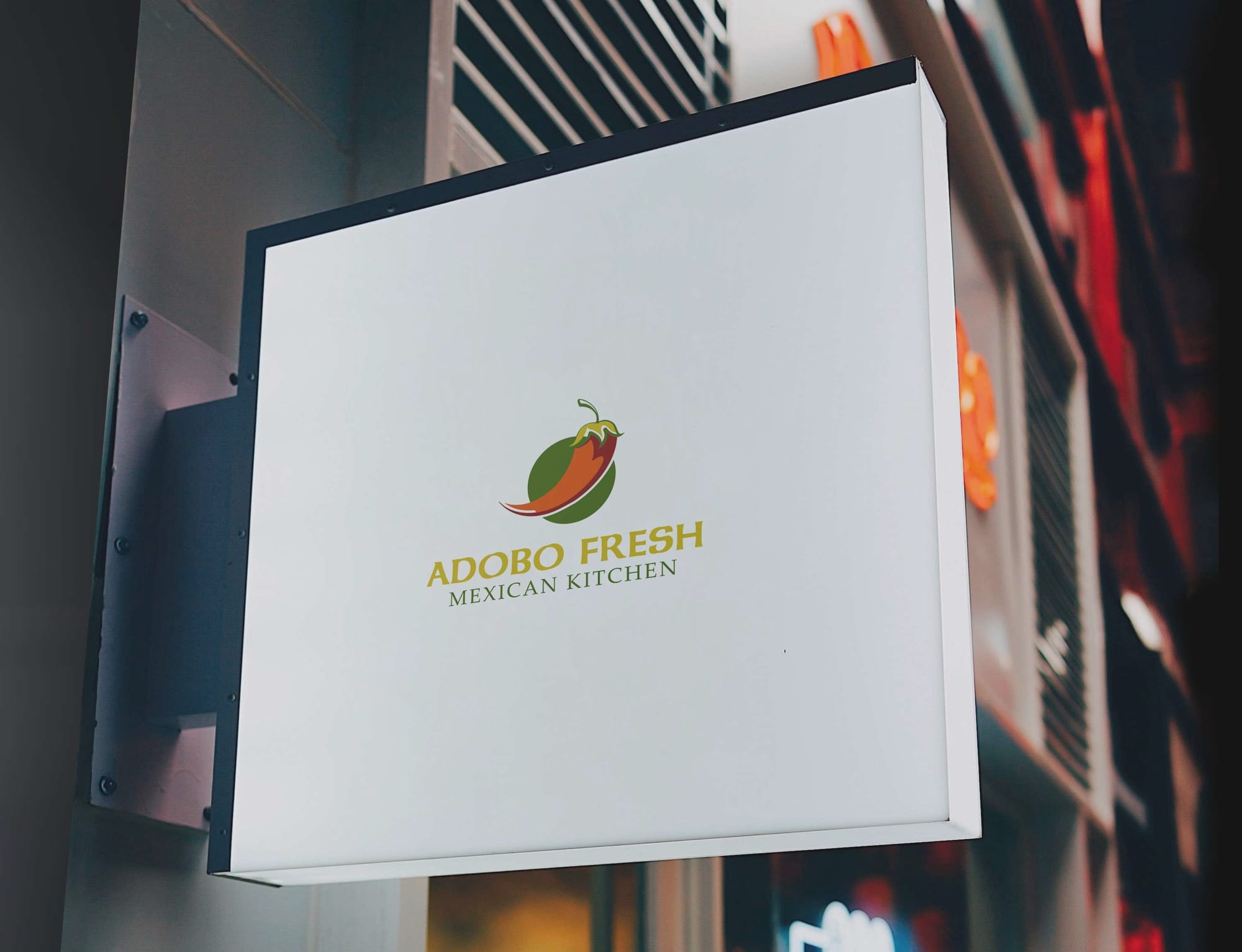
Option 3 ultimately resonated with the client, chosen for its thoughtful design and the meaningful blend of aesthetics that aligned perfectly with the brand's ethos.
The final logo design stands as a perfect balance of creativity and strategy. Every element from typography to symbolism was crafted with purpose, ensuring the mark communicates the brand’s values with clarity and confidence. Its simplicity makes it timeless, while its distinct form ensures memorability across every platform.
Font Choice and Meaning
The final logo design featured the Cinzel font, chosen for its classical elegance and readability, which effortlessly complements the graphical elements used to narrate the brand's story. This font choice underscores a timeless quality, conveying a sense of trust and tradition while aligning seamlessly with the visual narrative.
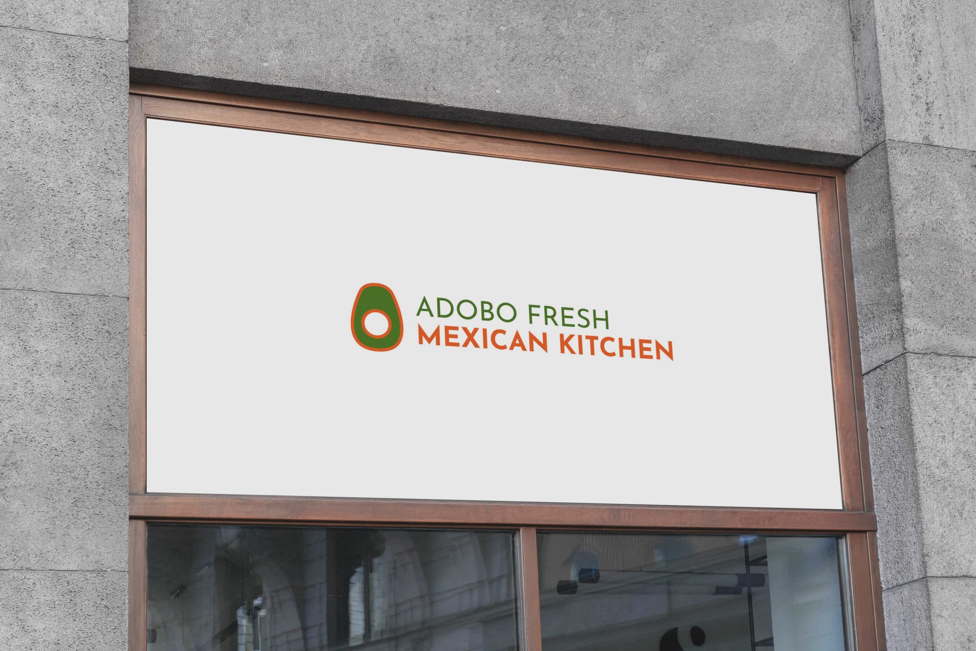
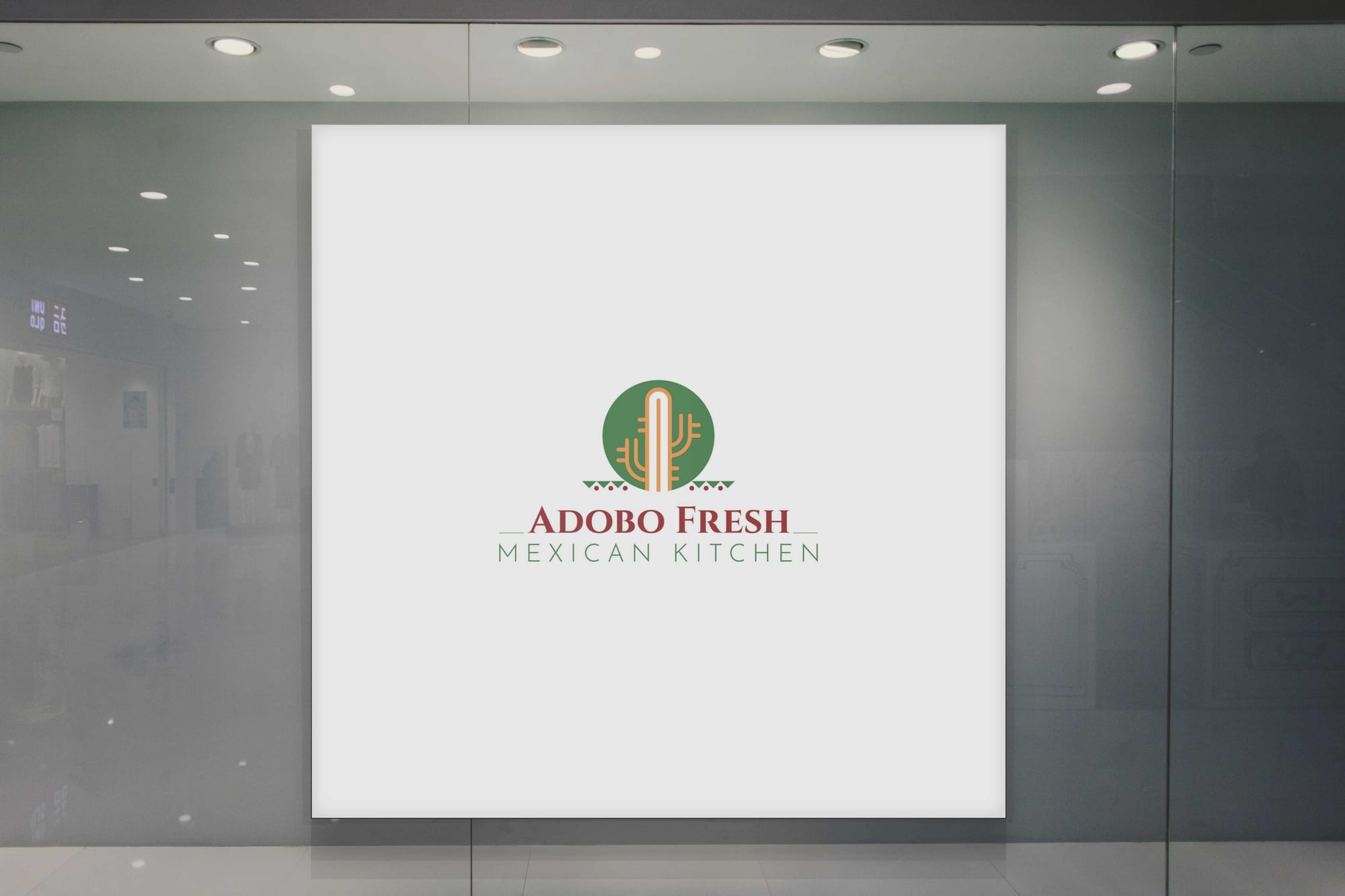
Final Deliveries and Real World Application
The comprehensive branding efforts culminated in a series of final mockups, showcasing the logo in diverse applications ranging from corporate branding to urban settings, reflecting the versatility and appeal of the visual identity across platforms.
CONCLUSION
In a journey of creative discovery, Adobo Fresh Mexican Kitchen has successfully positioned itself in the market with a brand that not only celebrates the richness of Mexican culture but also invites urban dwellers to partake in an experience where tradition meets contemporary joy. A simple logo has morphed into a compelling brand narrative, embodying a dynamic blend of flavors and innovation.
Start your brand journey today.
