A Stitch in Time: The Rebranding Journey of Brandmark Apparel
The meticulous rebranding journey of Brandmark Apparel. Discover how they redefine their visual identity to embody simplicity, adaptability, and authenticity.
In the world of fashion, where each stitch tells a story and every garment defines an identity, Brandmark Apparel stands as a testament to personalized style and bespoke aesthetics. This dynamic company, specializing in custom embroidered and printed apparel, embarked on a transformative journey to weave a cohesive visual identity that would mirror their dedication to quality and adaptability. Located at the intersection of creativity and craftsmanship, Brandmark Apparel's journey into rebranding is nothing short of a design narrative worth exploring.
Clothing as a Canvas for Expression
Brandmark Apparel has always been rooted in the idea that clothing is a canvas for expression. Renowned for its custom creations, the company aimed to expand its repertoire to offer more diverse apparel options while keeping embroidery a core essence. The challenge lay in crafting a logo that reflected this duality of simplicity and versatility, imperative for an entity that found itself constantly threading between creativity and practicality.
The Design Challenge
Choosing a logo fit for stitching was no ordinary task. The Brandmark Apparel team required a design that embodied succinctness while ensuring its elegance was preserved across varying apparel applications. The client was clear, the visual elements should be straightforward enough for embroidery yet striking and recognizable across a spectrum of printing processes. This dual approach presented the challenge of balance, between complex design insights and the simplicity necessary for practical application.
Exploring Logo Concepts
The design team at Brandmark Apparel presented a comprehensive draft, showcasing three distinct logo variants. They utilized fonts like AlethiaPro, Agency FB, and KittenSwashMonoline to inscribe Brandmark's narrative into a visual form. Each version echoed a unique facet of the company, intertwining elements of modern minimalism and traditional textile motifs that pay homage to the company's custom work ethos.
Option one favored sleek typography, a symbol of sophistication, offering a nod to the high-quality nature of their apparel. Option two turned towards a bolder, more playful typeface, reflecting the creativity and spontaneity inherent in custom clothing. The third option leaned into a classic emblem, a tribute to the timelessness found in classic apparel pieces.
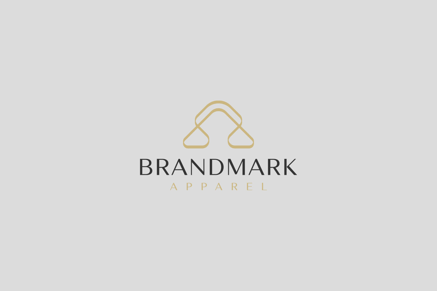
The Final Identity
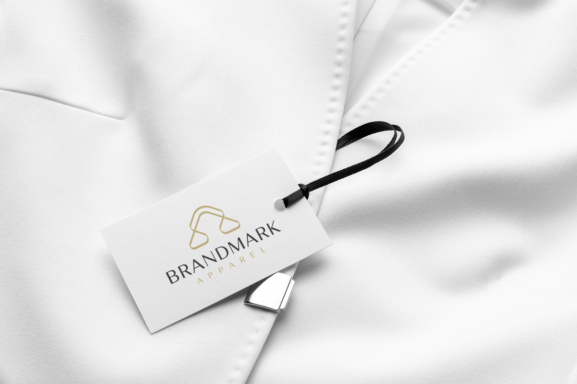
From this meticulously crafted selection, a singular design emerged—one that resonated with the company's vision and future aspirations. Elegantly understated yet imbued with character, the final logo embraced its role as the branding cornerstone for Brandmark Apparel. The harmonious blend of clean lines and articulate typography ensured adaptability, enabling the logo to shine, whether adorning a t-shirt or a stylish hat.

From Apparel to Experience
This redefined brand identity not only reinforces Brandmark's commitment to custom craftsmanship but also positions itself to capture a broader audience. Its potential extends beyond textiles, glancing towards potential explorations into fashion-forward designs and contemporary apparel collections.
The new logo is not just an emblem of Brandmark Apparel's present narrative; it envisions a future where each thread and stitch carries forward the legacy of personalized style. The new design is transformative yet foundational, reflecting the brand's capacity to adapt to market demands while remaining true to its core values. This case study epitomizes the essence of effective branding—a harmonious blend of identity, purpose, and aesthetic grace weaving all the pieces together.
Start your brand journey today.
