A Refreshing Reimagining: Splash Drinks' Bold and Vibrant New Look
Explore the creative transformation of Splash through its exciting rebranding journey crafted to enchant and attract.
In the world of competitive beverage markets, branding is not just about standing out but creating an impression that lingers. The journey of Splash, a delivery-only drinks lounge, reaffirmed this narrative through a meticulous rebranding process.
Established as a modern take on traditional soft beverage stores, Splash is a quaint yet lively concept that required a brand identity to encapsulate this spirit. Located centrally at a bustling thoroughfare, its primary offerings of sodas and teas cater to a young, adventurous crowd keen on vibrant flavors and experiences.
Understanding the Vision
The client, in the initial briefing, was clear in envisioning a logo that vividly represented the drinks theme. The preferences spanned colors such as blue and pink or blue and white to signify freshness and energy. The slogans "Drinks Lounge" or similar phrases were suggested to encapsulate the chilled yet vibrant atmosphere.
The logo needed to speak to the simplicity of a delivery-only service where customers would experience an easy queue and collect mechanism.
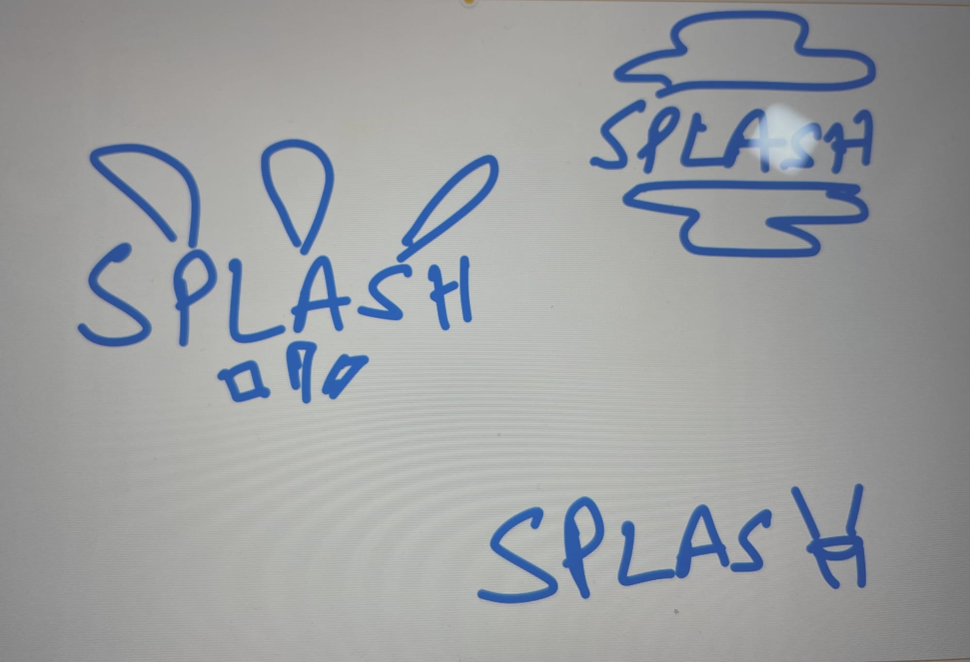
Design Exploration
The design team presented three initial concepts, focusing on the vibrancy of blue hues paired with pink and green. Each option aimed to convey the fresh, lively essence of Splash.
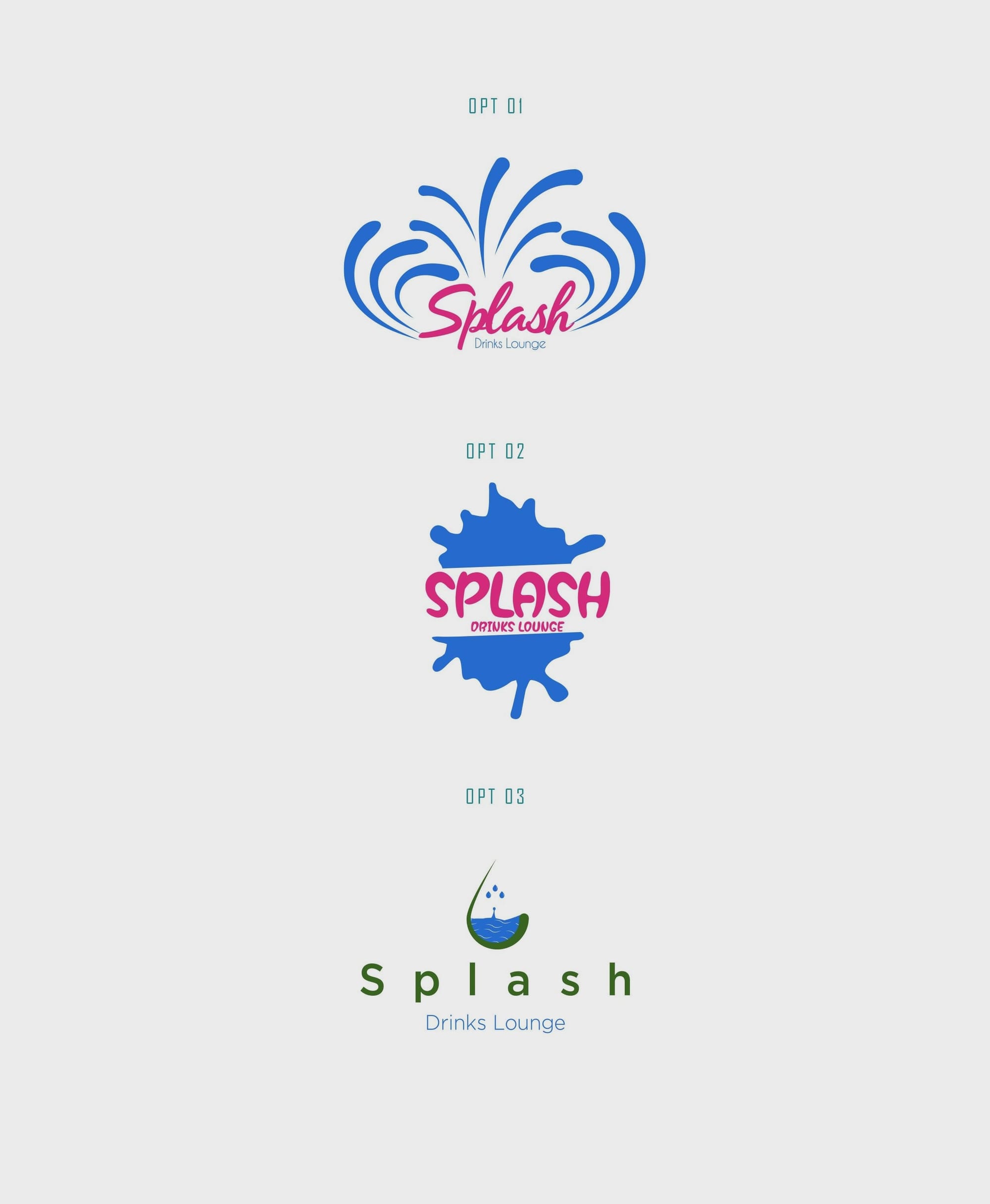
True to their vision, the client expressed preference for bold elements and clearer visibility of the word 'Splash'. The connection between the name and the visual concept was important, hence, revisions were requested.
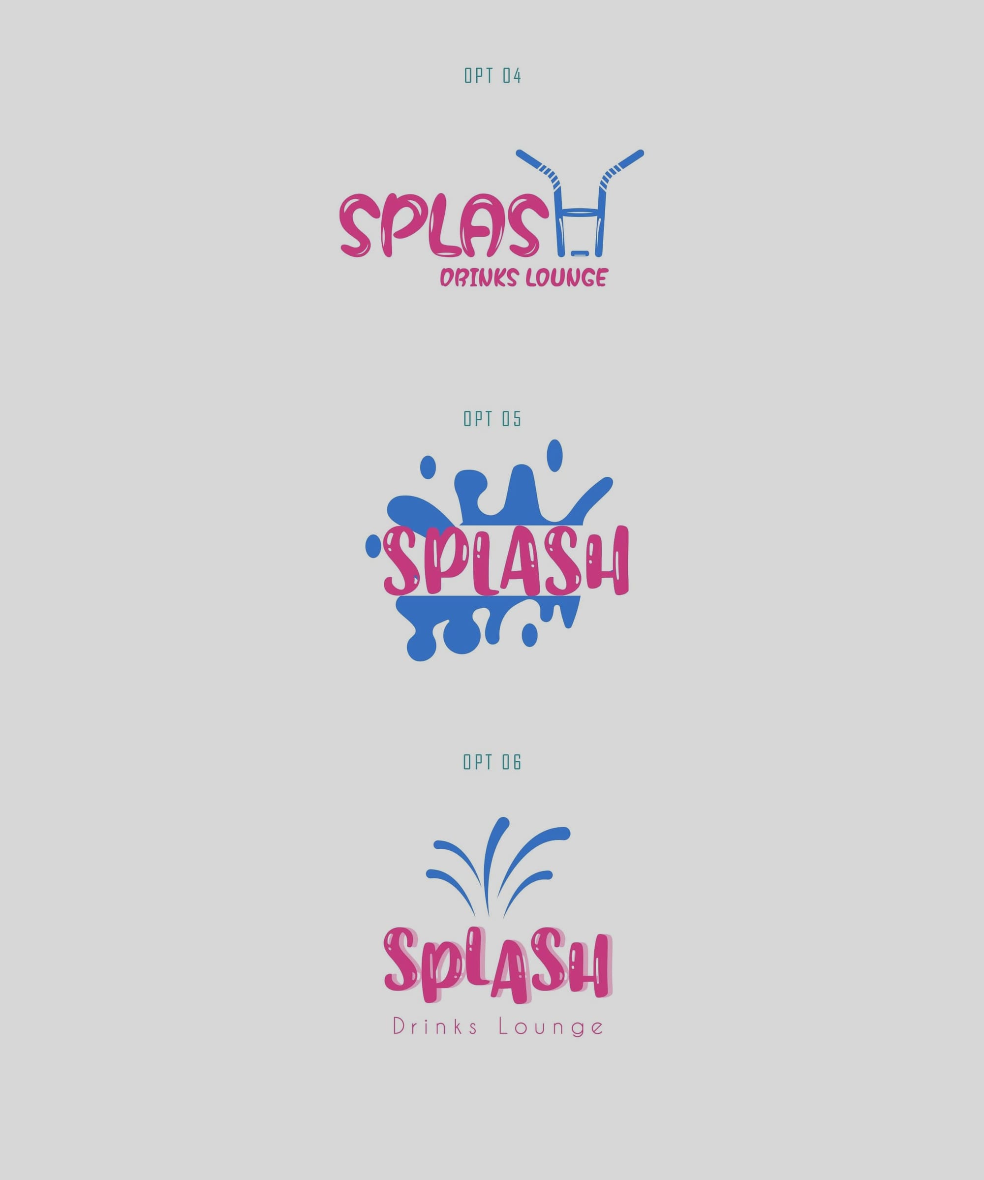
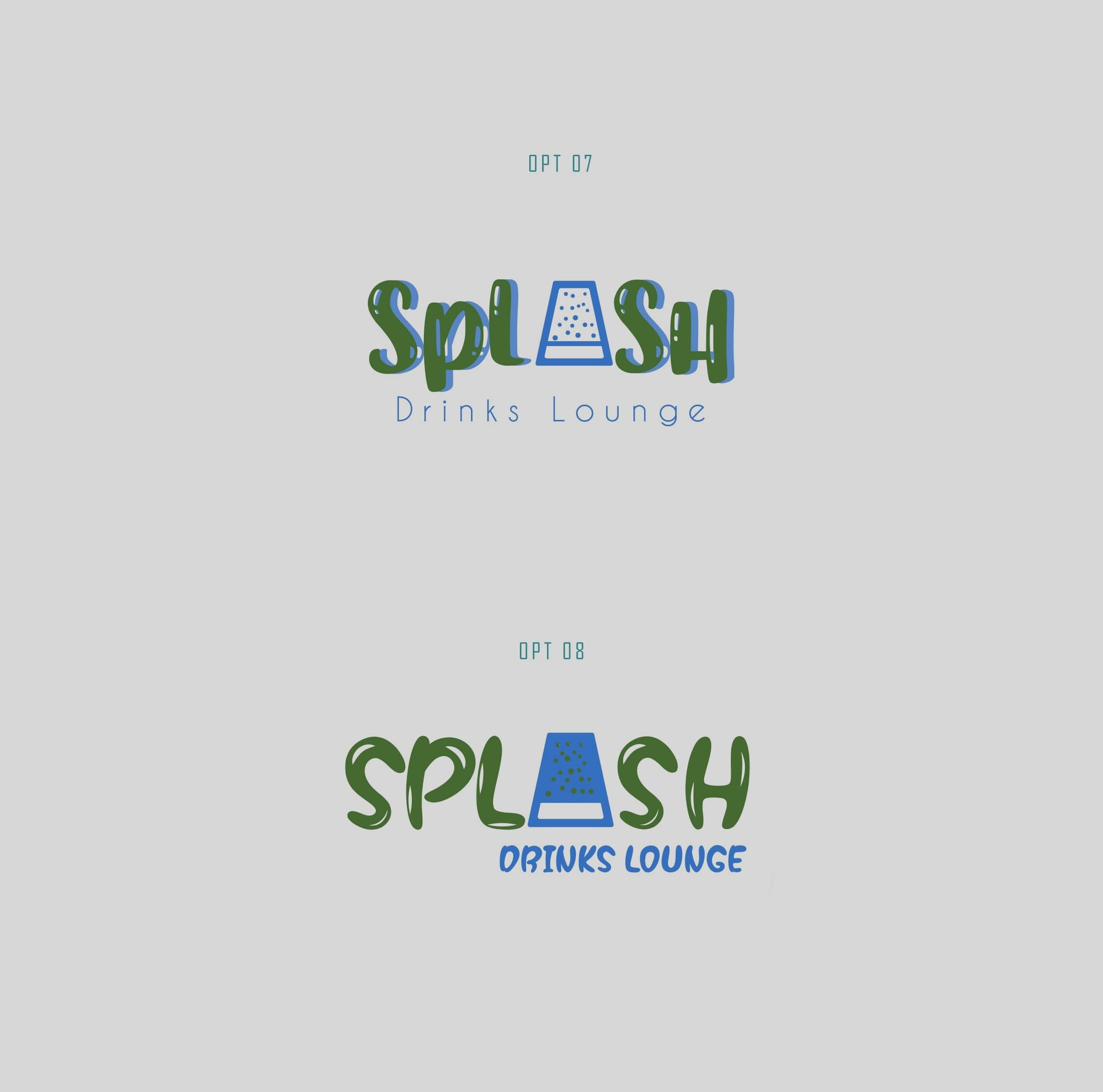
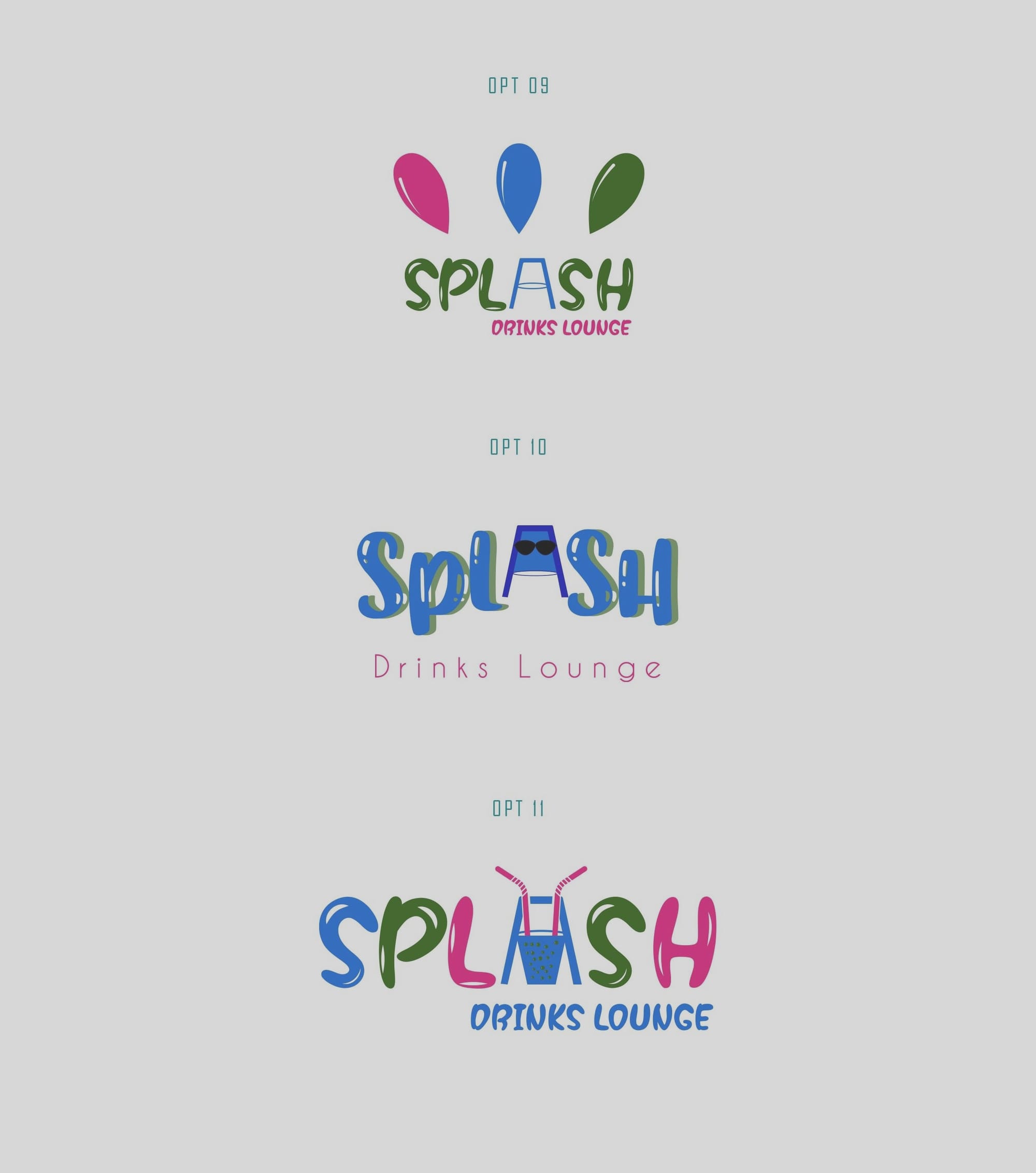
Creative Refinement
A fresh set of options incorporated client feedback, introducing a green and blue palette with a unique play on typography. Notably, one revision replaced the letter 'A' with an inverted glass, adding visual depth through clever symbolism. Further tweaks led to bold and colorful font options, underscoring the brand's joyful nature.
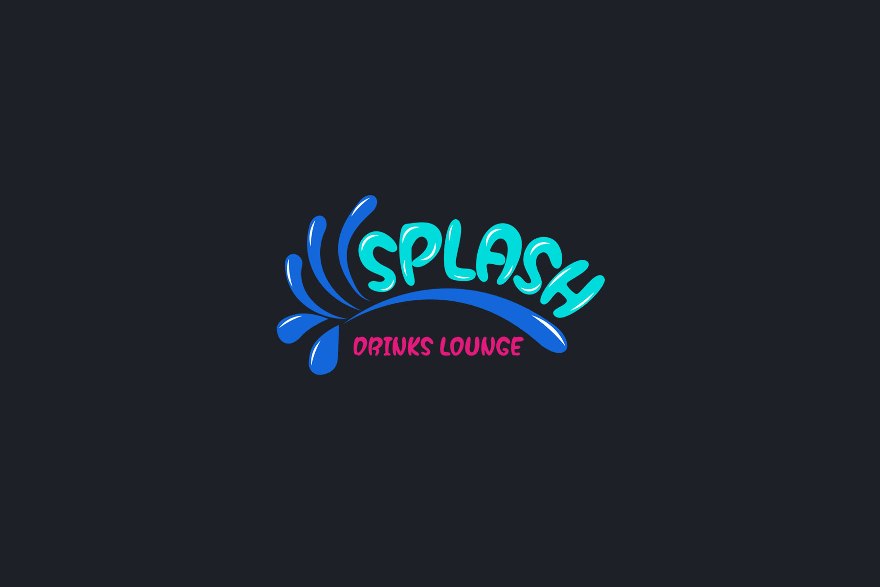
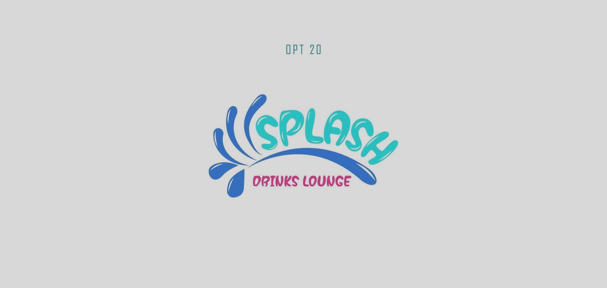
The Final Seal
After extensive exploration, Option 20 stood out, captured the essence of Splash perfectly, and marked its choice as the ultimate avatar for the brand.
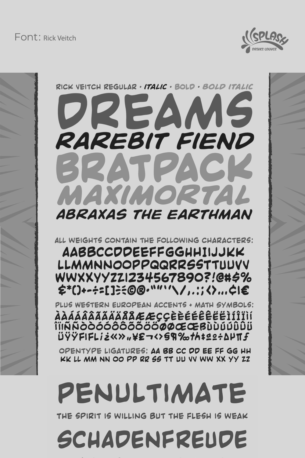
The font used for the approved logo, Rick Veitch, contributed significantly with its bold simplicity. The choice was apt for creating a strong, lasting impression while ensuring readability. The font's playful yet assertive style complements Splash's exuberant identity.
A Journey Concluded
This invigorated identity not only aligns with the spirited offerings of Splash but sets a dynamic example in the competitive beverage scene. This iconic look and feel allow Splash to resonate with its audience, promising an enjoyable and memorable encounter with every drink.
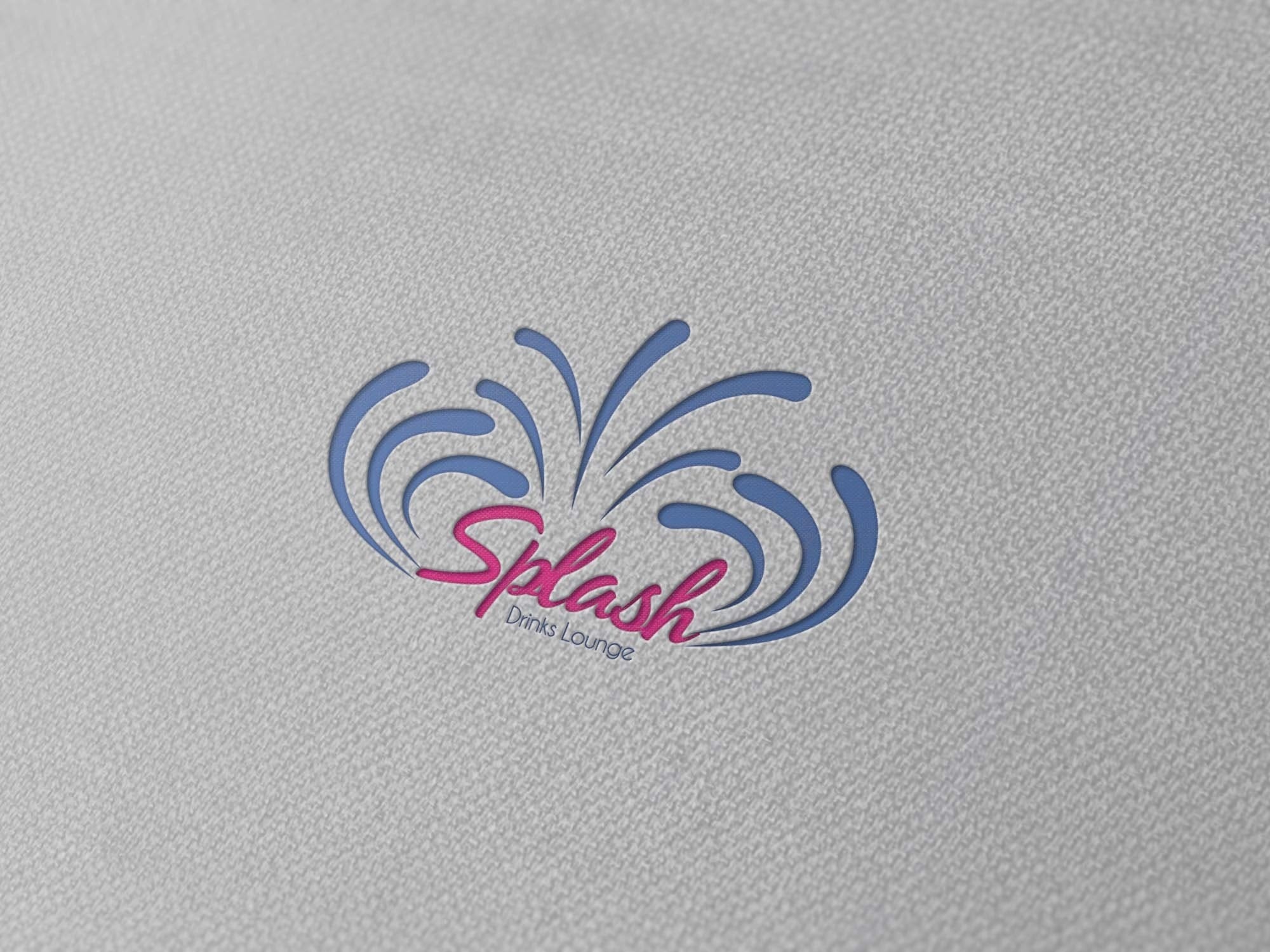
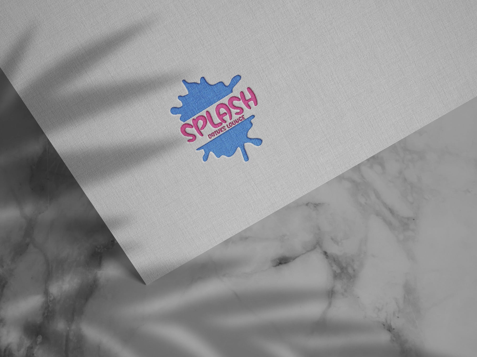
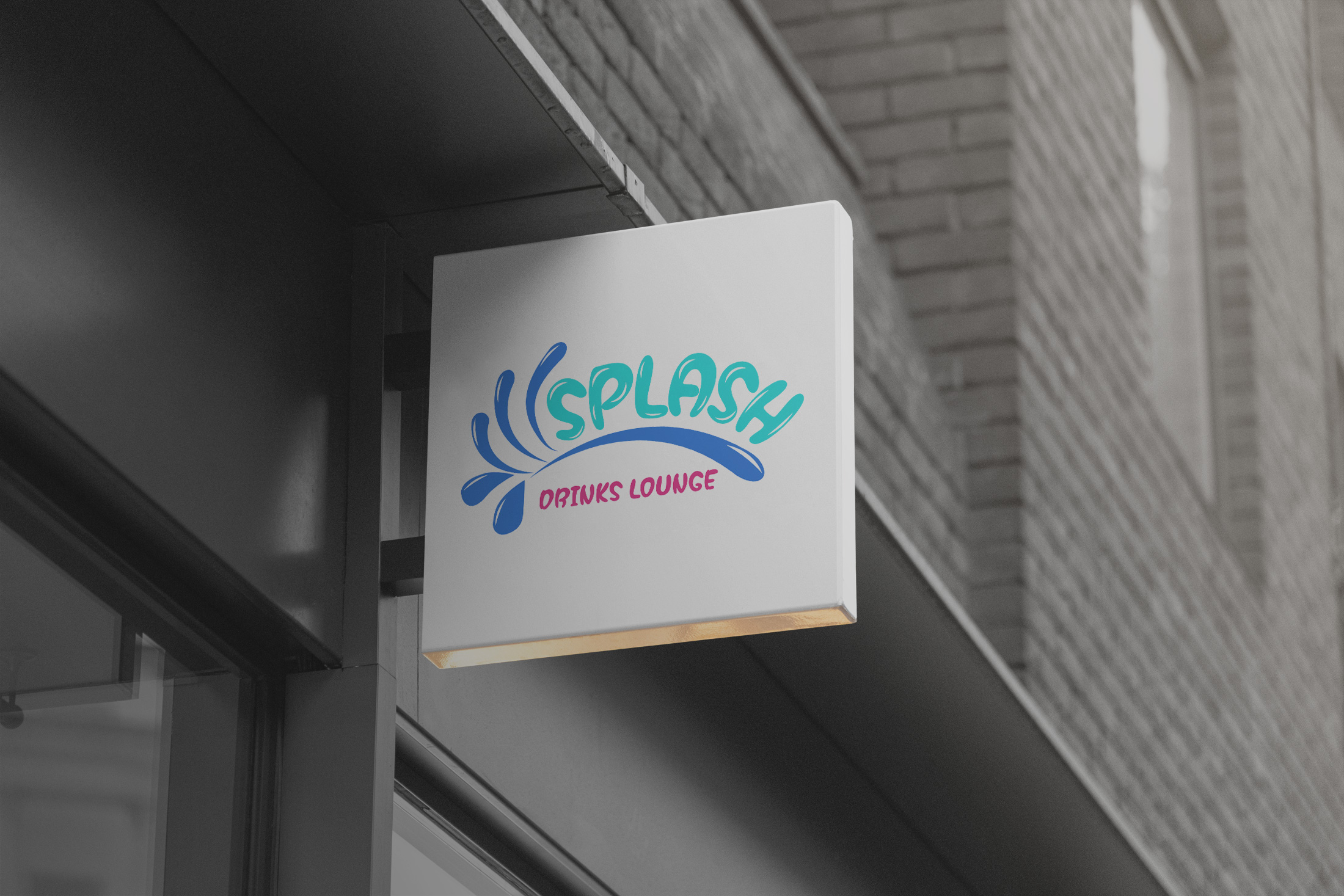
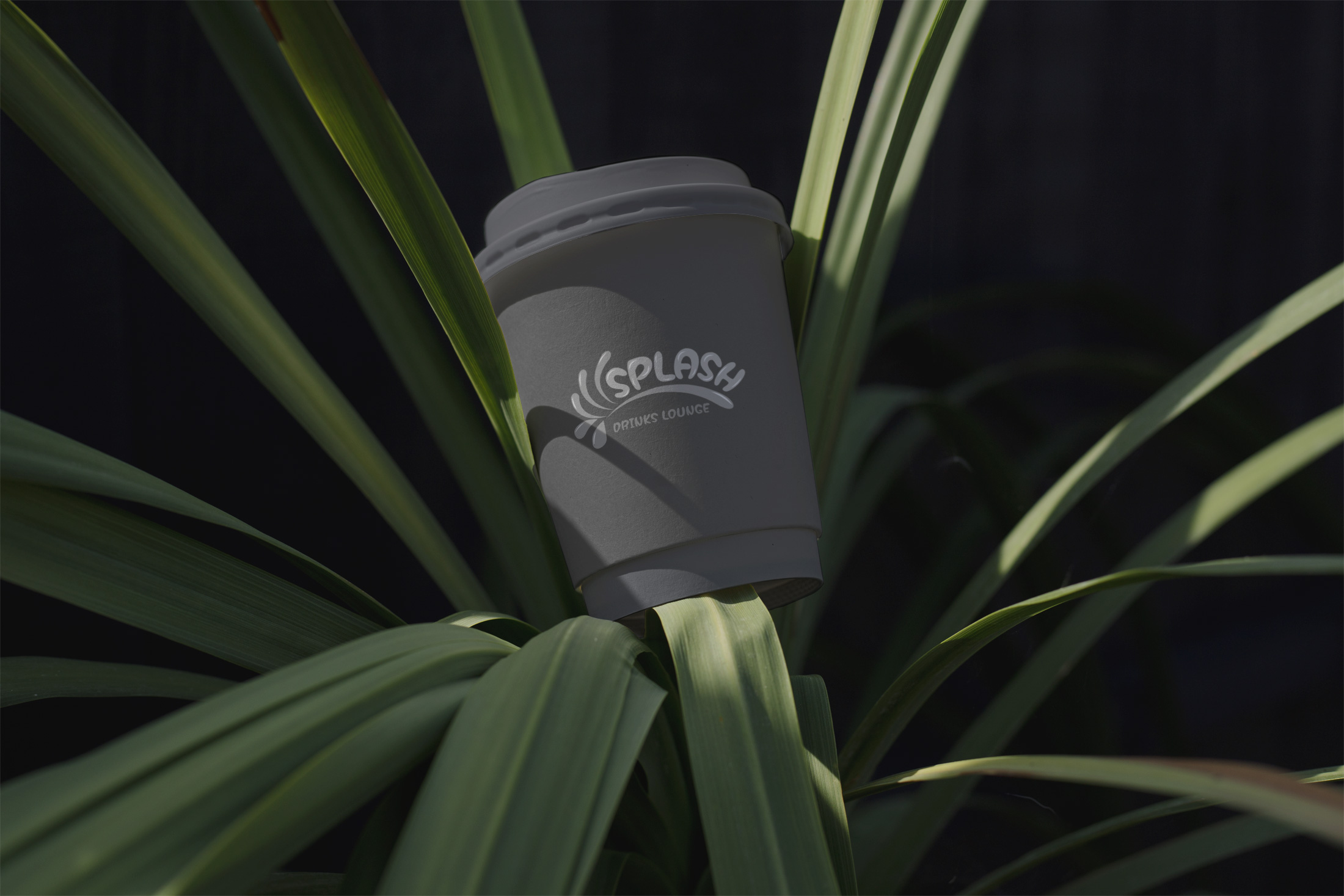
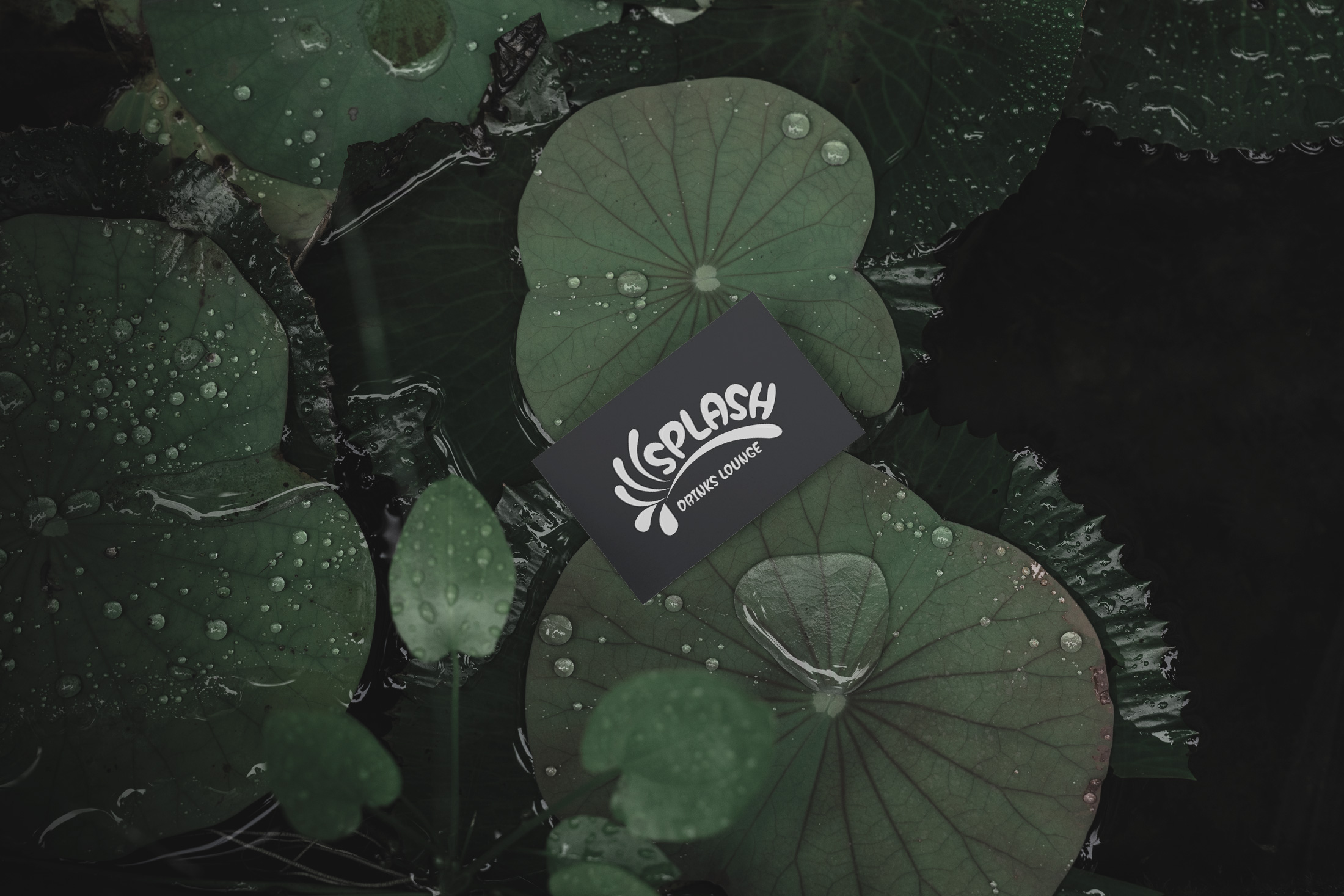
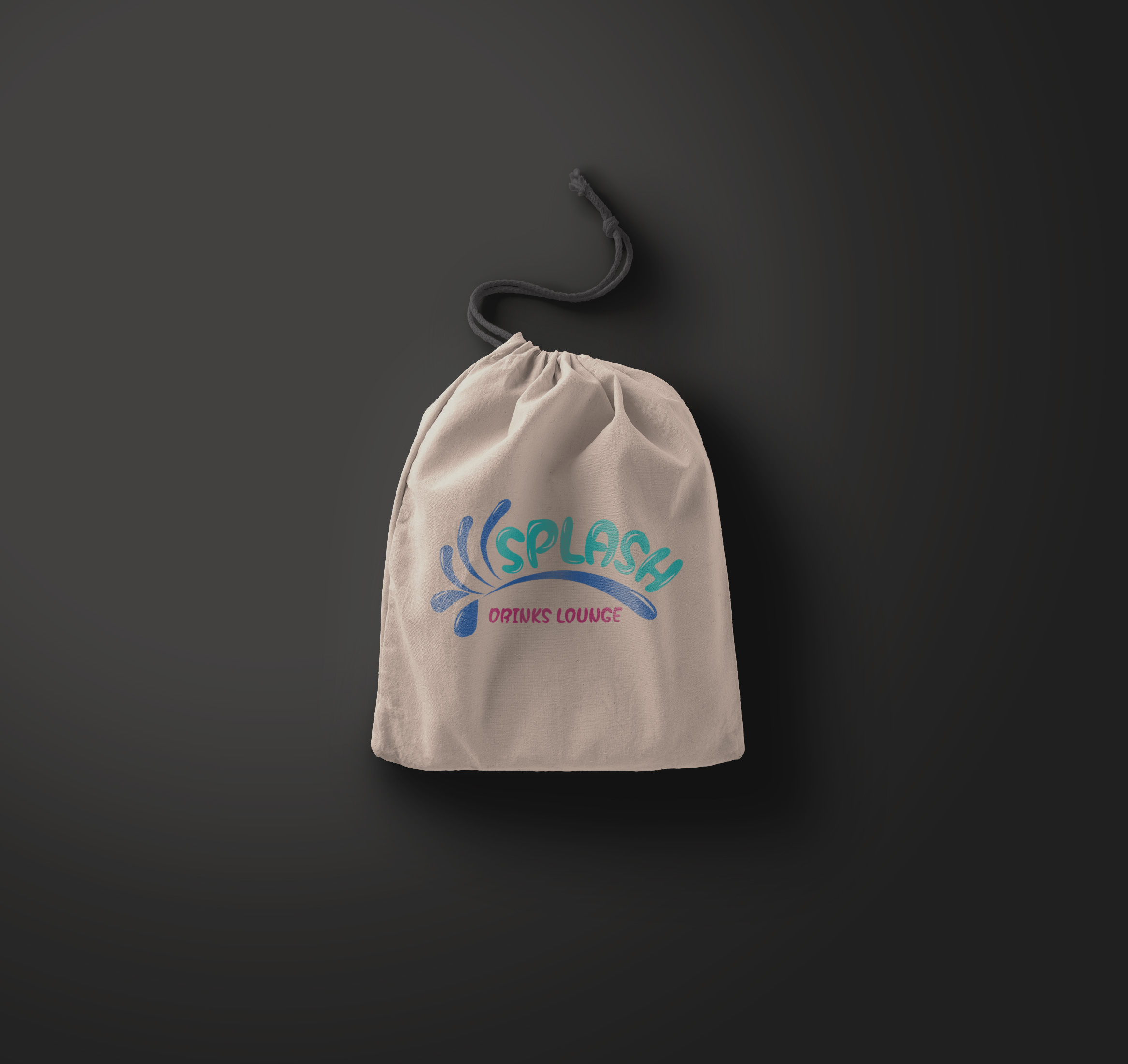
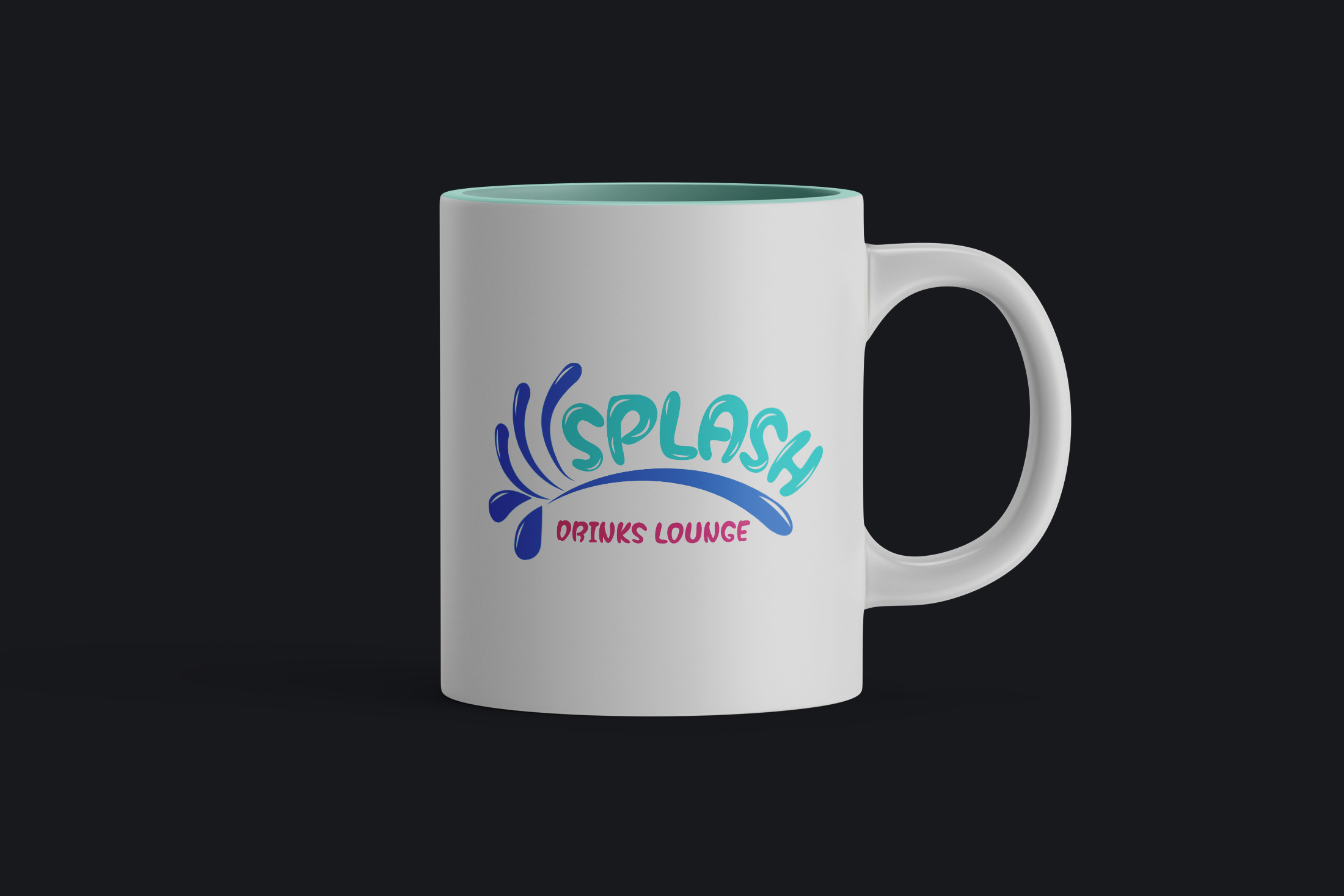
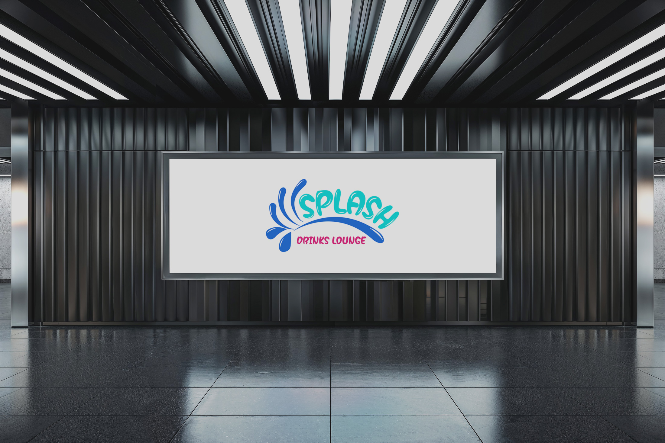
Real World Application
The final delivery showcased the logo in various real-world settings, reinforcing its adaptability and visual appeal. From branded paper cups to street signage, each application echoed the brand's vibrant essence.
Start your brand journey today.
